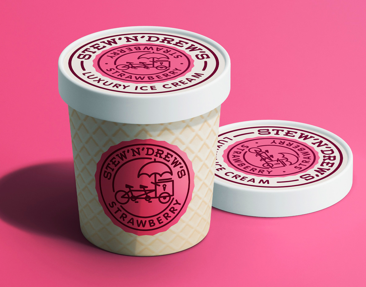

-
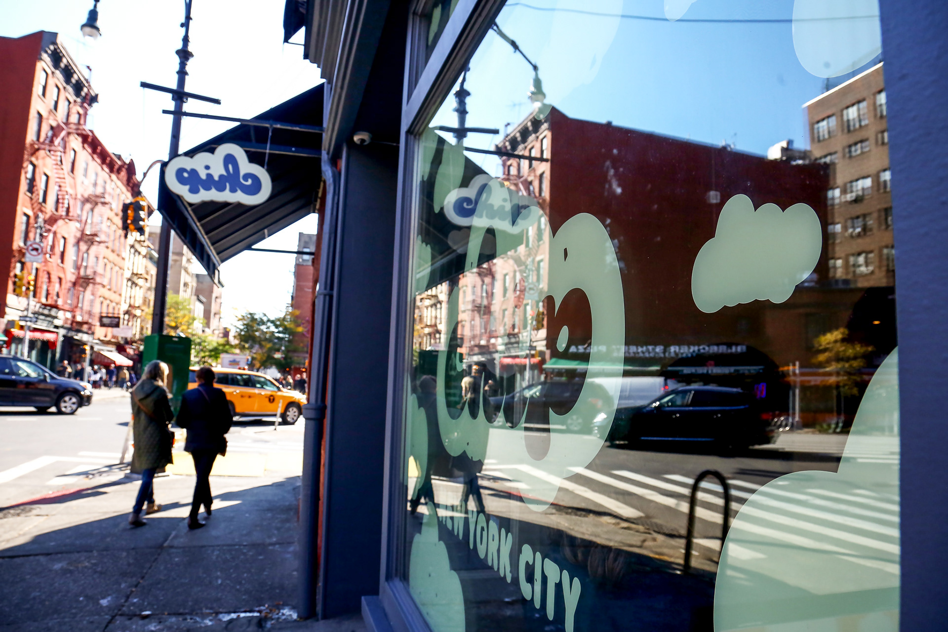
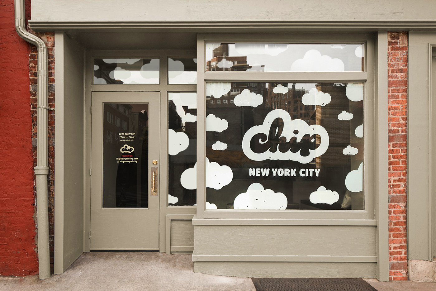
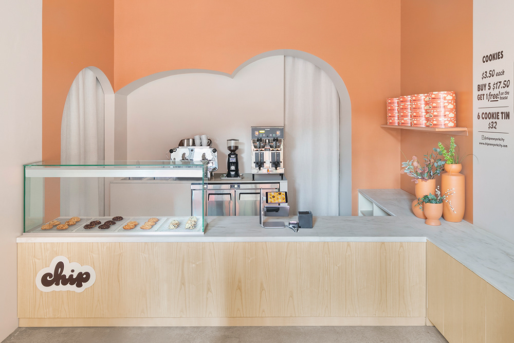
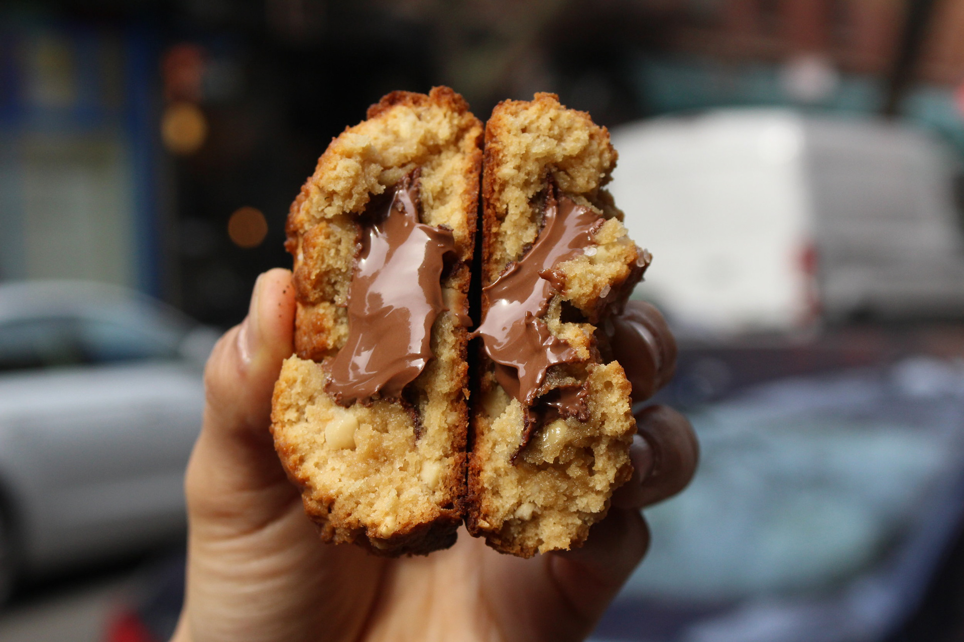
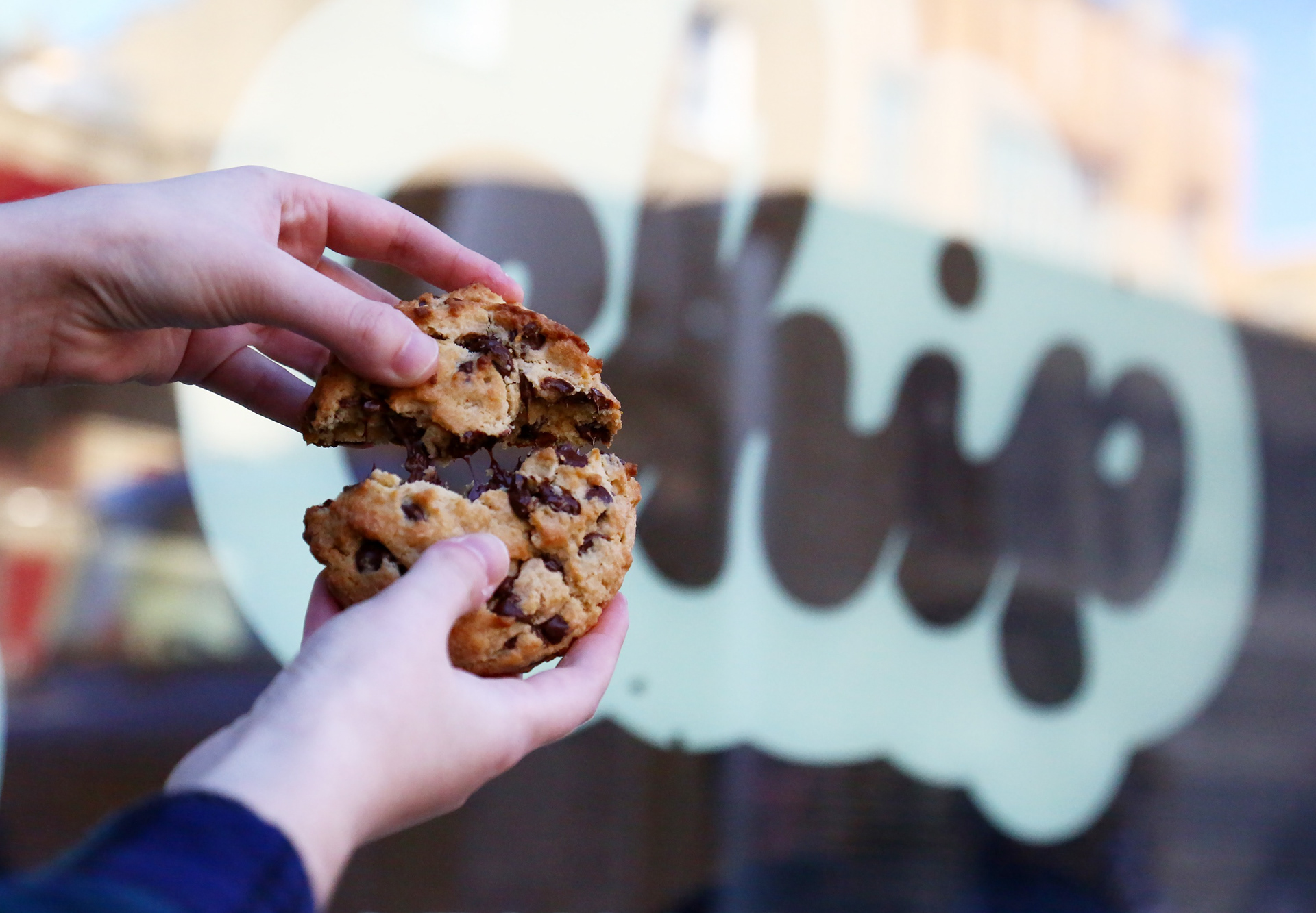
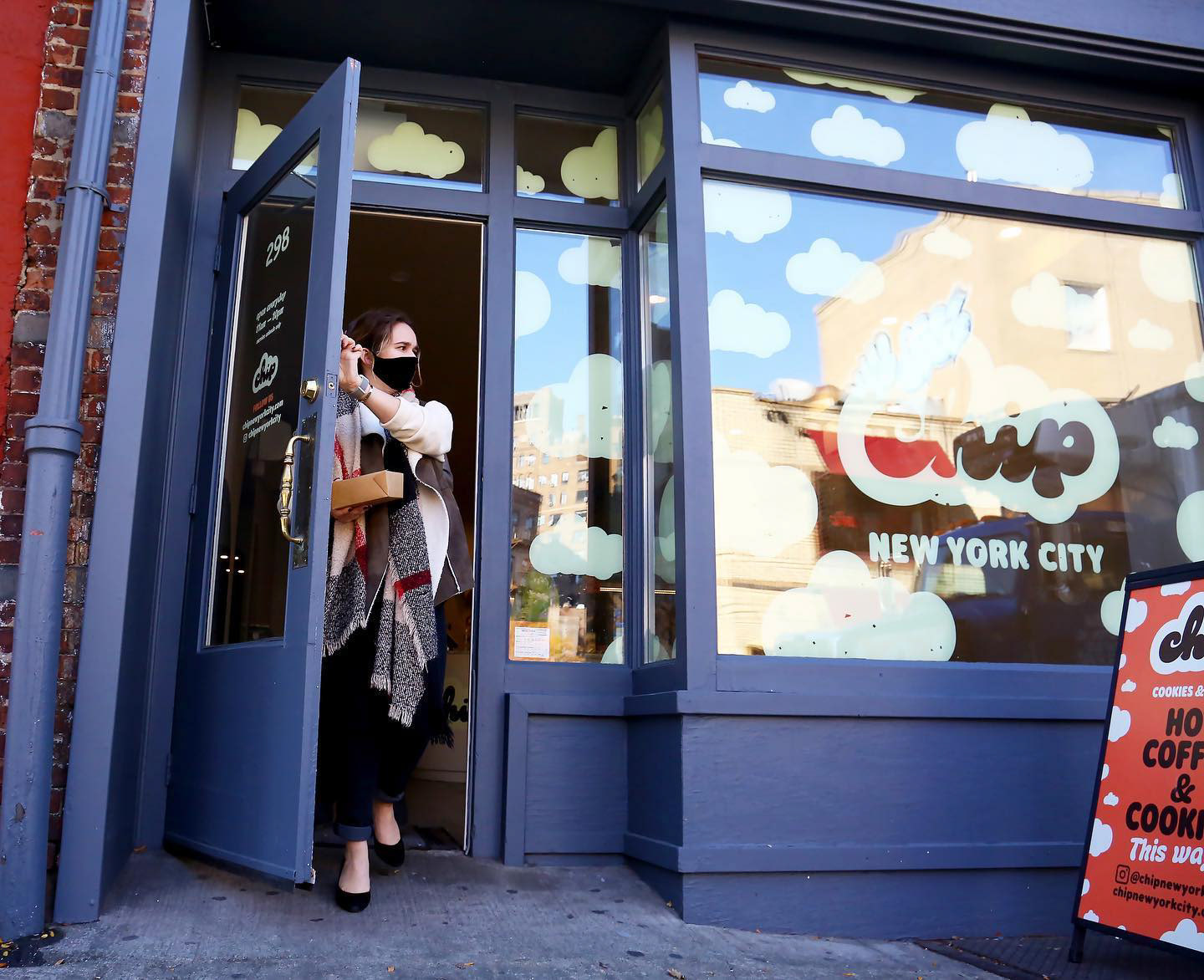
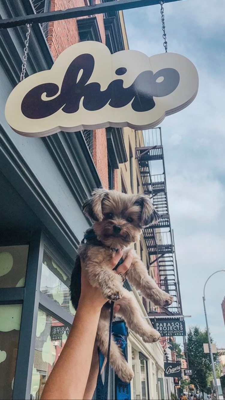
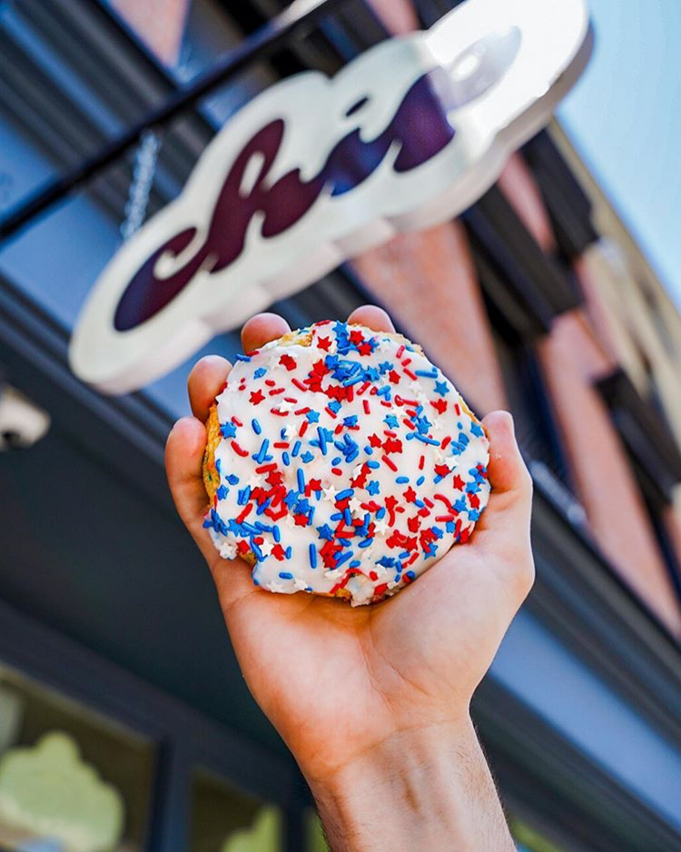
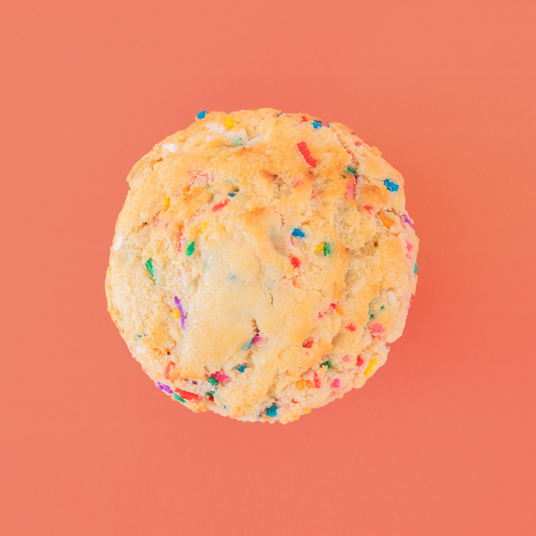
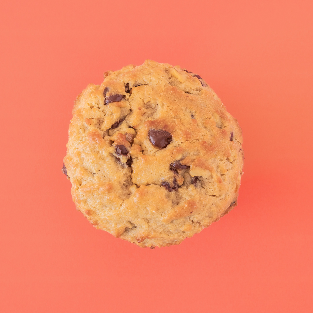
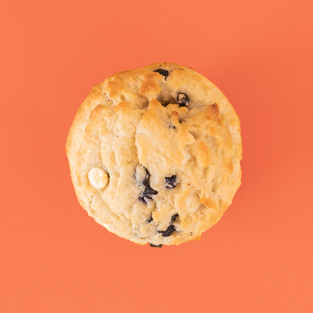
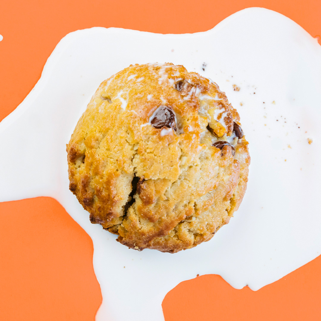
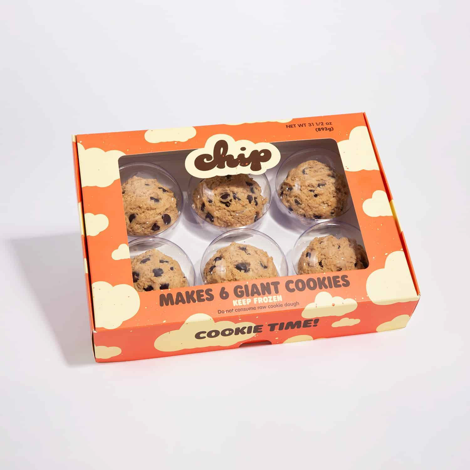
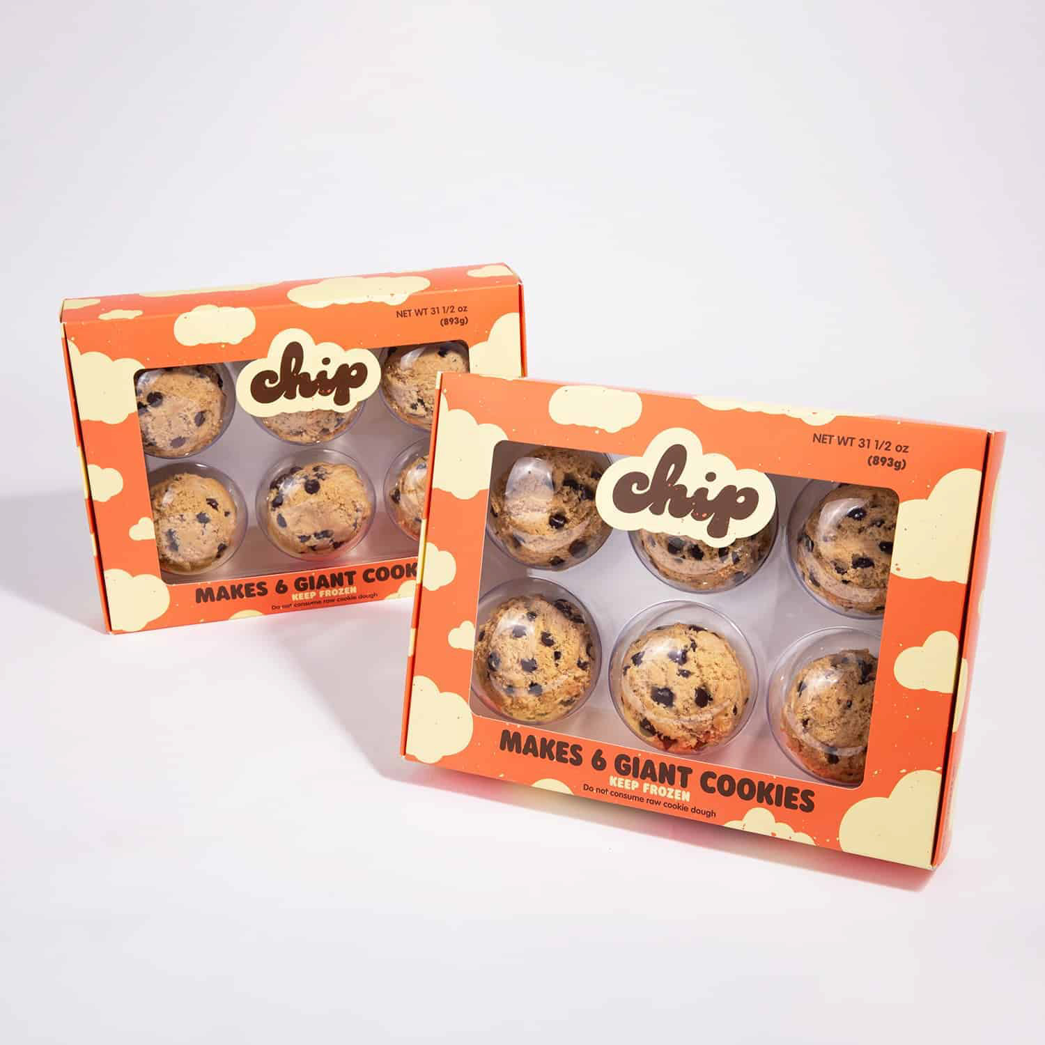
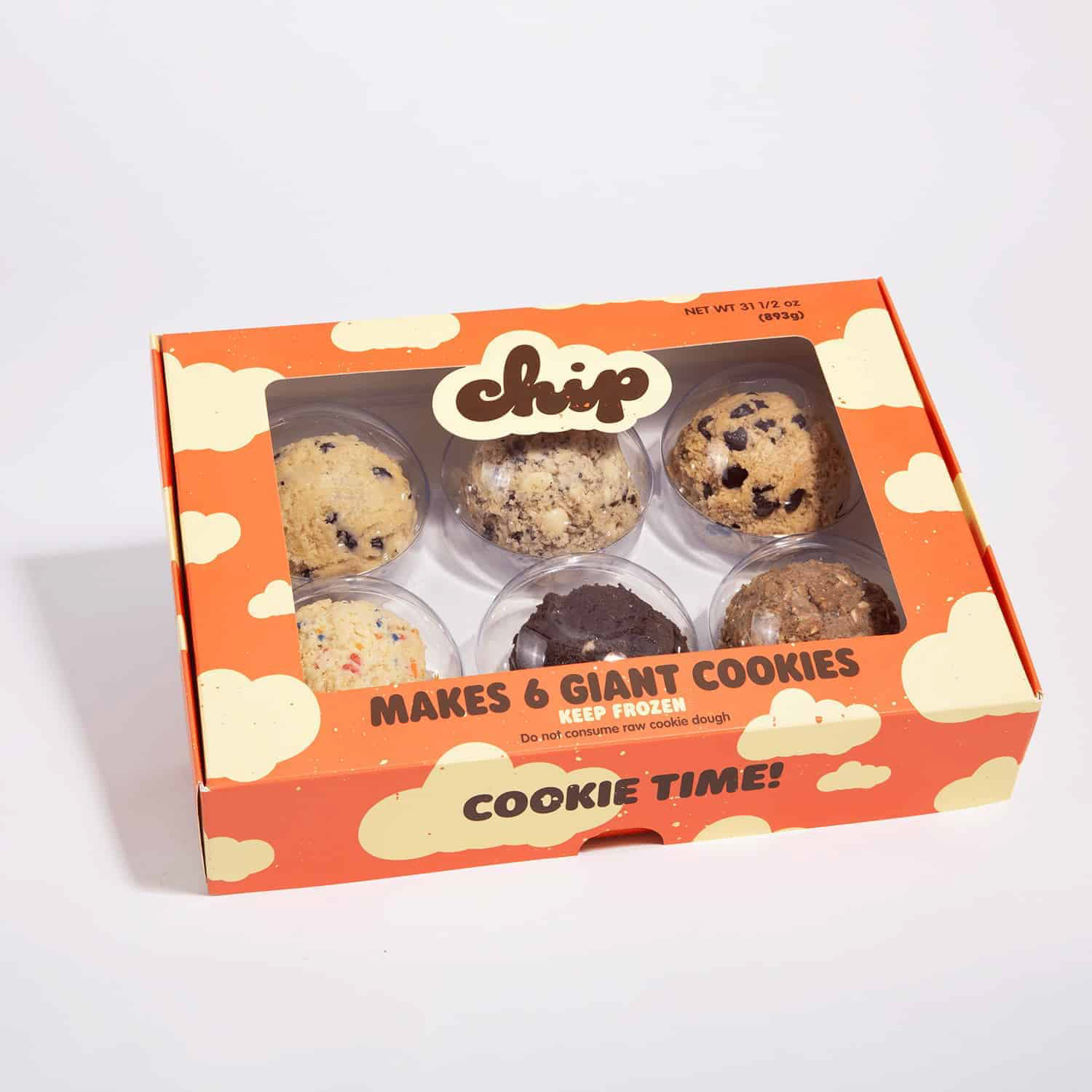
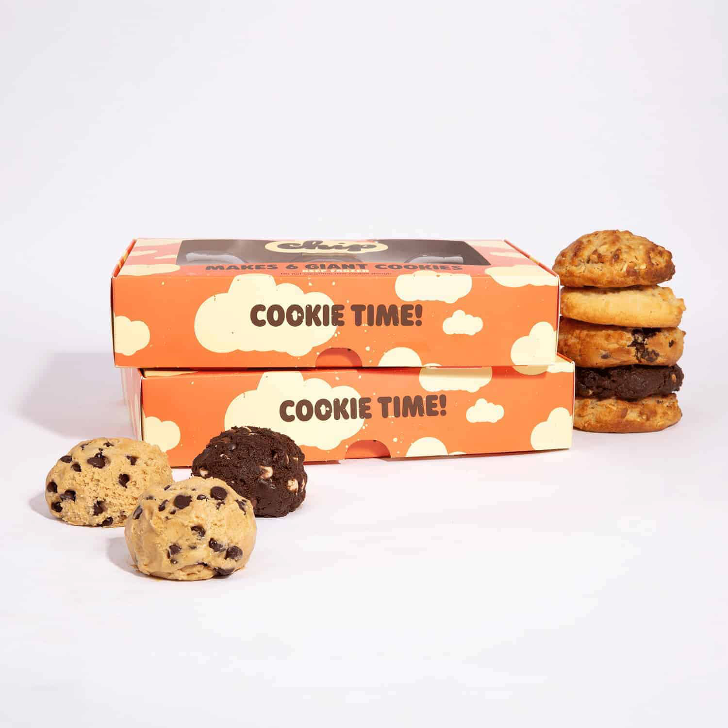
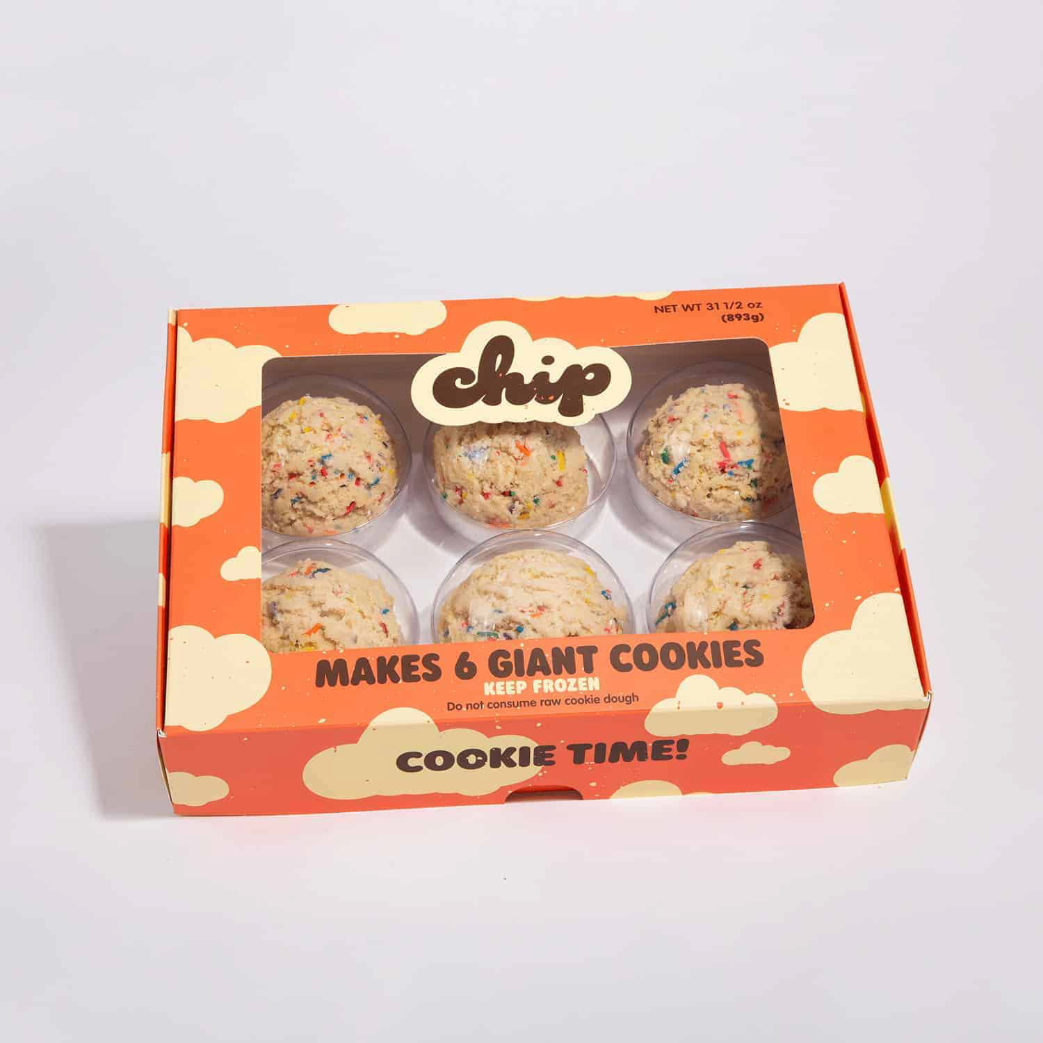
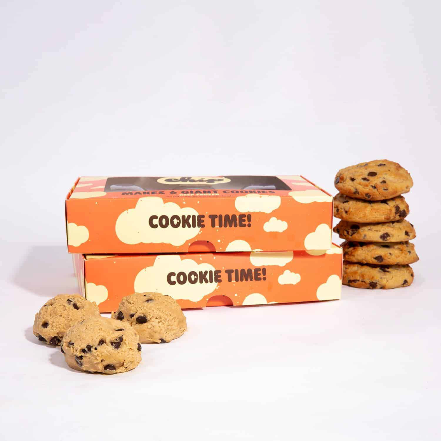
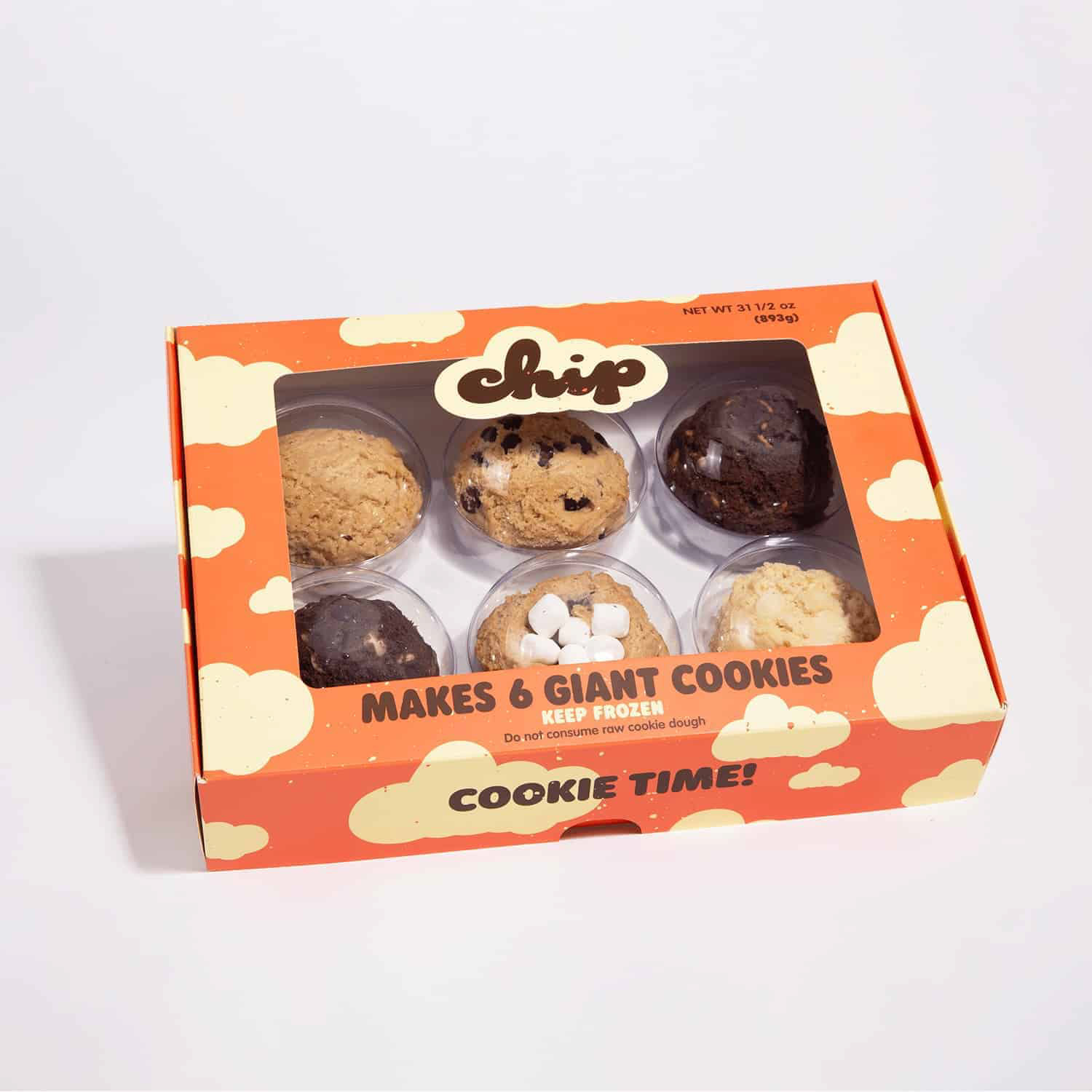
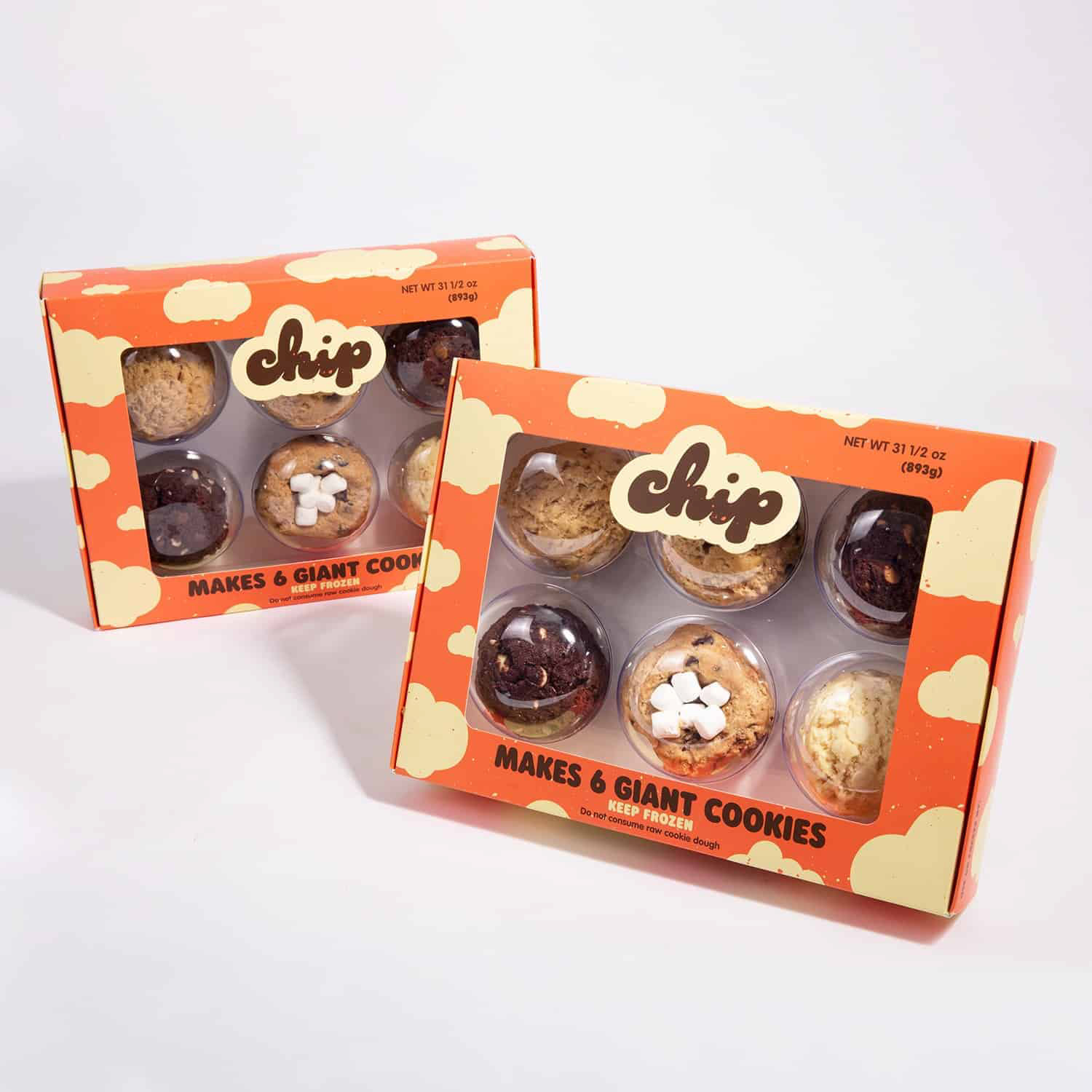
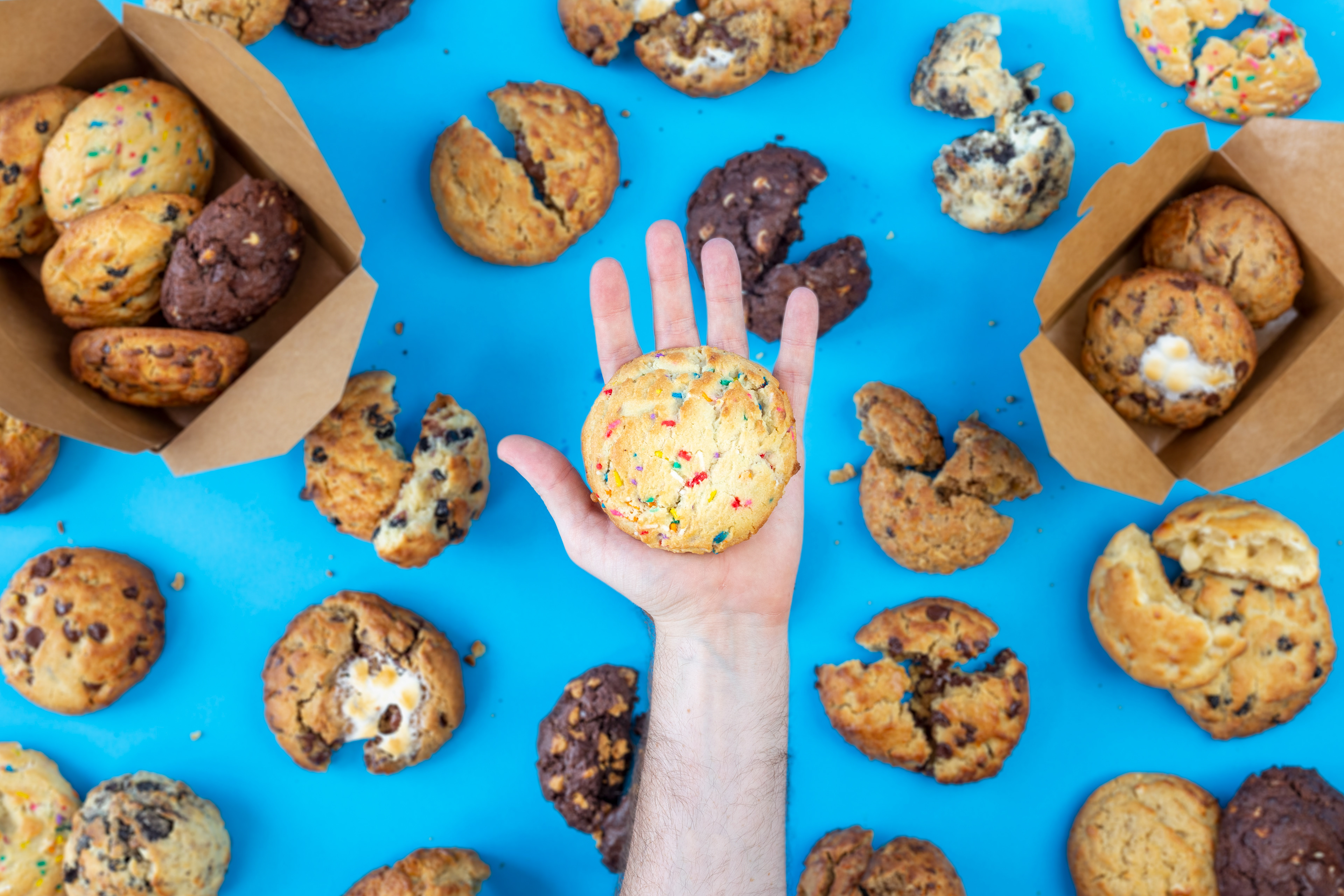
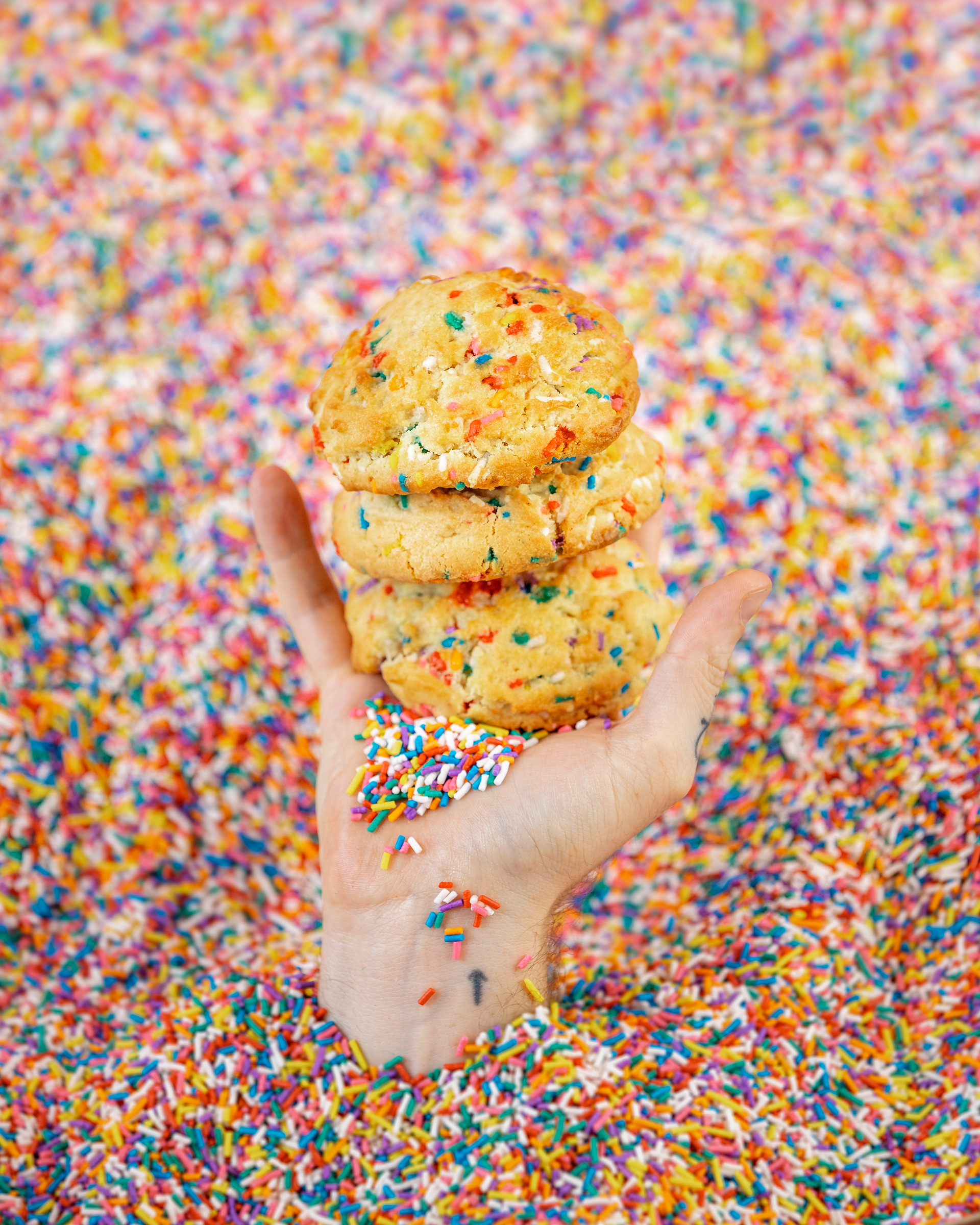
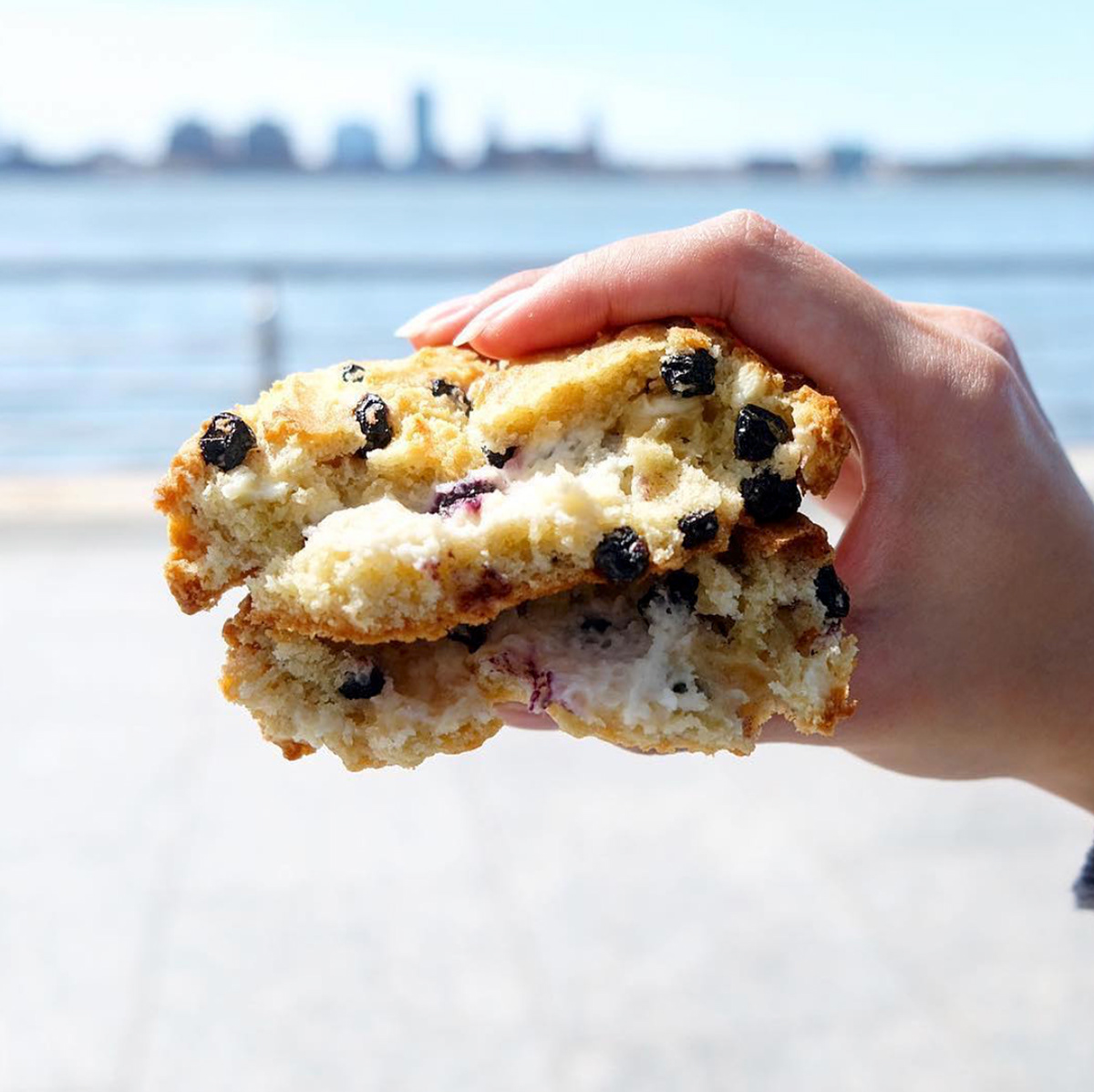
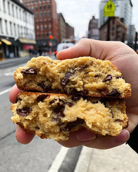
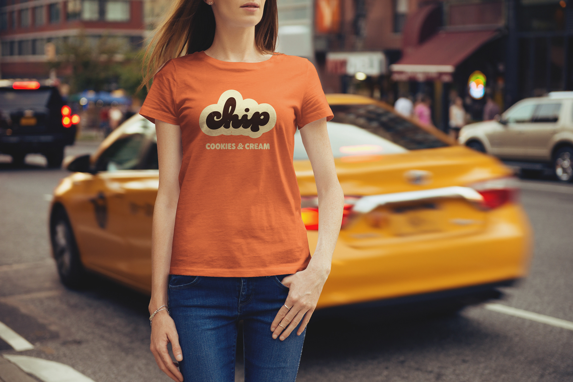
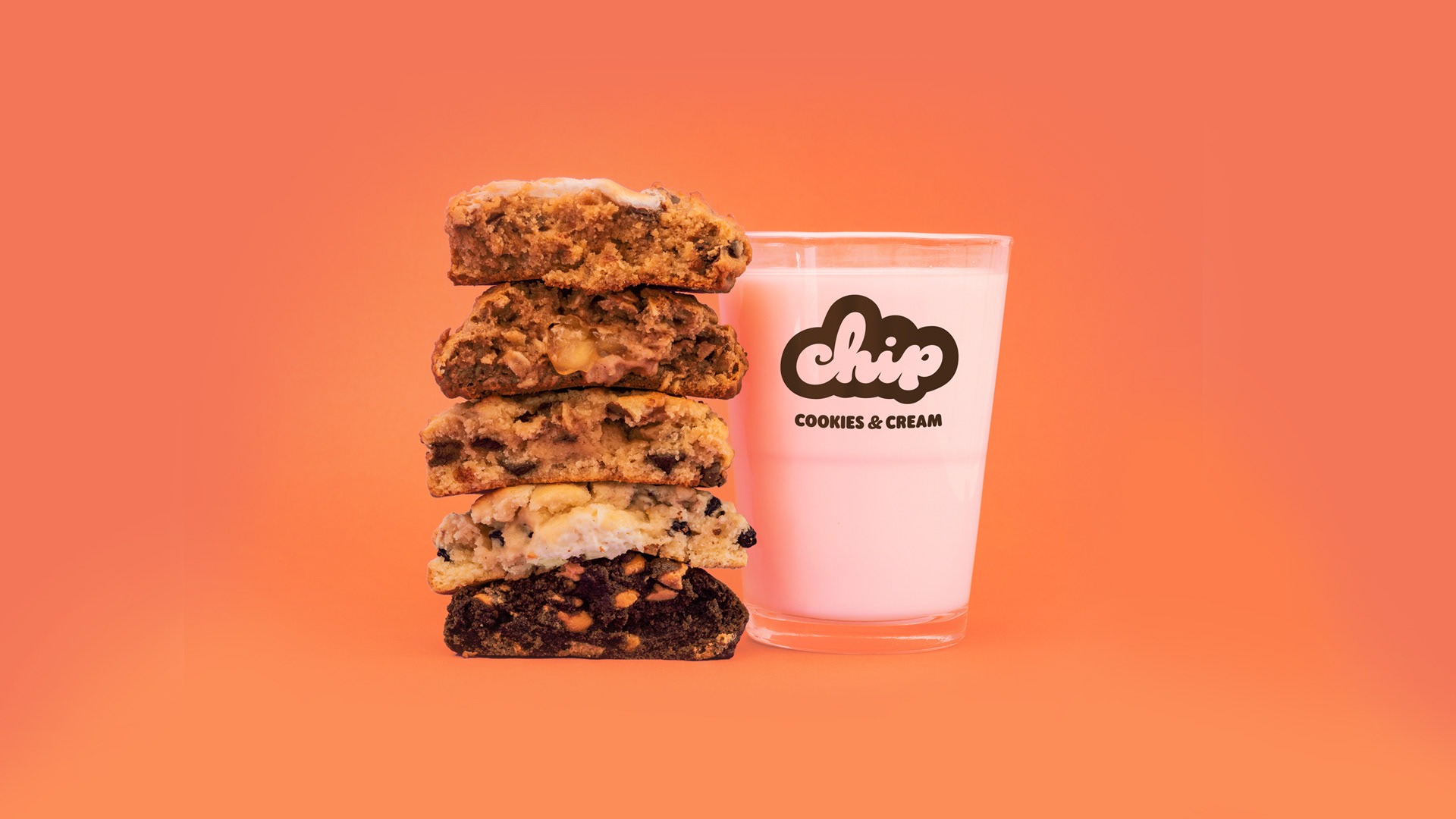
Chip NYC is a Queens-originated cookie shop known for large gooey cookies & creative flavours that led them to go viral. With their first Manhattan project on the horizon, we were tasked with rebranding them from their current homemade, aesthetic to a more exciting brand that reflected their young social-media driven audience and creative offerings. They now have 5 stores and counting located around New York City. They have just launched a delivery system of box fresh cookies that can be baked at home.
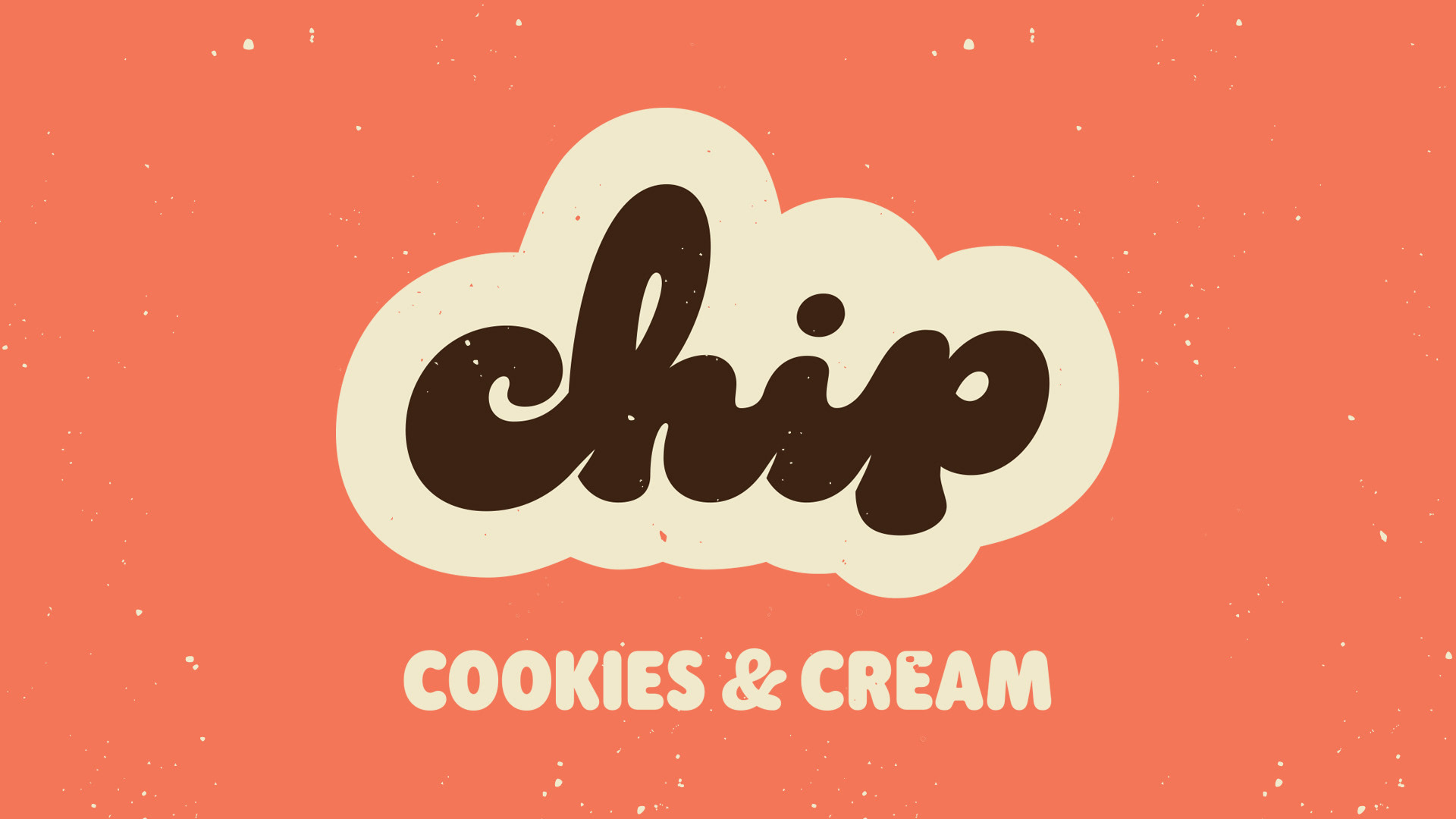
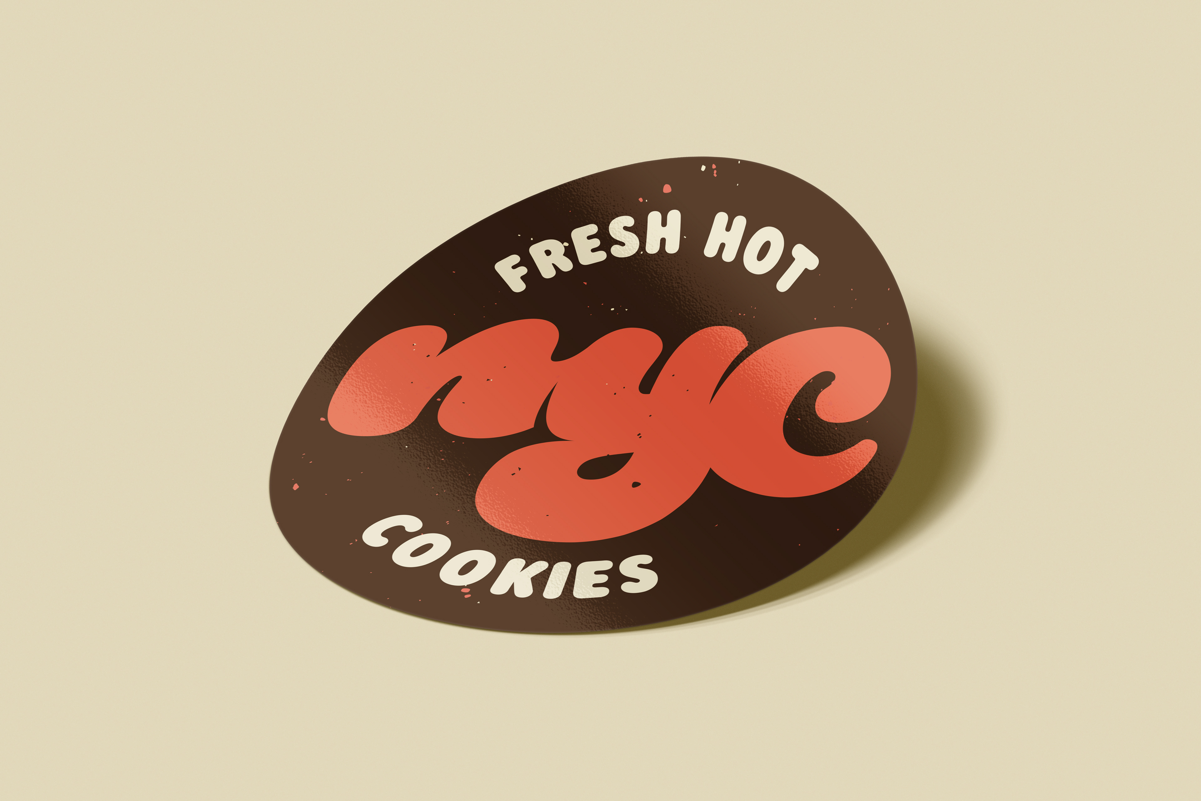
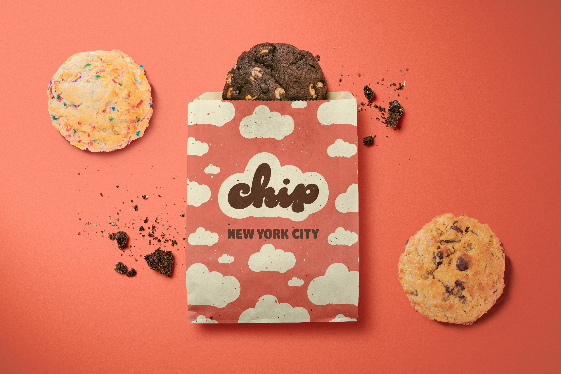
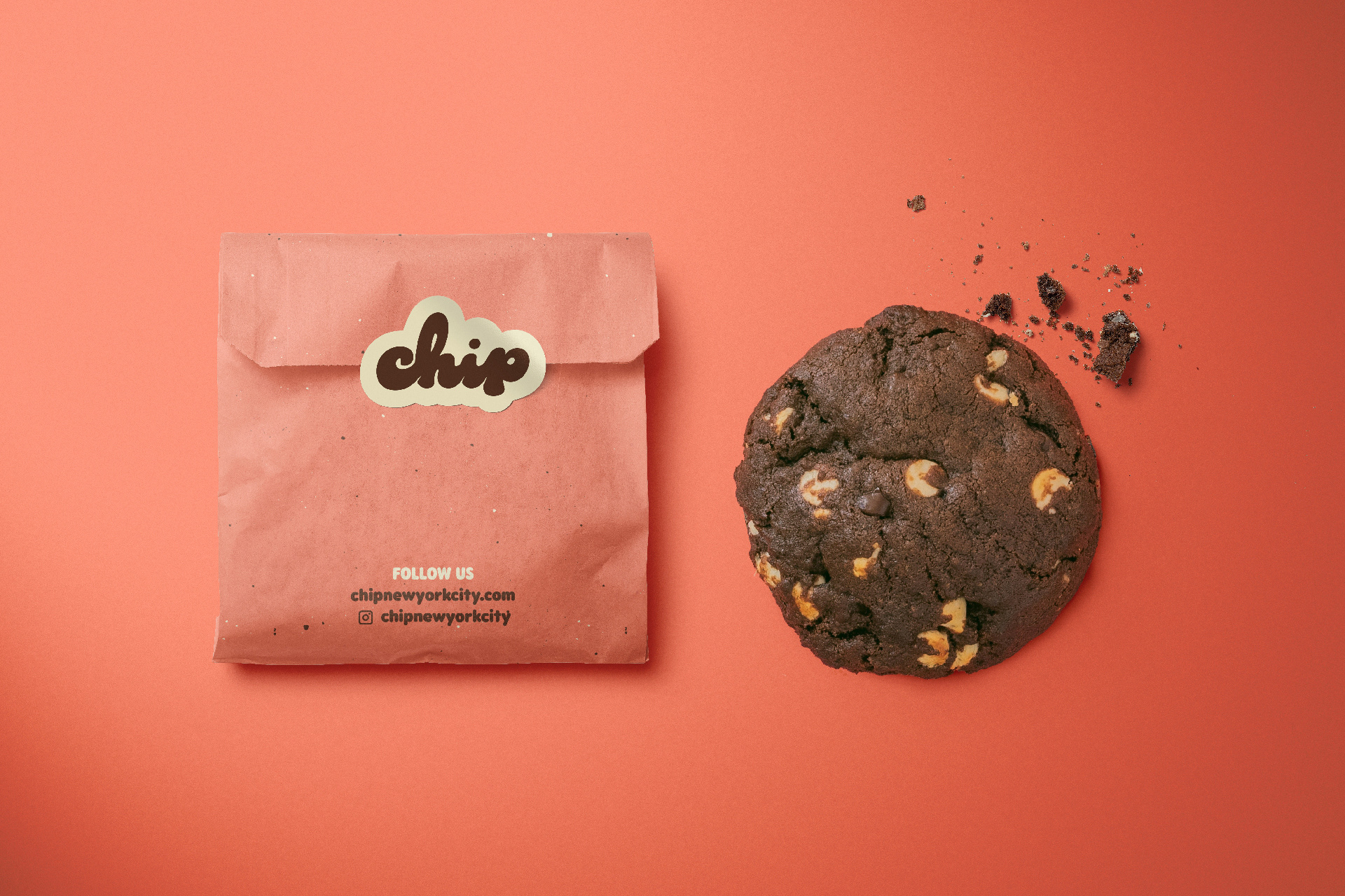
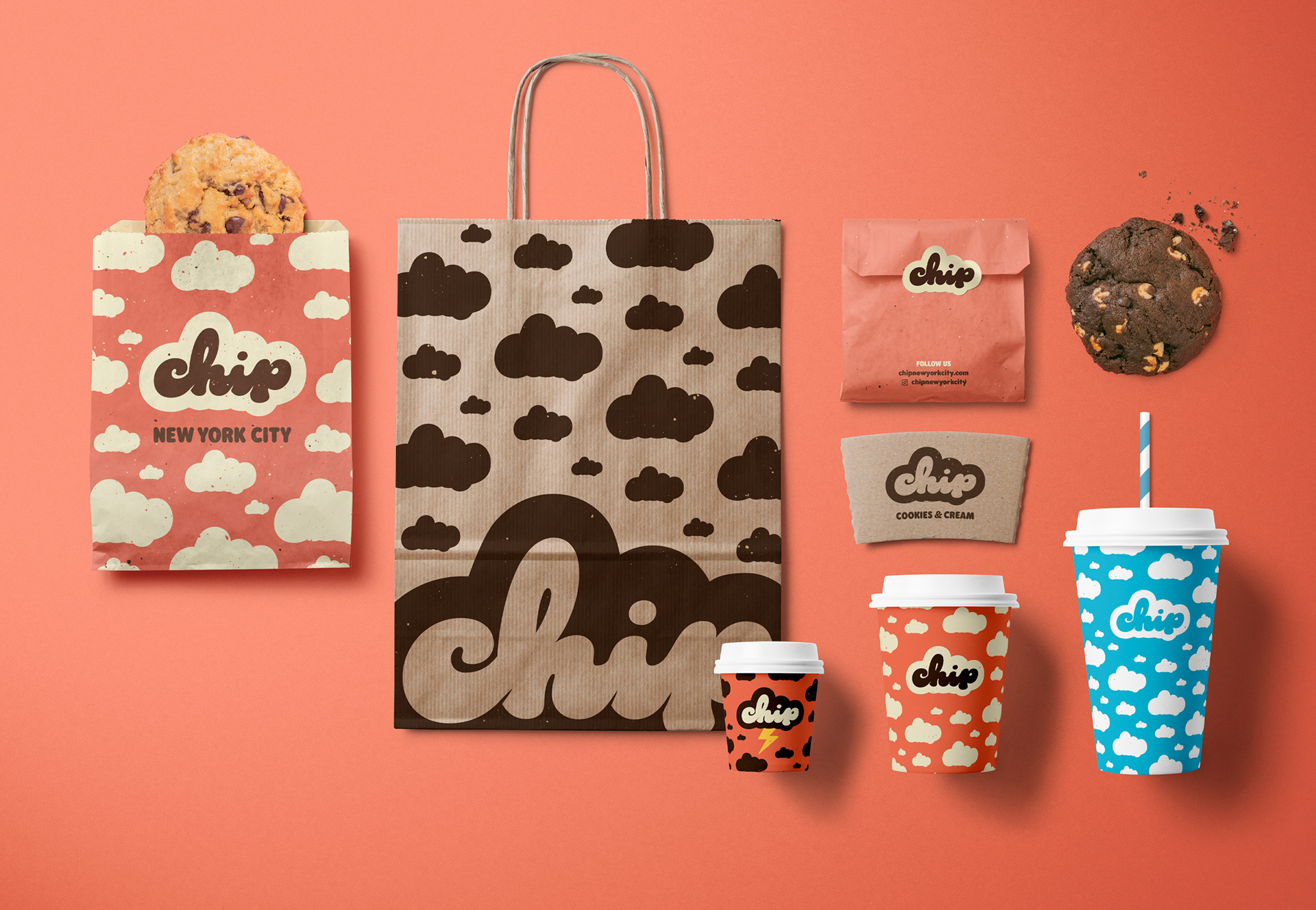
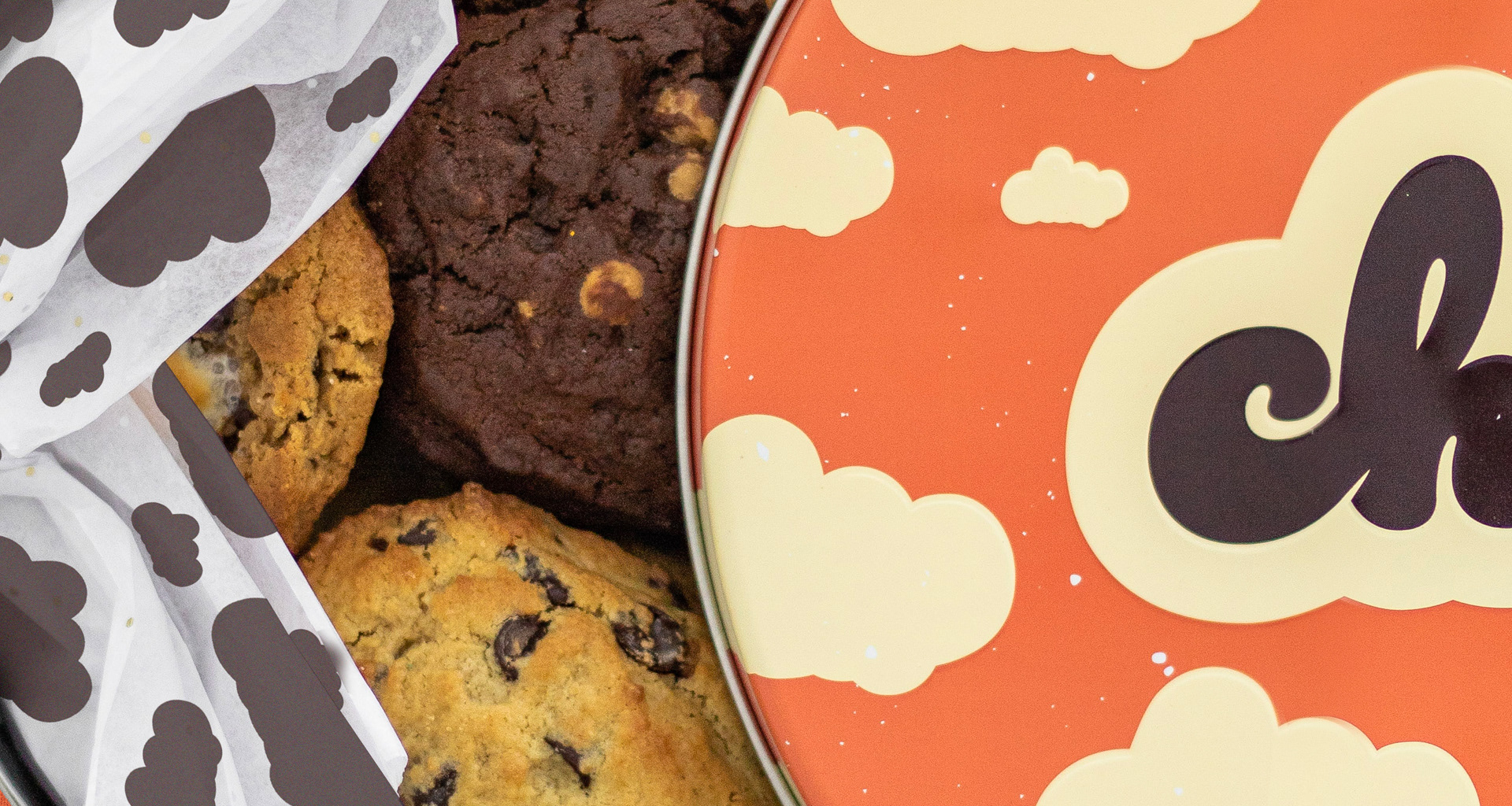
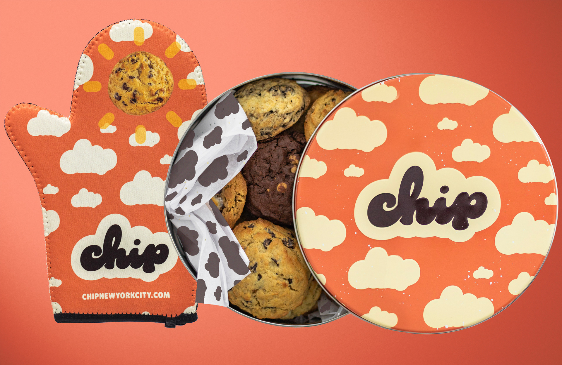
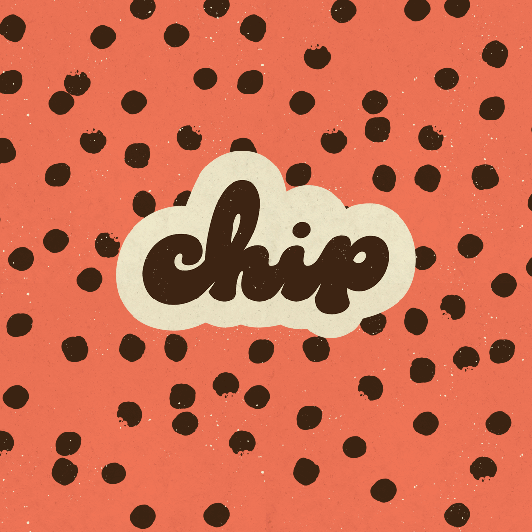
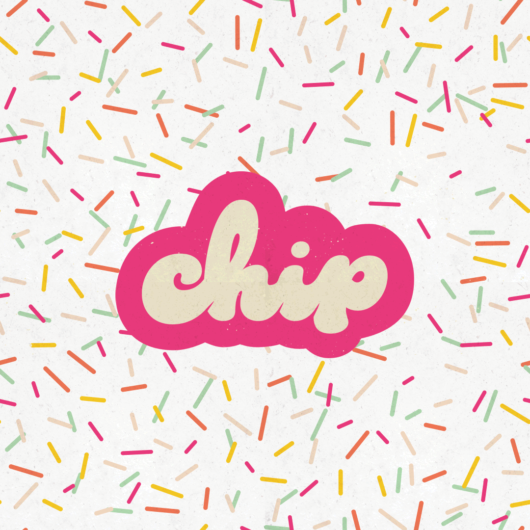
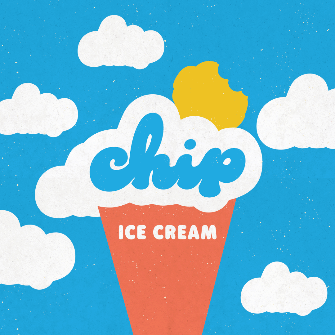
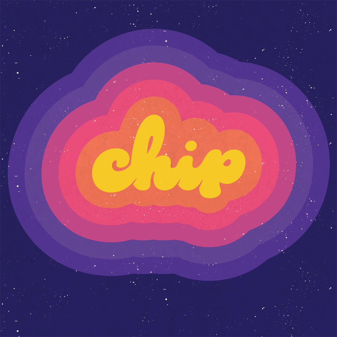
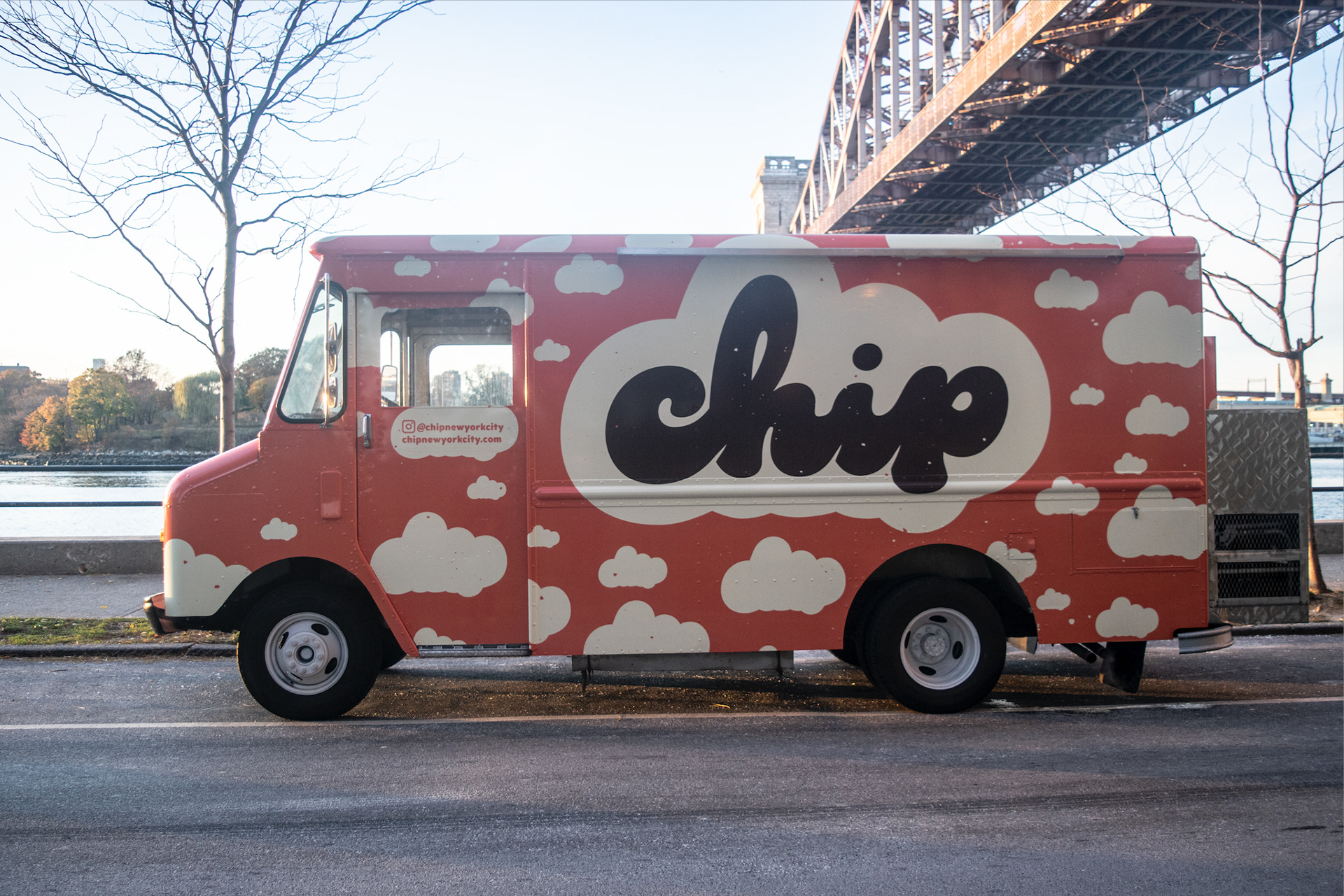
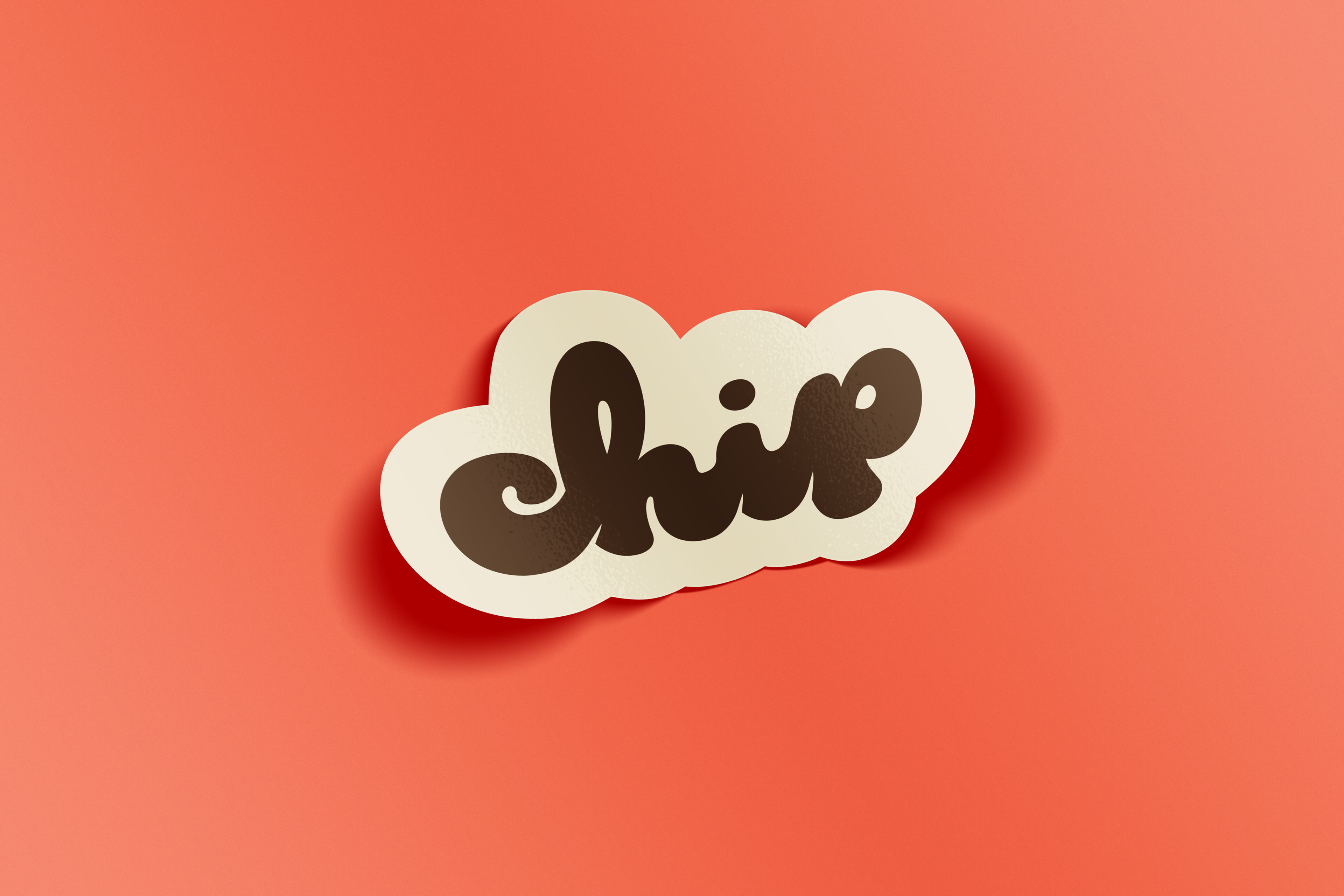
Their unique shaped gooey centered cookies were a direct influence on the logo mark design. With a vintage touch to represent a nostalgia for cookies shared by everyone from all generations.
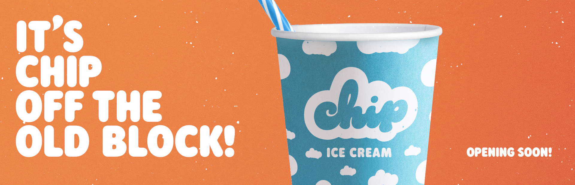
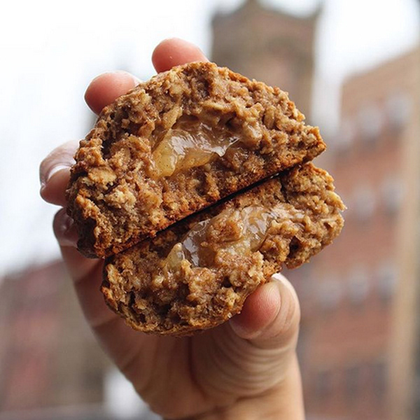
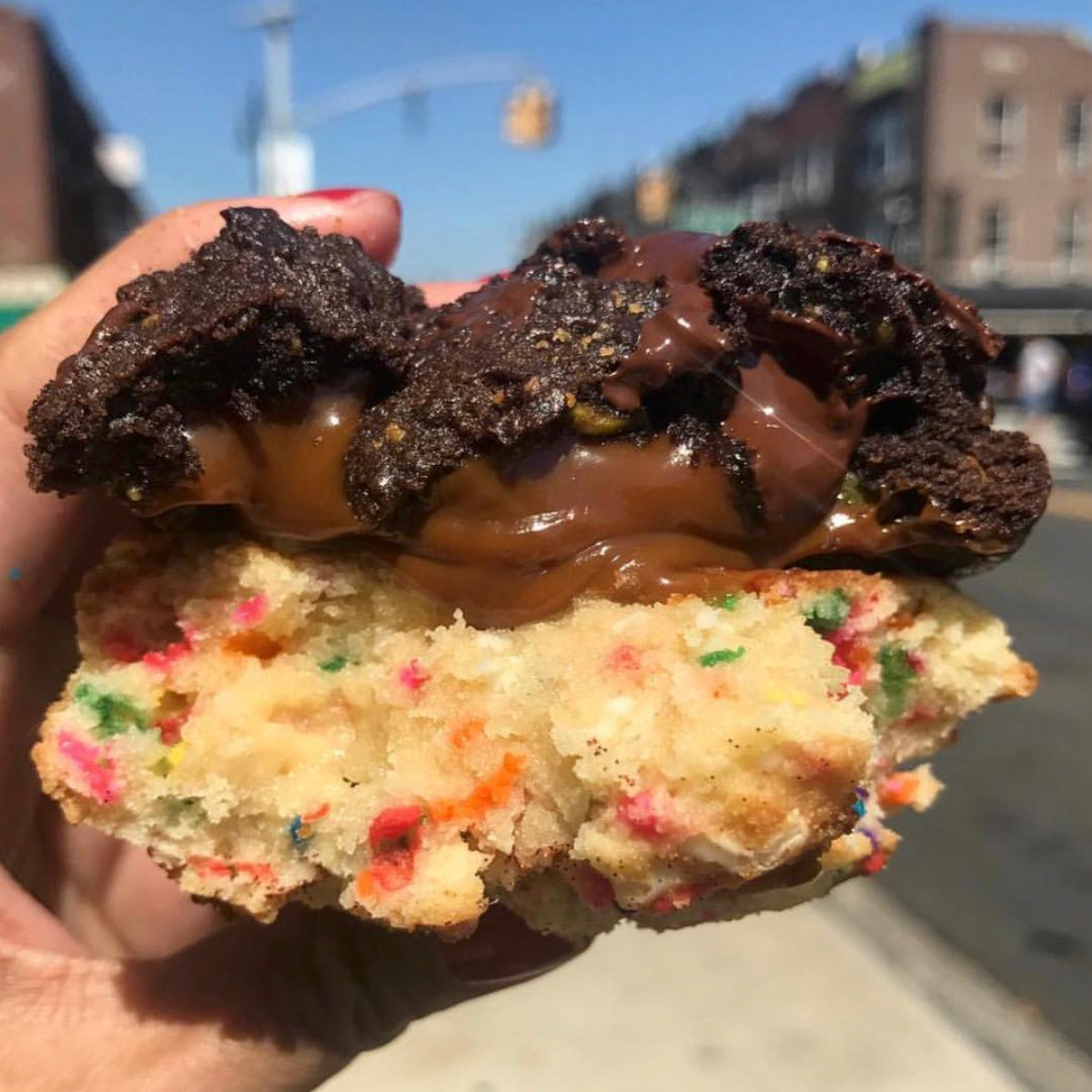
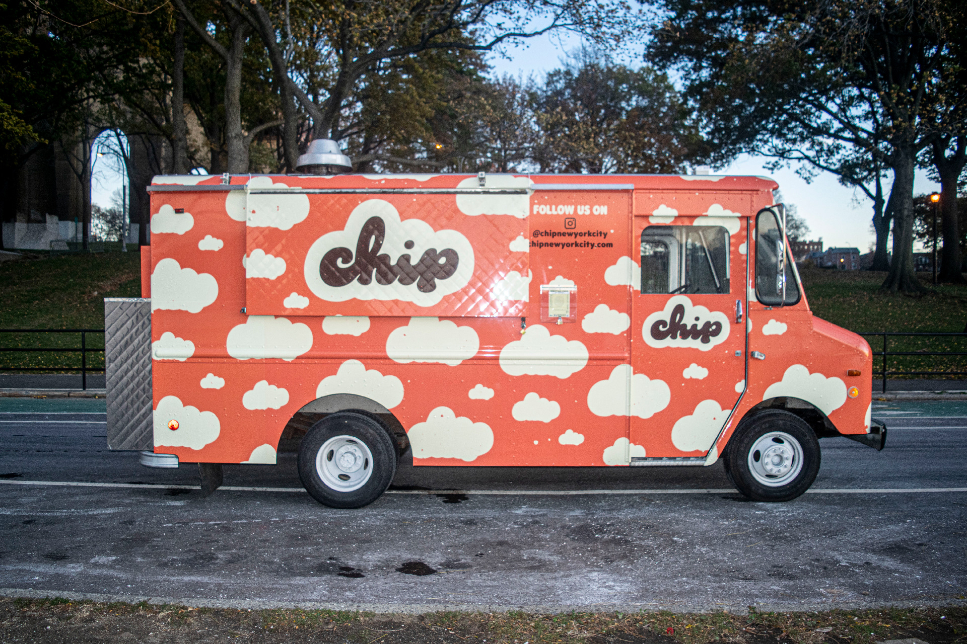
Once that was decided, we expanded on a world of Chip City Cookies, animating the illustrations of clouds to rain chocolate chips and rainbow sprinkles.
Their unique shaped gooey centered cookies were a direct influence on the logo mark design. With a vintage touch to represent a nostalgia for cookies shared by everyone from all generations.
Once that was decided, we expanded on a world of Chip City Cookies, animating the illustrations of clouds to rain chocolate chips and rainbow sprinkles.
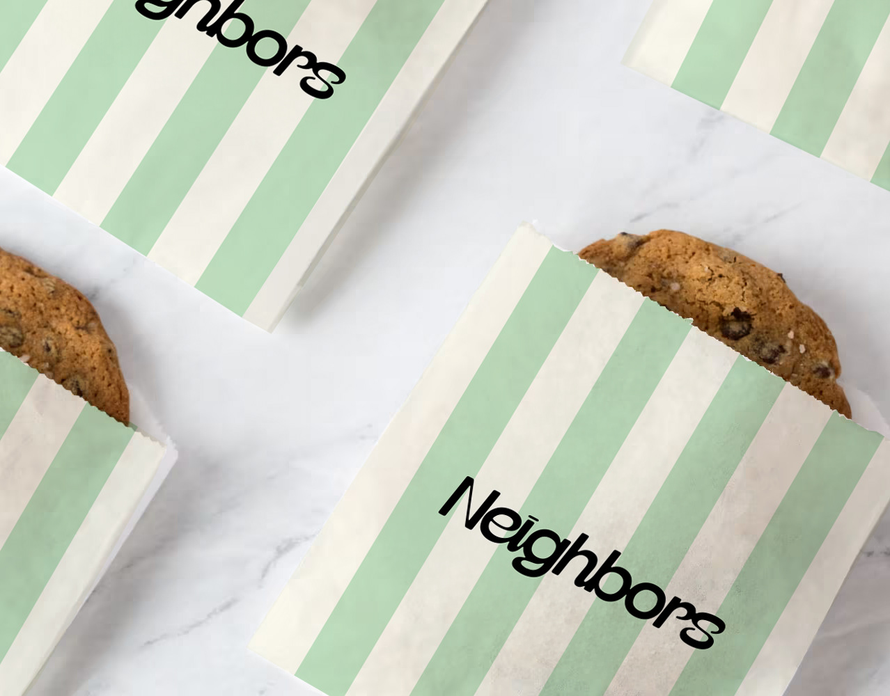
Deliverables include: restyling logo design and brand identity, signage, icon design, menu system, online content, labels, uniform apparel, merch, cookie tin and takeaway packaging. The lot!


-
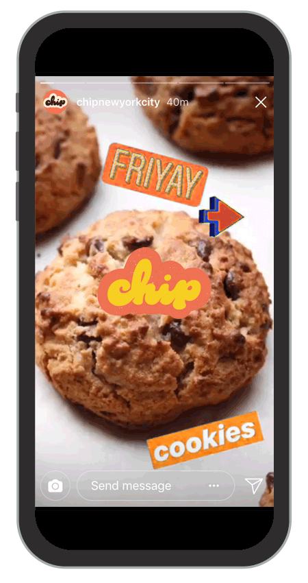
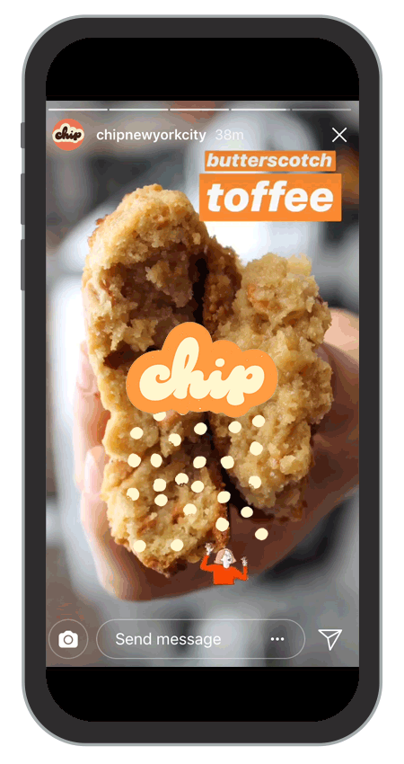
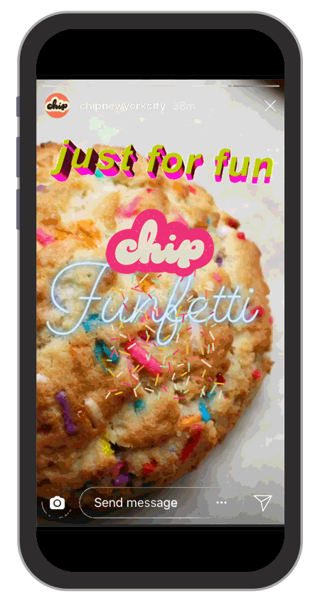
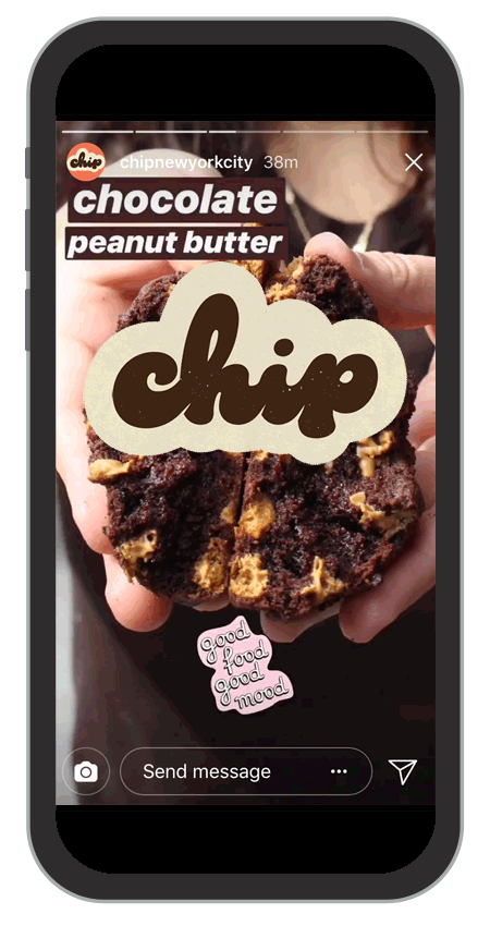
Together we worked on expanding their marketing visuals for social media and wider business development. Below are a range of animated gifs that can be found on Glify to use by Chip or the public to pimp up there Instagram stories and posts. This unique tool has been a great success with over 5 million uses this year alone.


-
Thank you. If you would like to know more about my:creative or are interested in collaborating in a new venture please visit us at Twitter / Instagram or Email
-
Credits.
Brand and design by My Creative: (UK)
Illustration and Animation: Ewan Leckie
Branding strategy with SaintUrbain
-
Feature.
Chip City Packaging featured on The Dieline:
Feature.
Chip City Packaging featured on The Dieline: