
-
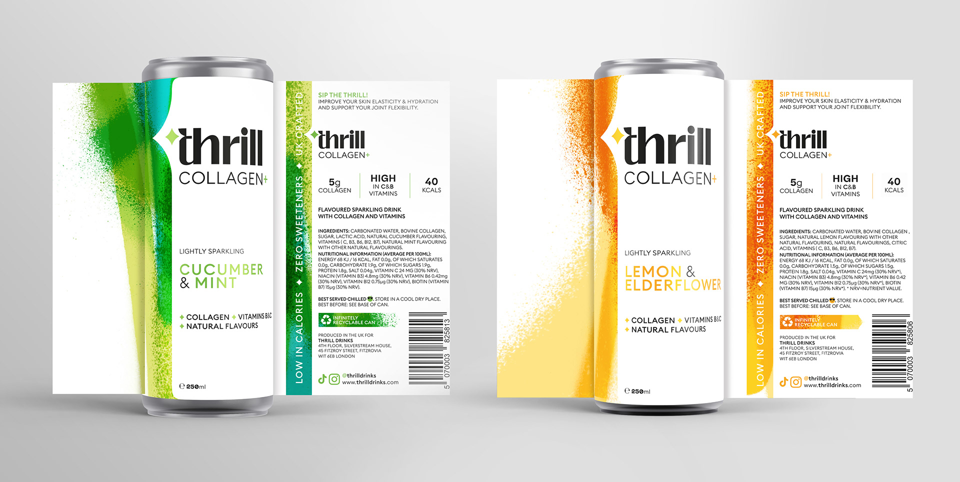
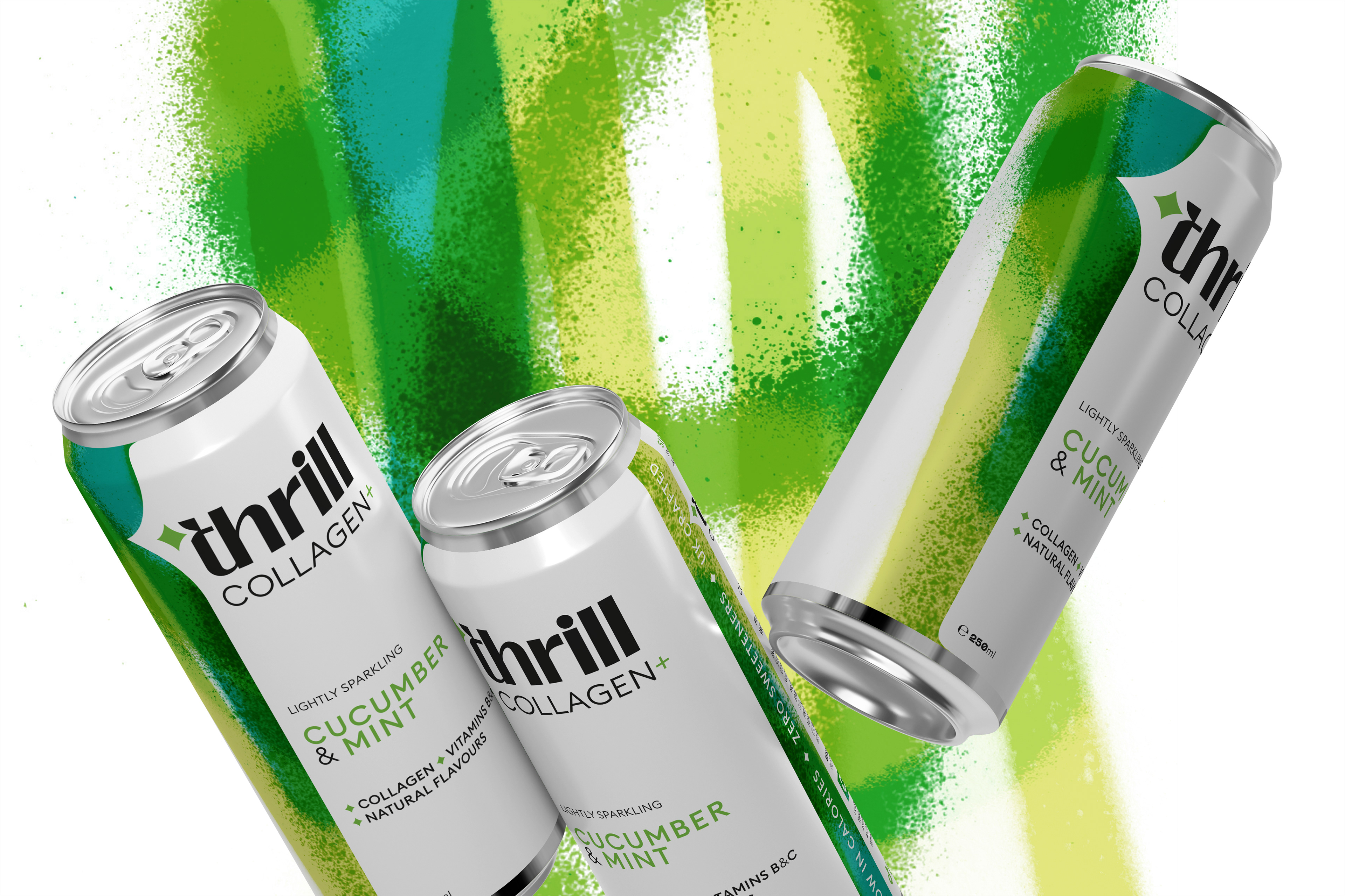
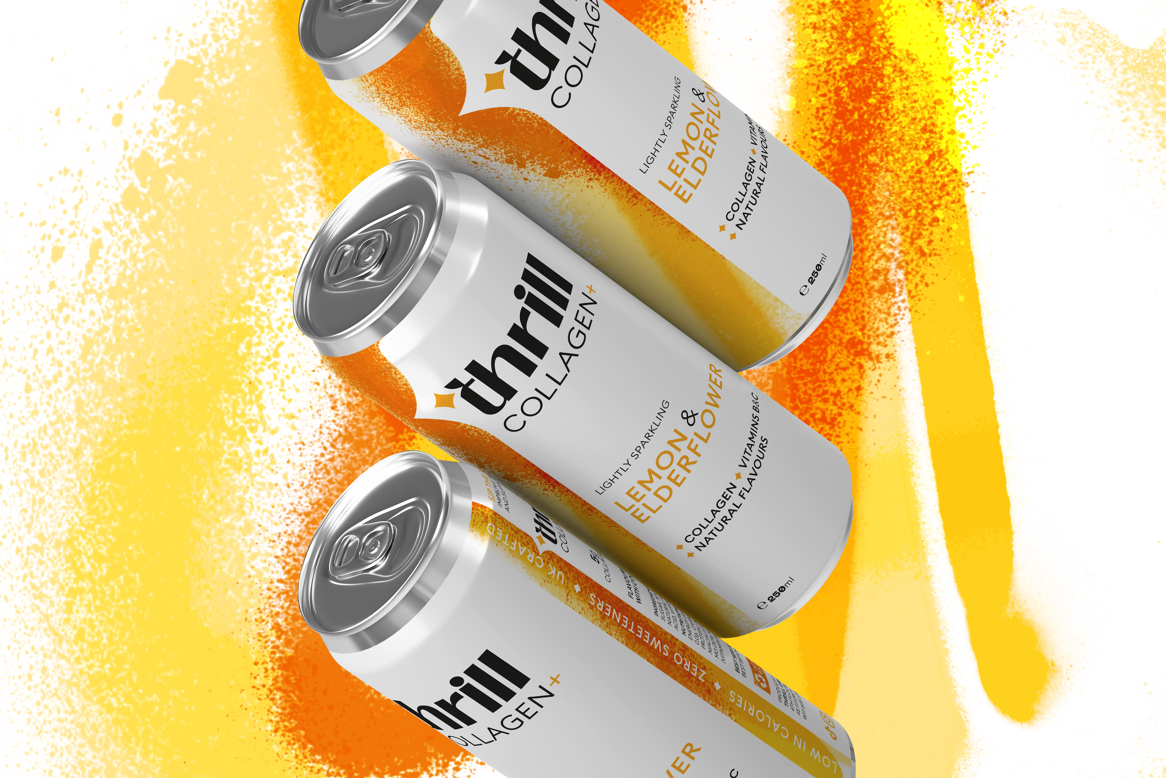
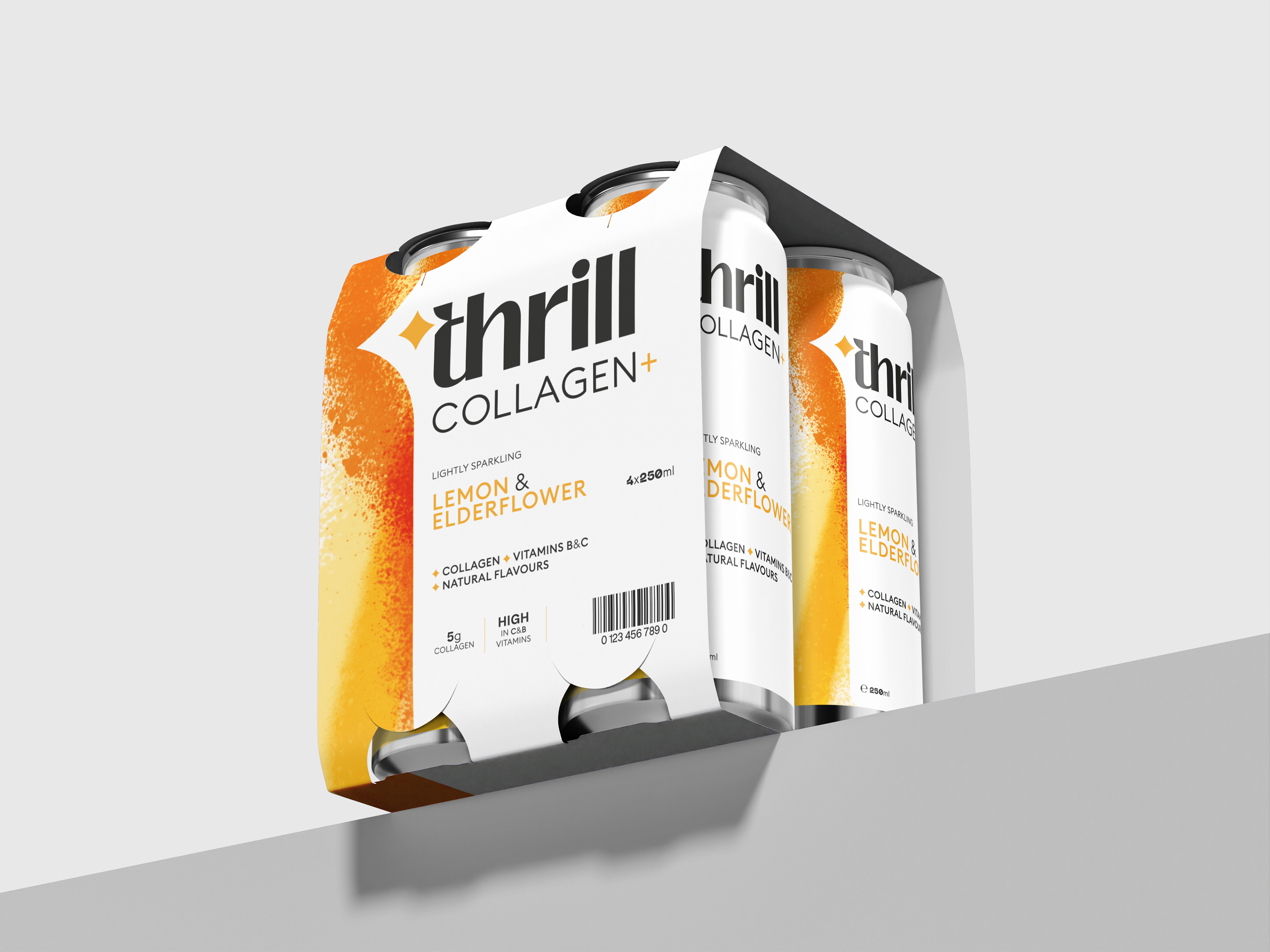
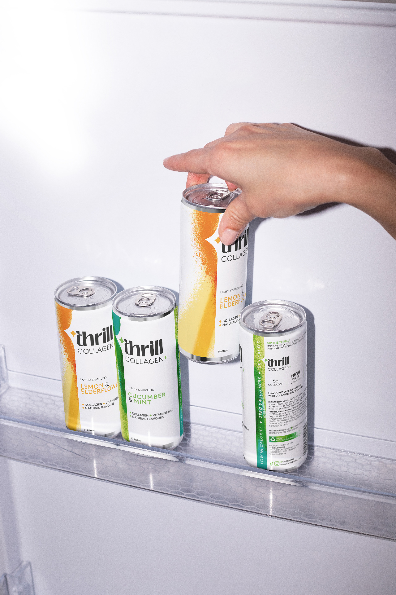
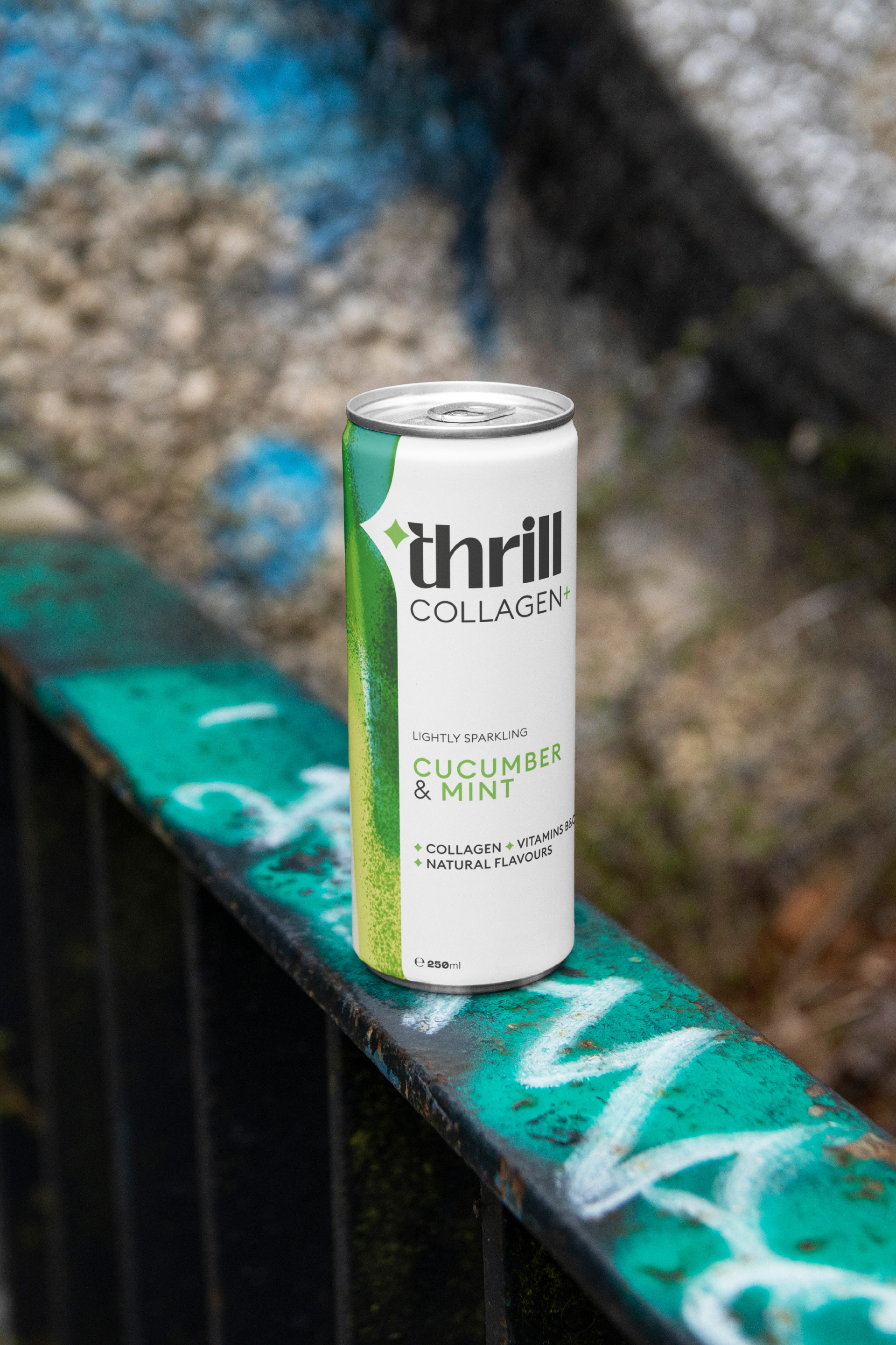
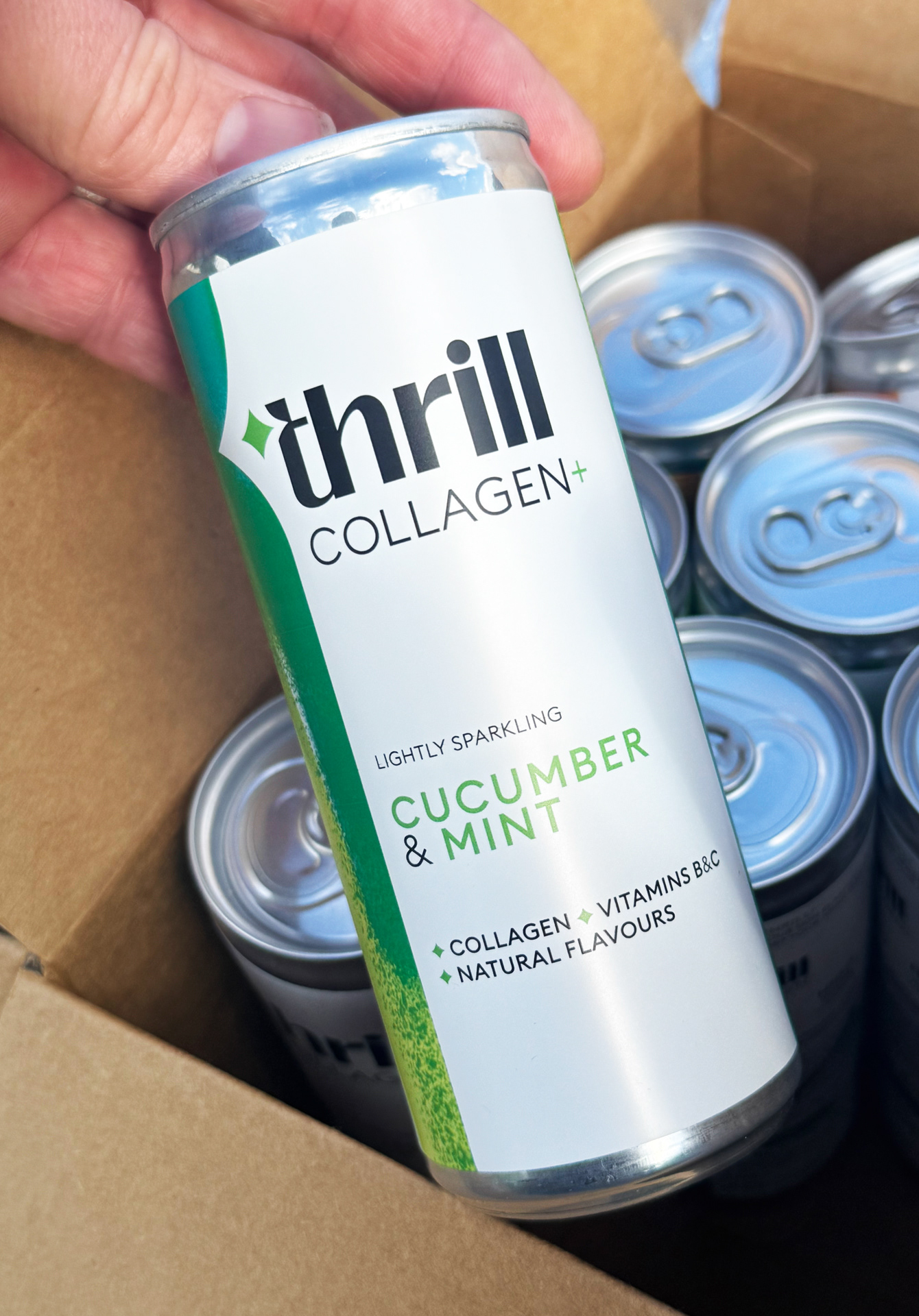
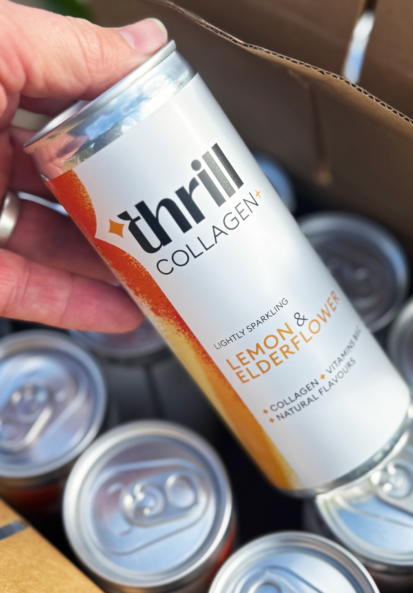
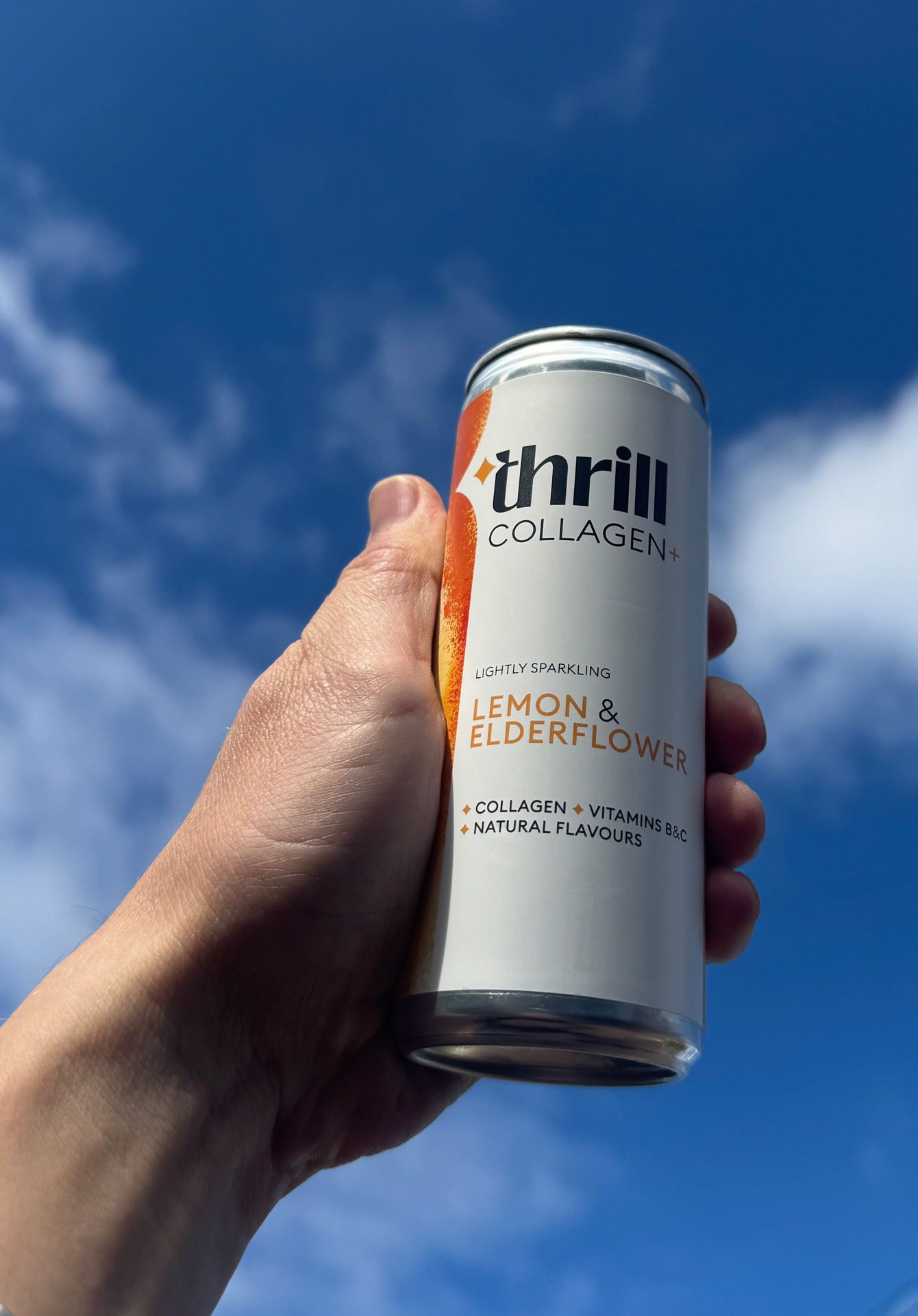
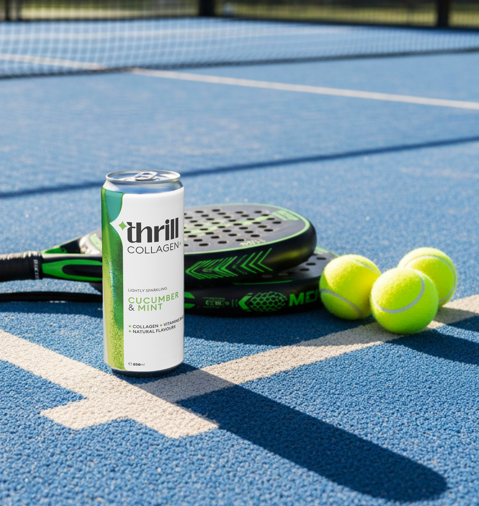
Thrill Collagen + is a game-changer to those chalky, hard-to-mix formulas that make you dread your daily supplement routine. A natural, efficient, deliciously refreshing and conveniently packaged 250ml drink designed to fit effortlessly into a busy life, to let you focus on the essentials!
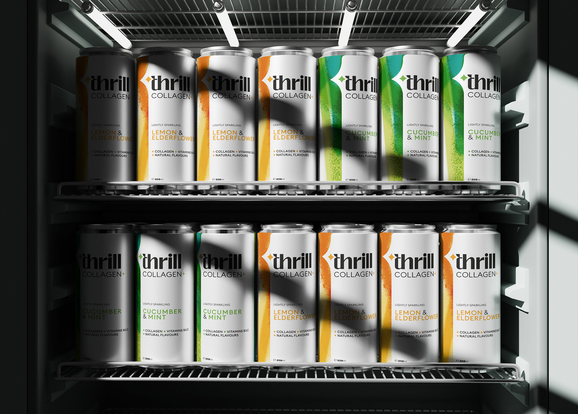
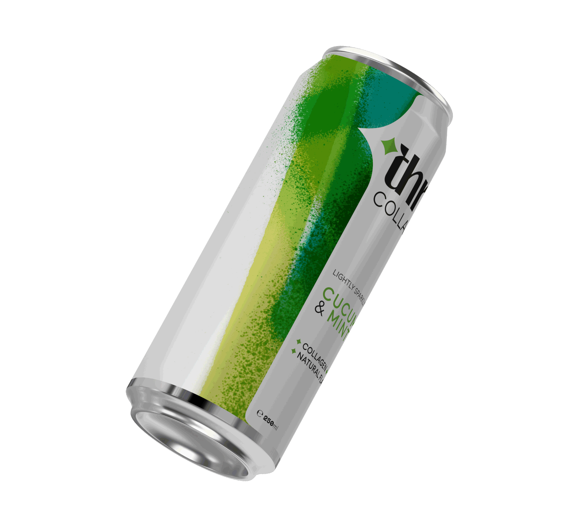
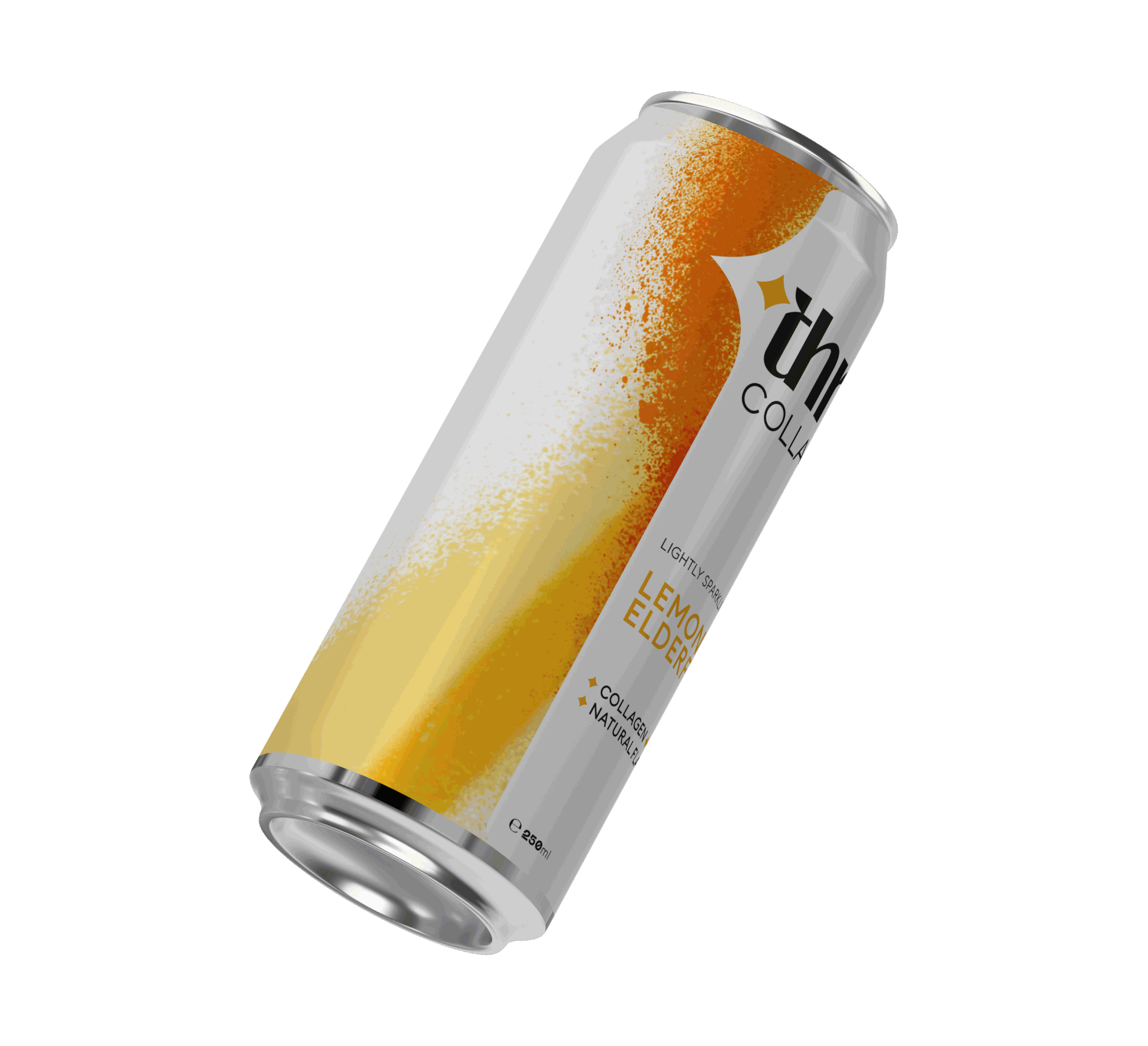
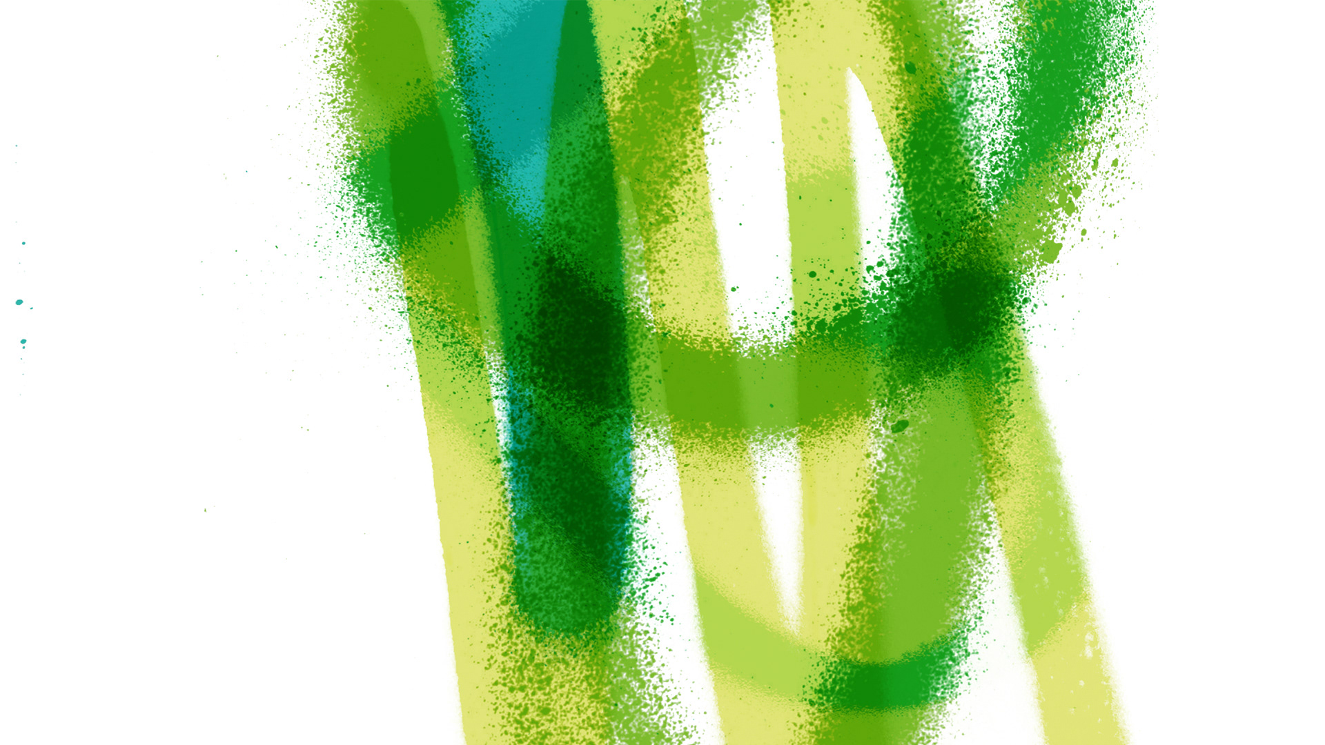
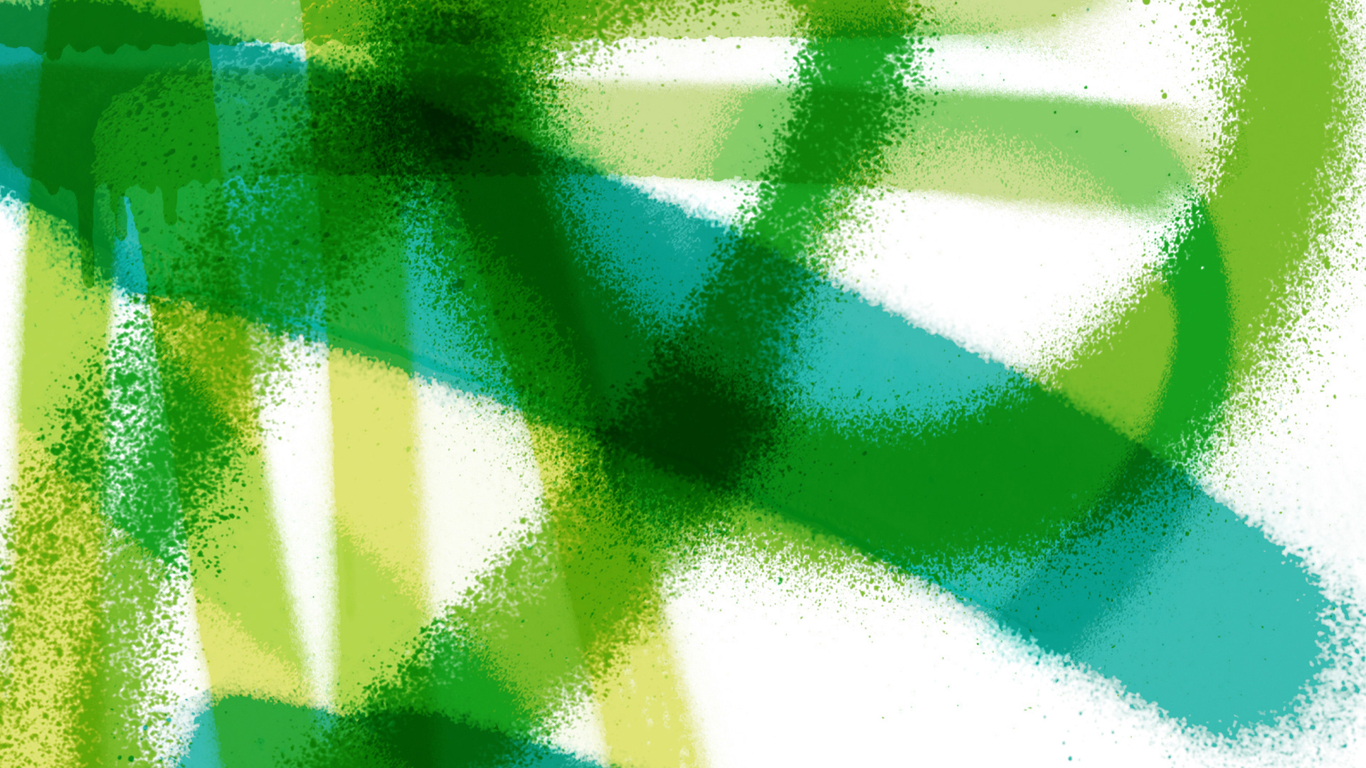
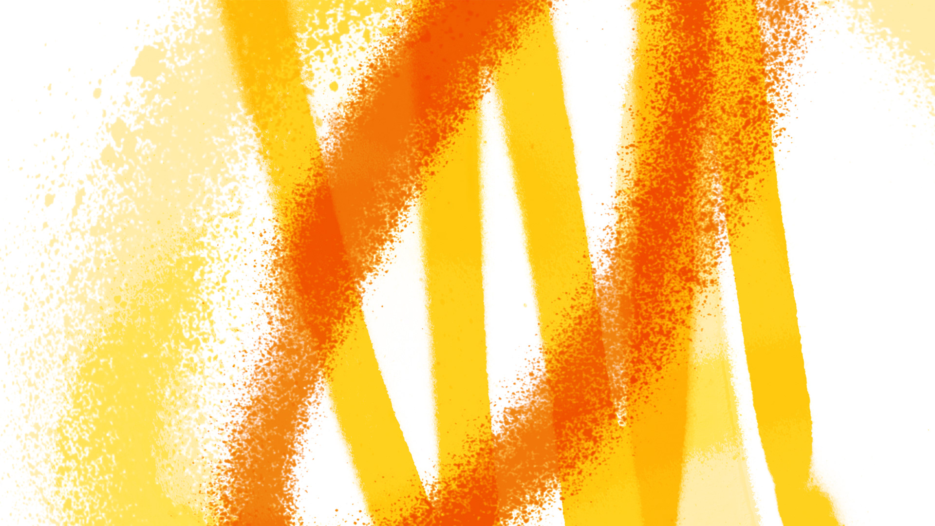
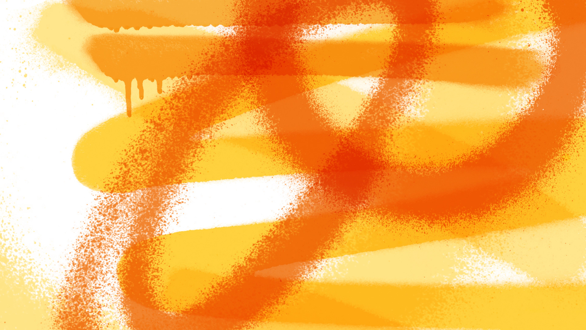
My: created a simple and light can design to maximise shelf standout and quickly associate it with health. The flash of colour, made with quick strokes of spray-painted layers, gives this refreshing brand an energetic feel.
Deliverables include Logo design and brand identity, label, packaging design, online content, animation, typography, labels, website and merchandise.
Laure Puissilieux: Founder of Thrill Drinks
"
I knew we needed a standout design. The can would be the first touchpoint between Thrill and the world. I contacted agency after agency, and finally found MyCreative. I’ll never forget when they said, “You’re under our budget, but we believe in this project. And we’ve always wanted to design a can.”
Designing the can was one of the most meaningful — and vulnerable — steps in bringing Thrill to life. Handing over your brand vision is never easy, but our design partners understood it right away. The result is a look that’s artistic yet minimal, vibrant yet clean — striking a perfect balance between wellness cues and the fresh, modern aesthetic of FMCG shelves.
The can’s soft white space feels fresh and pure, while the bold splash of colour represents flavour, vitality, and movement — echoing the dynamic benefits of collagen in your body.
And at the heart of the logo, the small spark isn’t just decorative. It’s a subtle nod to what Thrill is all about:
— Like the pores of the skin, it reflects beauty from within.
— Like the pivot point of a joint, it symbolises flexibility and strength.
— Like the pores of the skin, it reflects beauty from within.
— Like the pivot point of a joint, it symbolises flexibility and strength.
"

-
Available from: Thrill Drinks
Kickstarter: Back Thrill
-
Thank you.
If you would like to know more about My Creative or are interested in collaborating on a new venture, please visit us at Twitter / Instagram / Email or our Contact Form