
-
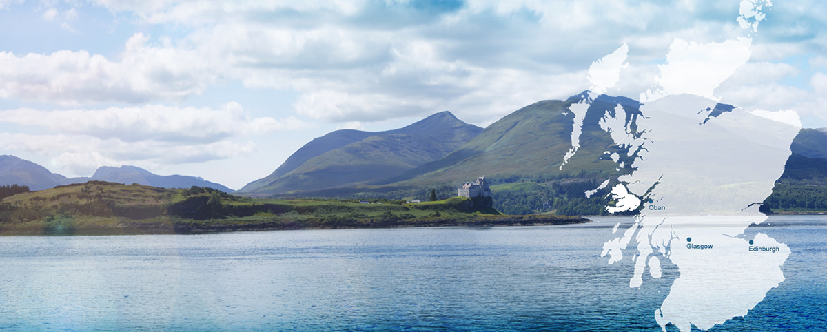
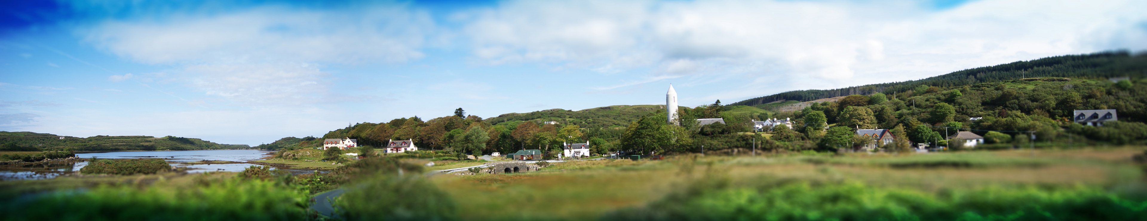
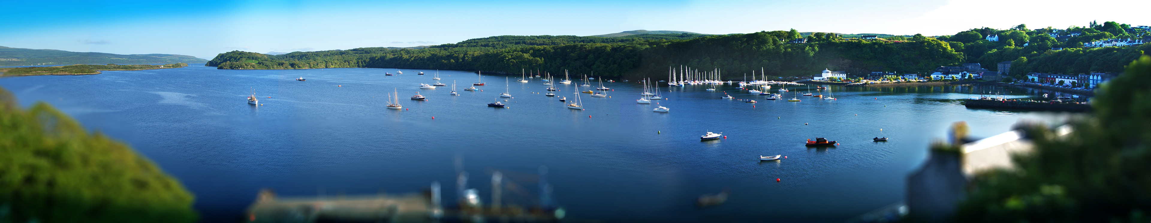
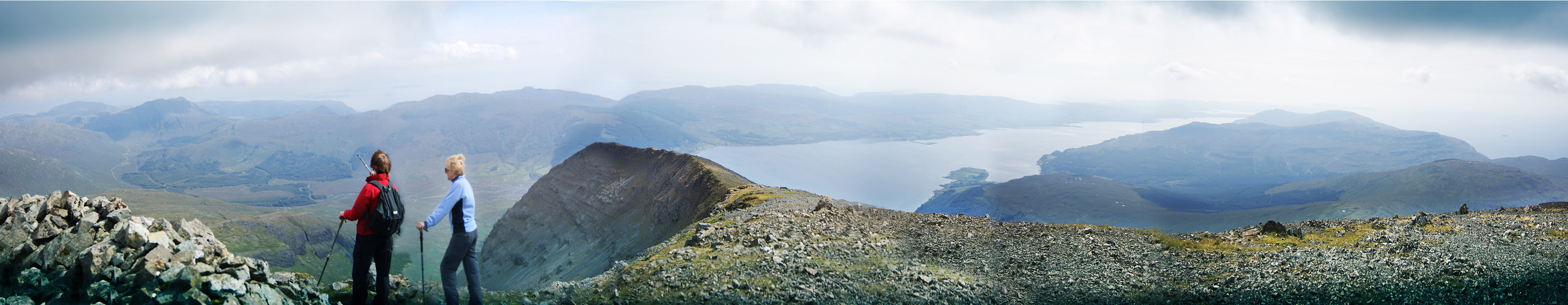
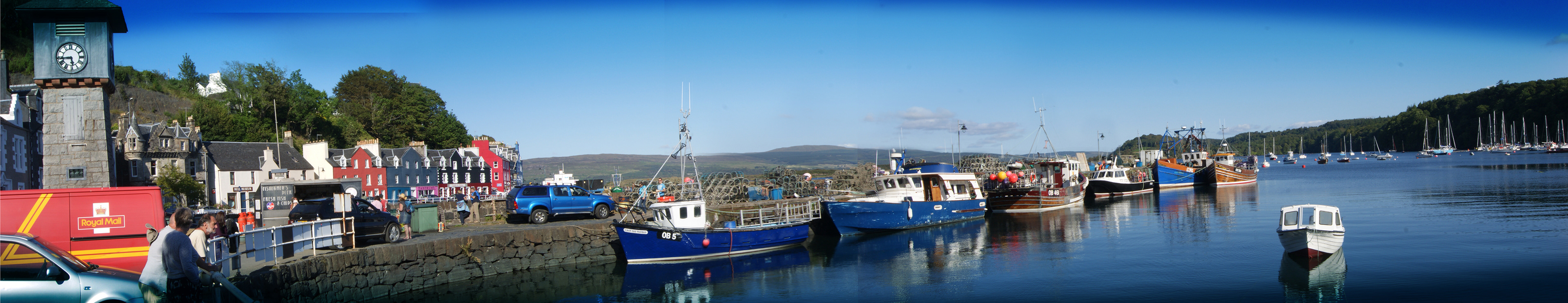
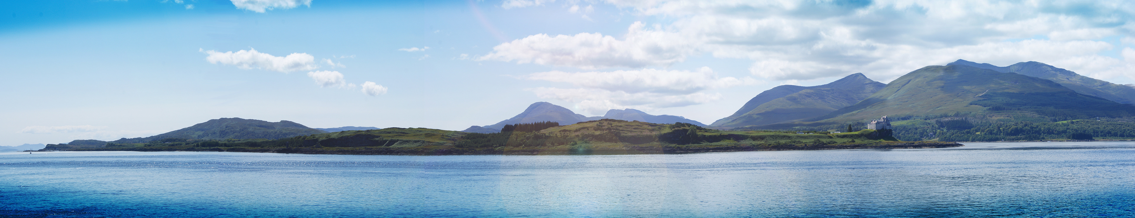
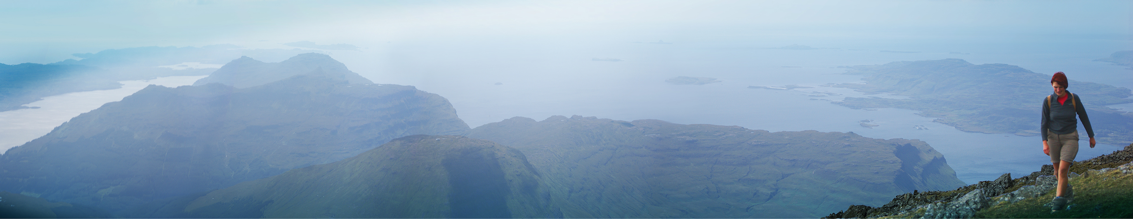
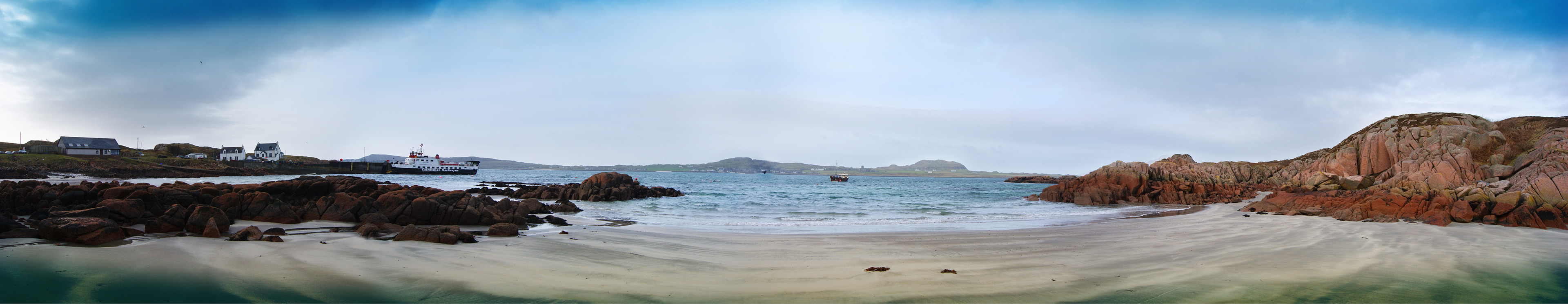
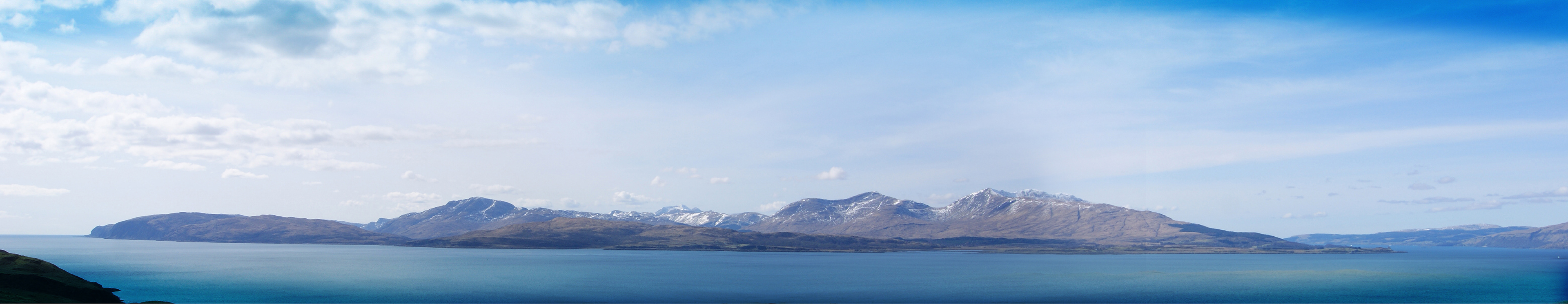
Mull & Iona are neighboring islands situated on the stunning west coast of Scotland.
A group was formed to showcase and promote their area for tourists and local residents. The islands have long been desirable destinations for homemakers and tourists alike. Mull and Iona wished to build on this and promote their area to increase visitor numbers and awareness, while showcasing the local luxuries to a bigger audience.
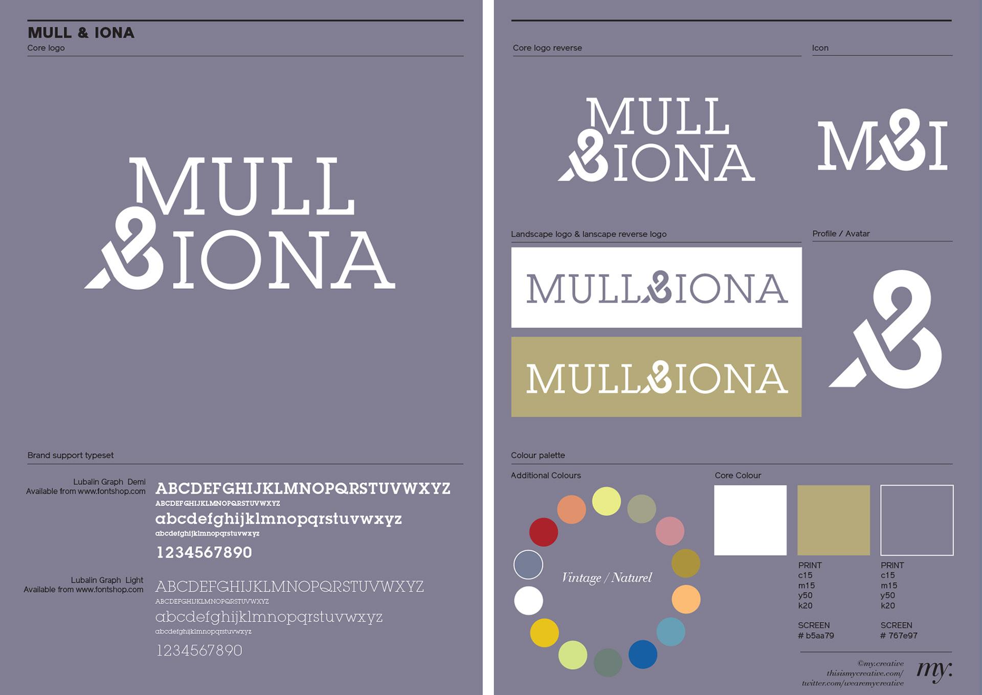
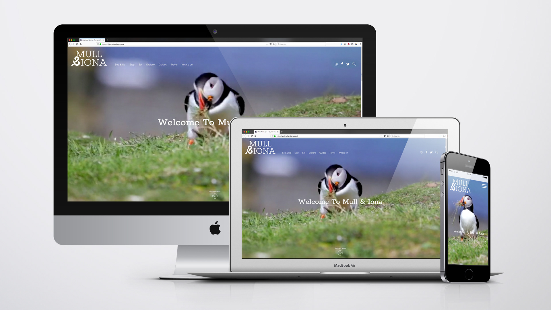
From a series of research workshops we defined and conceived the brand values, tagline, identity system, positioning and photography.
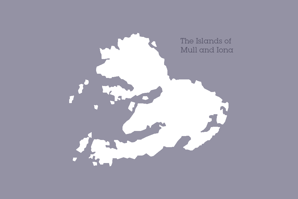
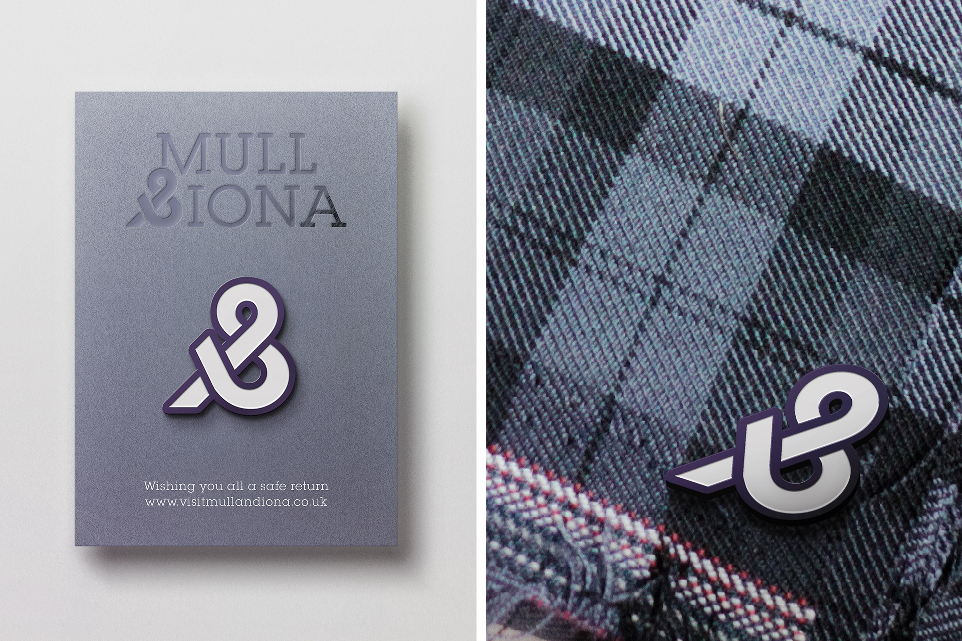
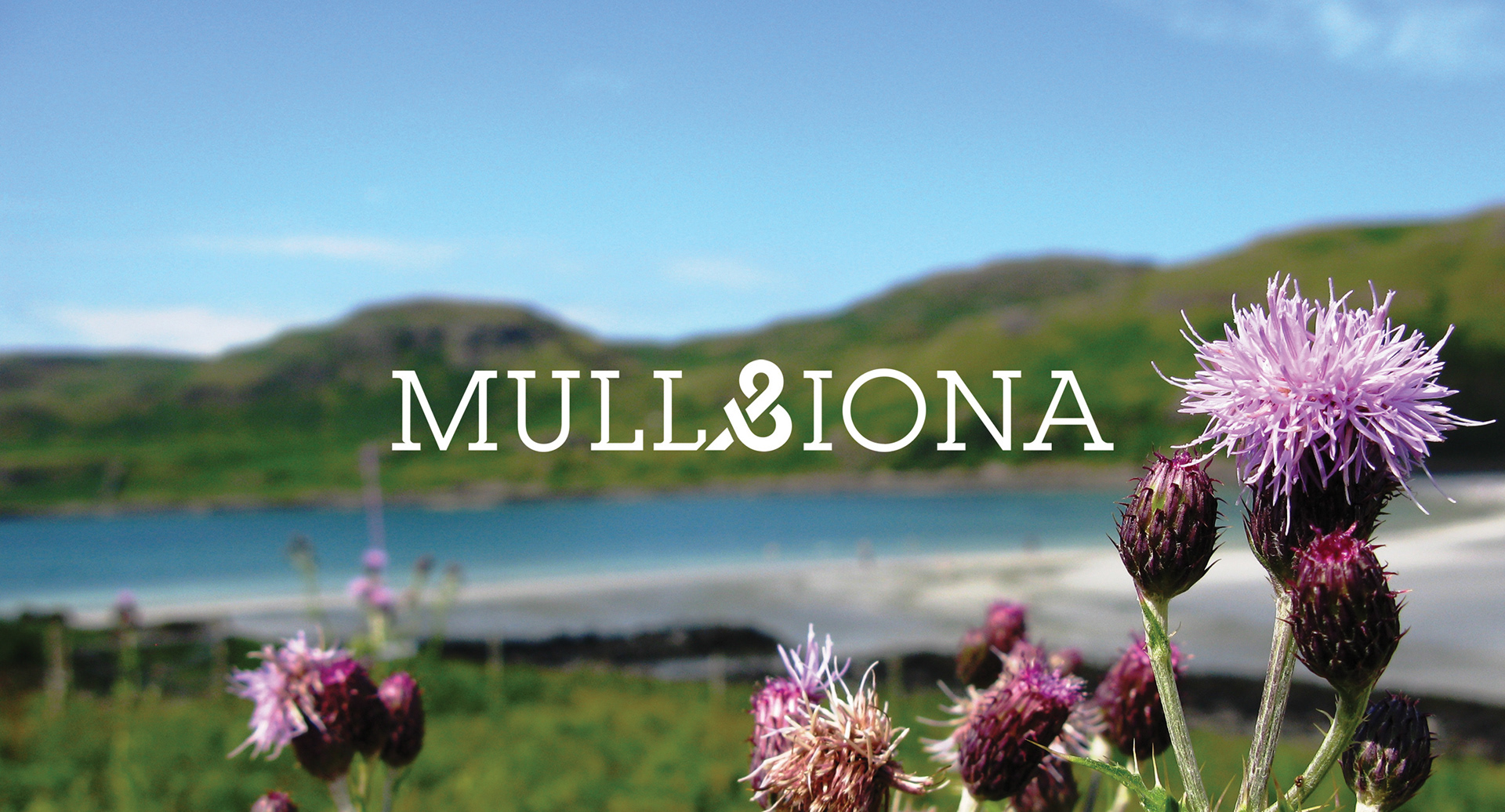
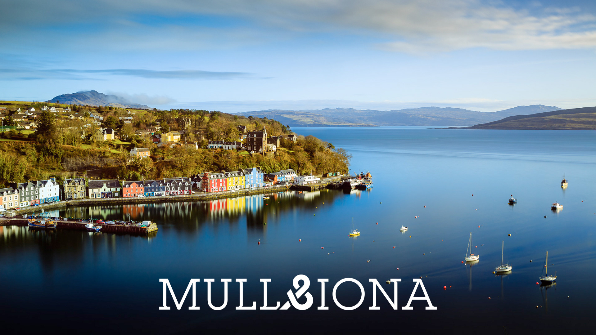
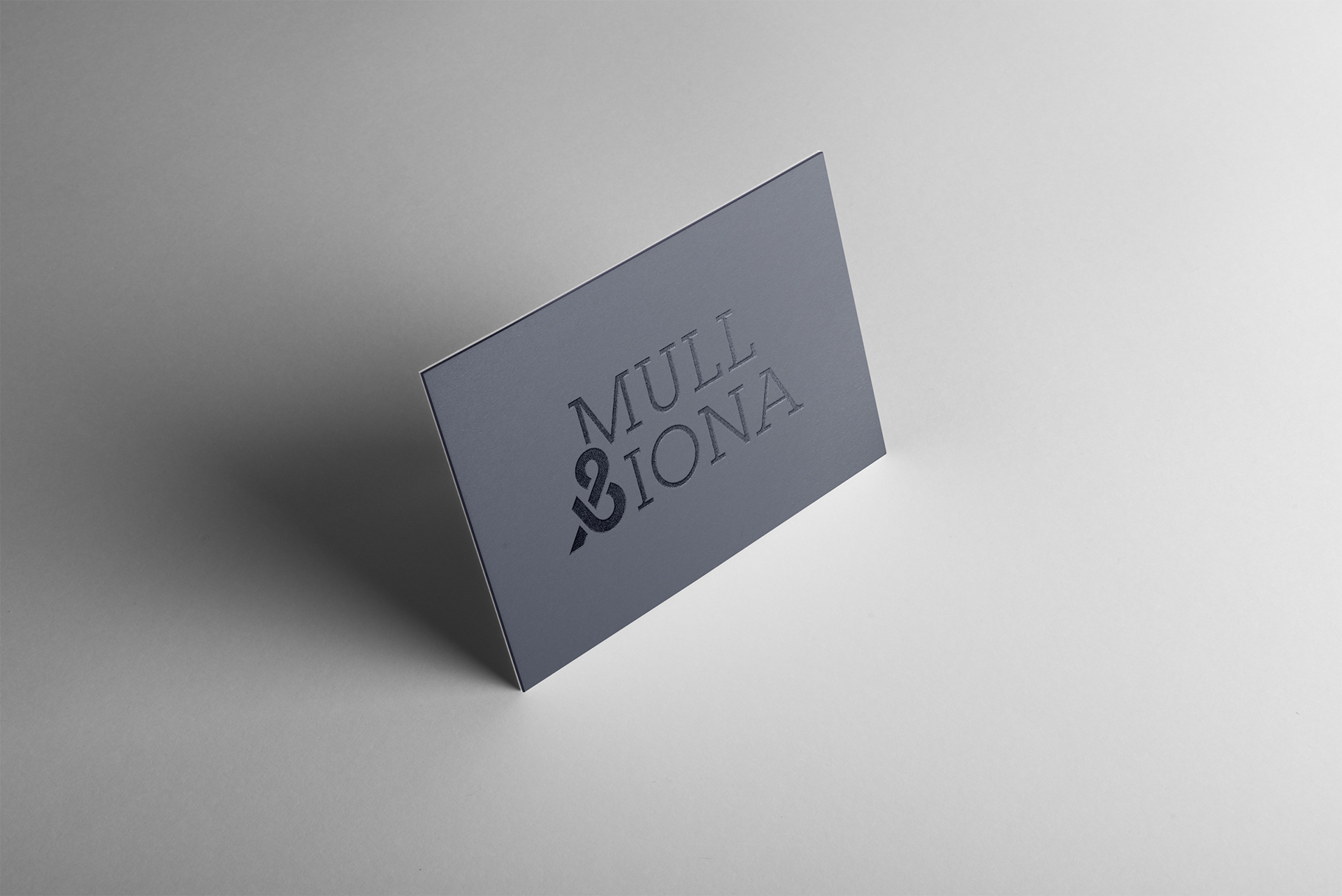
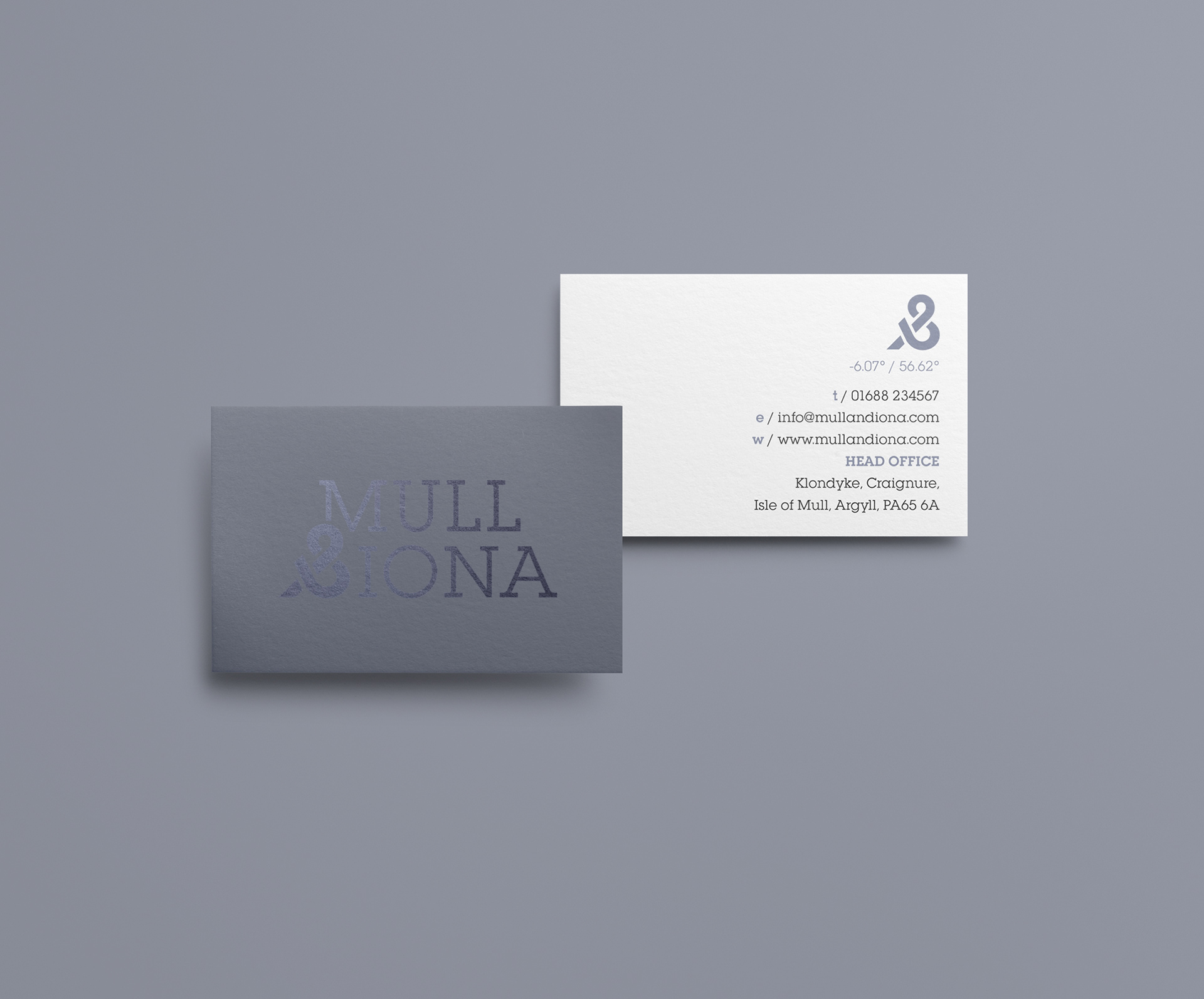
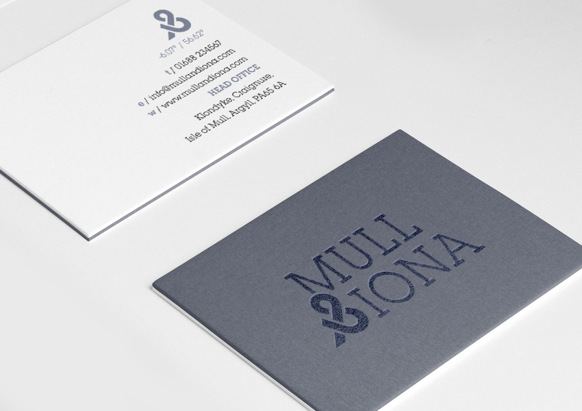
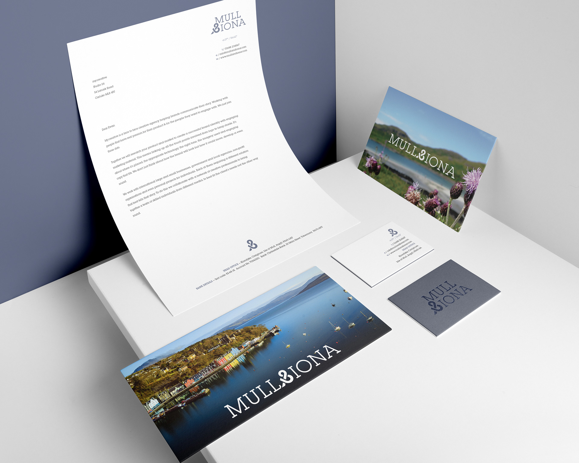
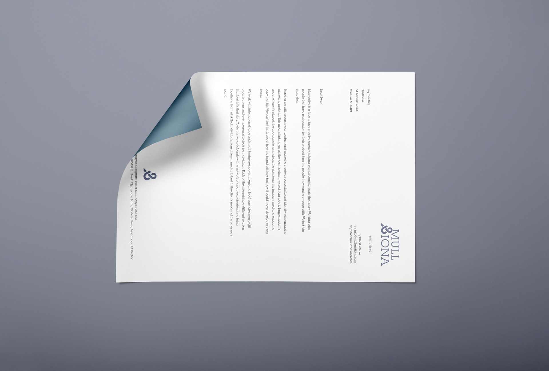
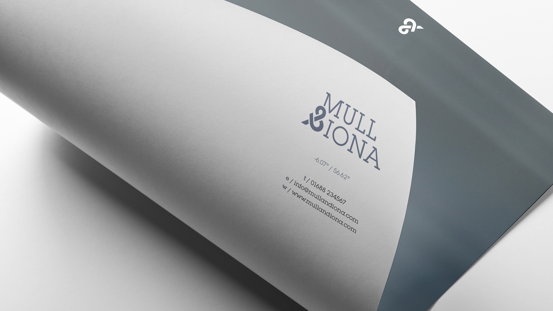
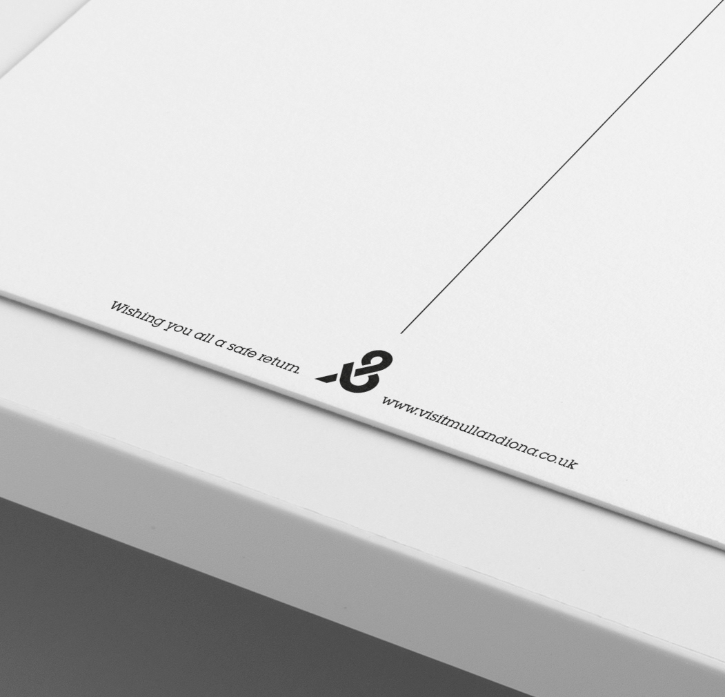
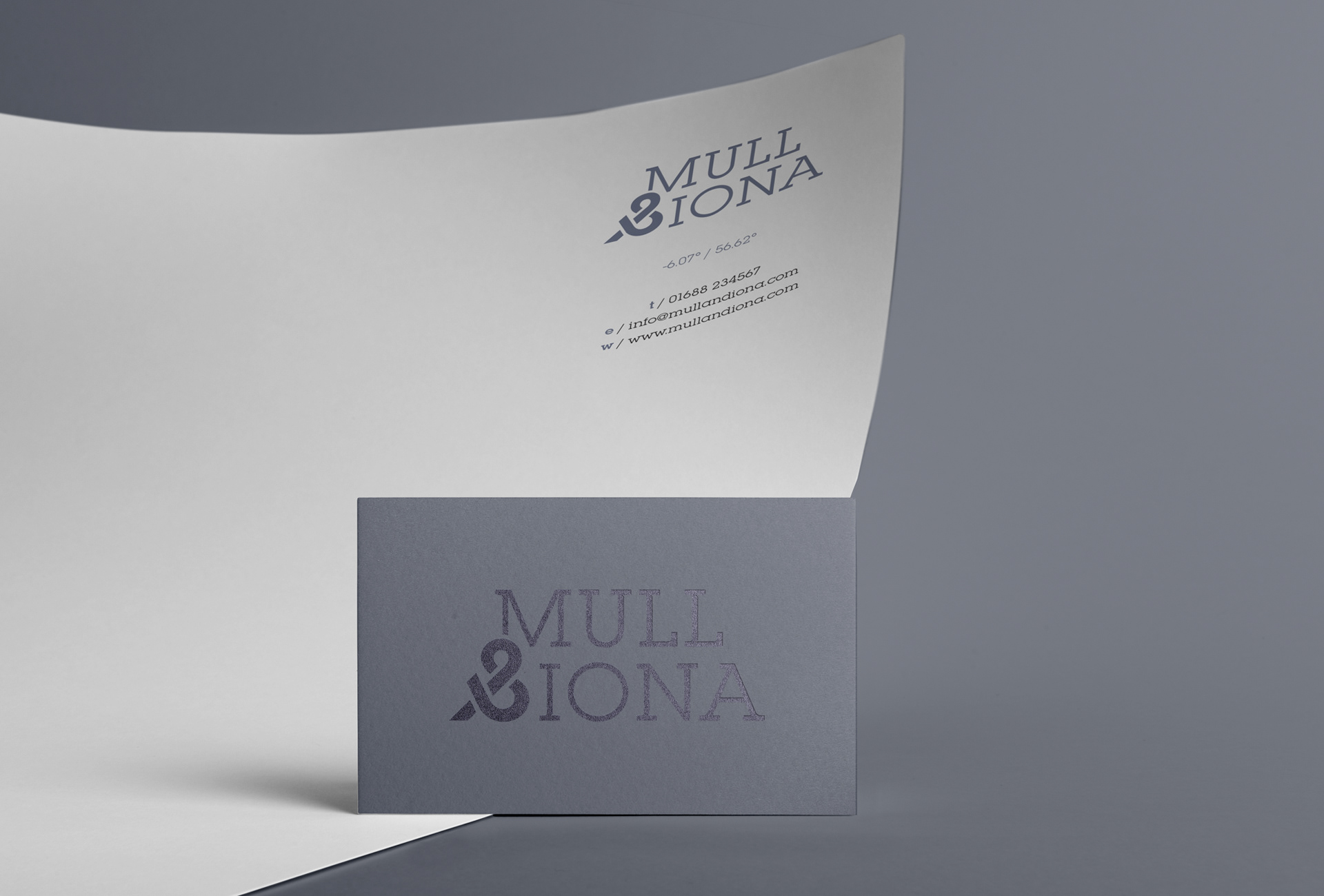
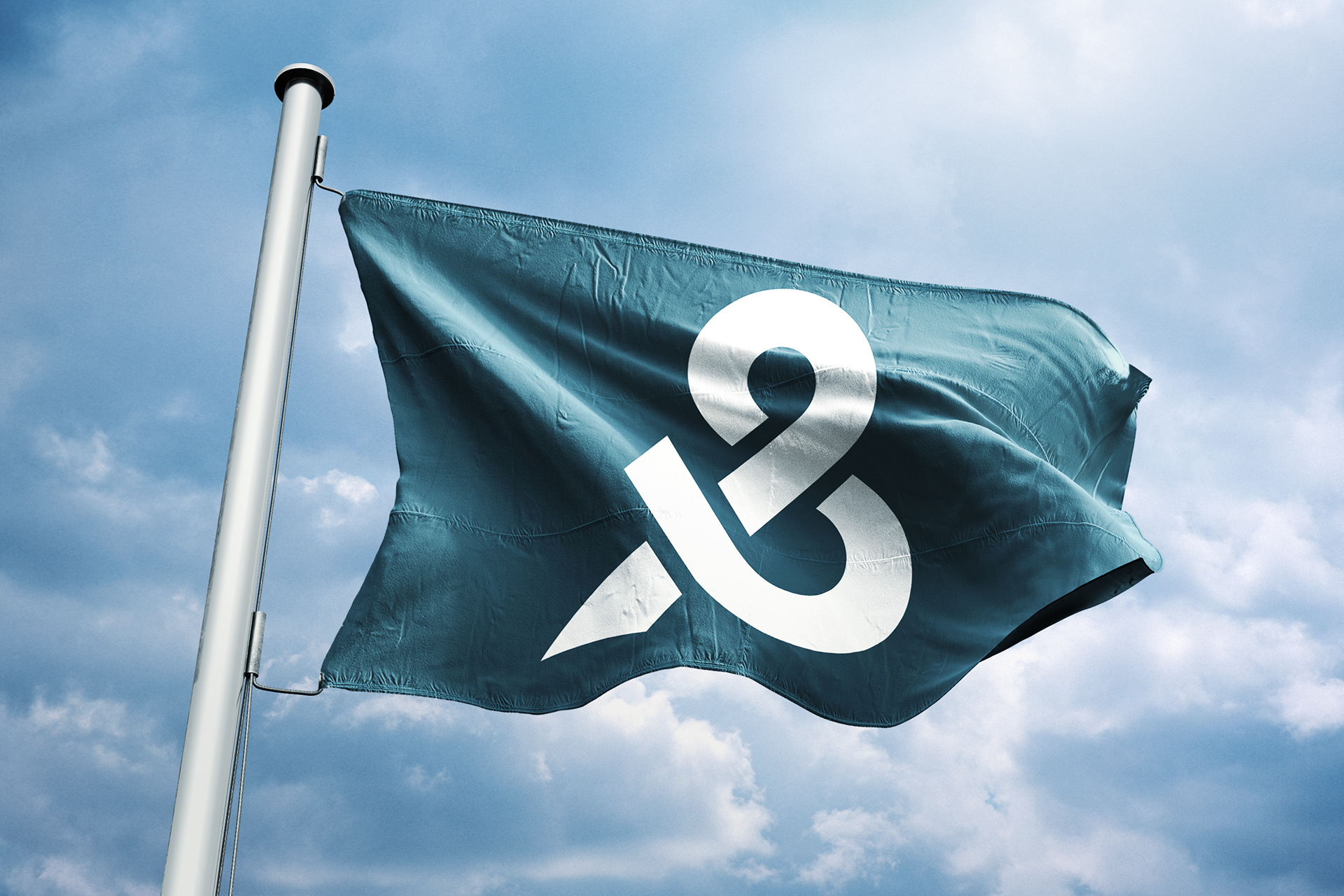
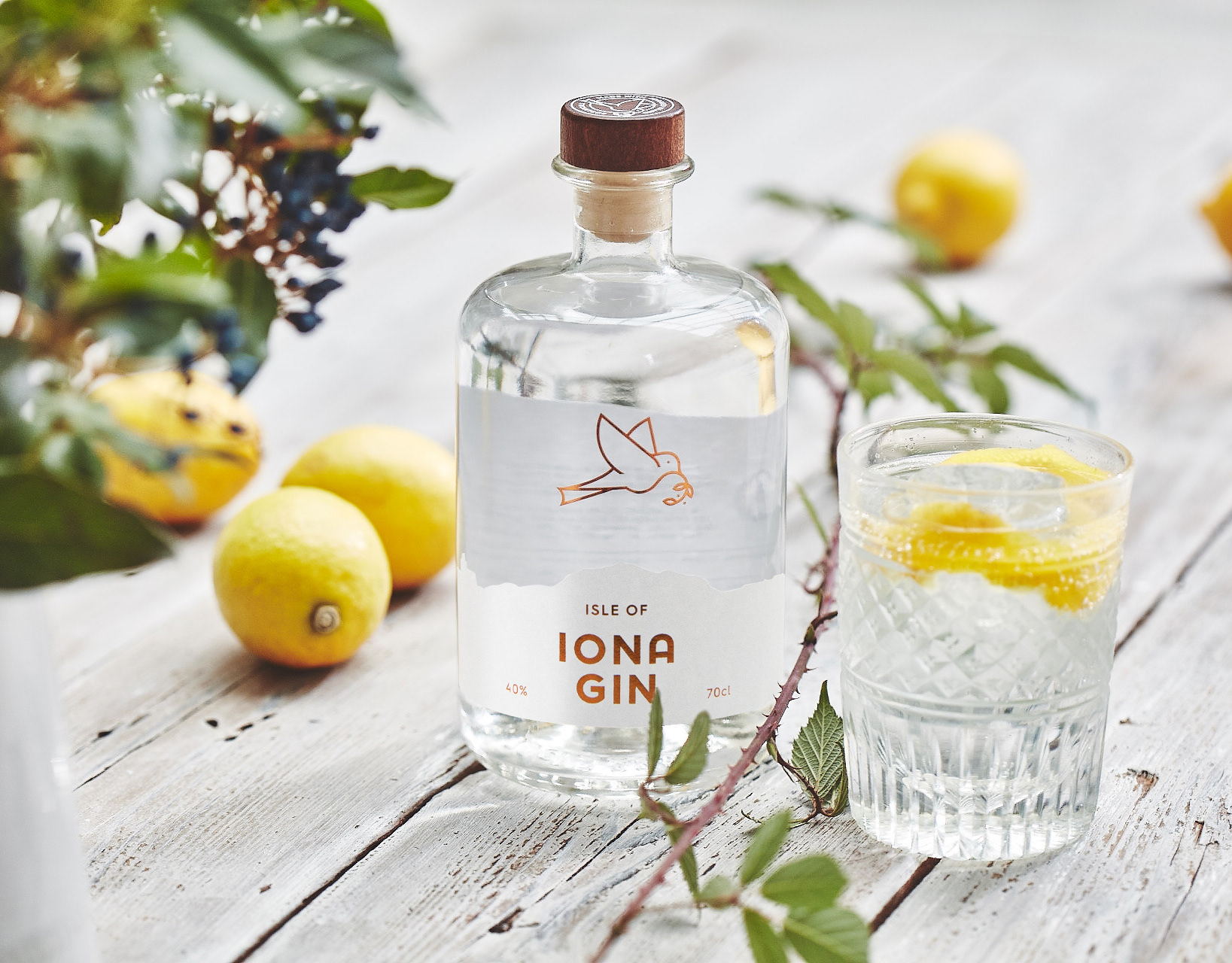
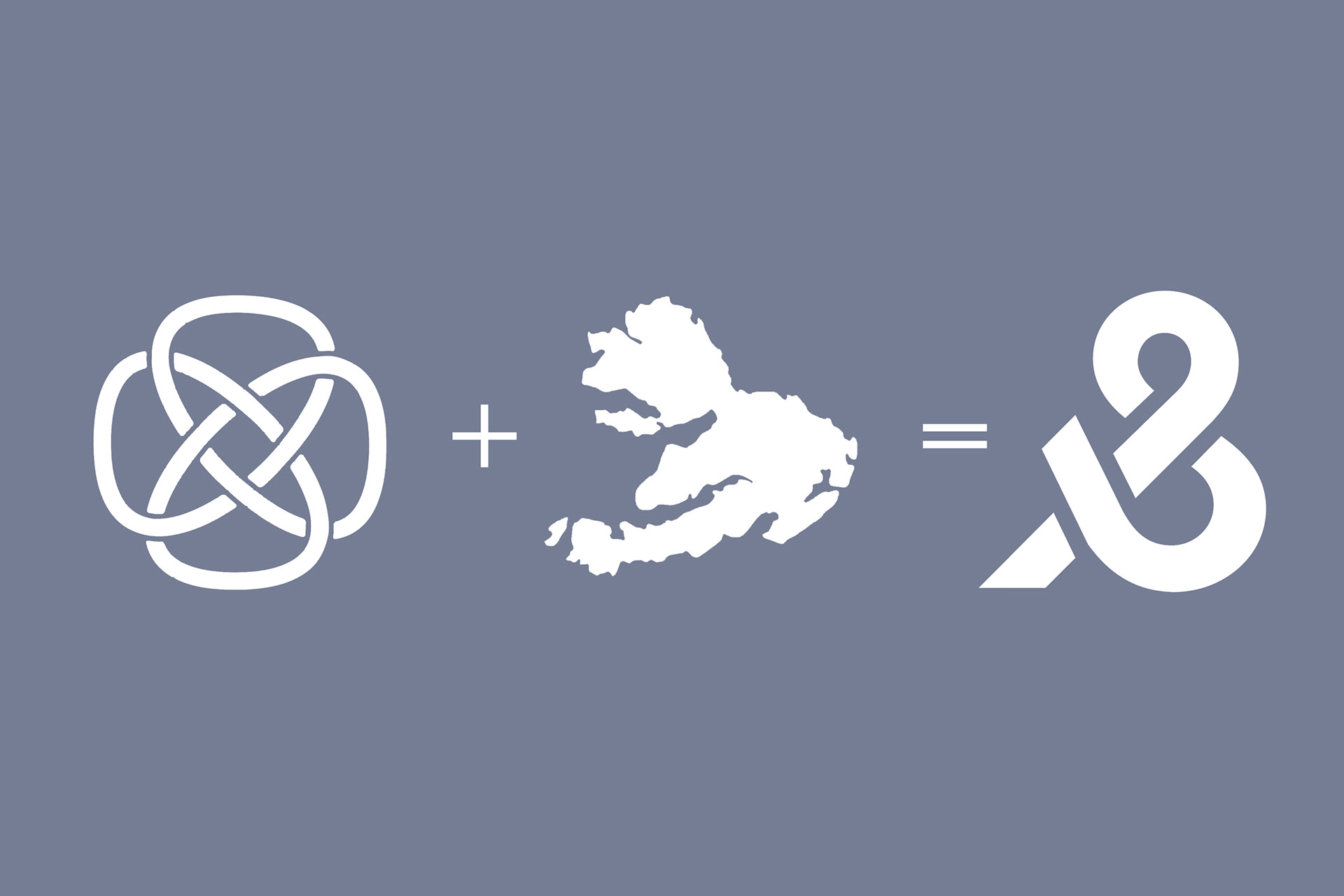
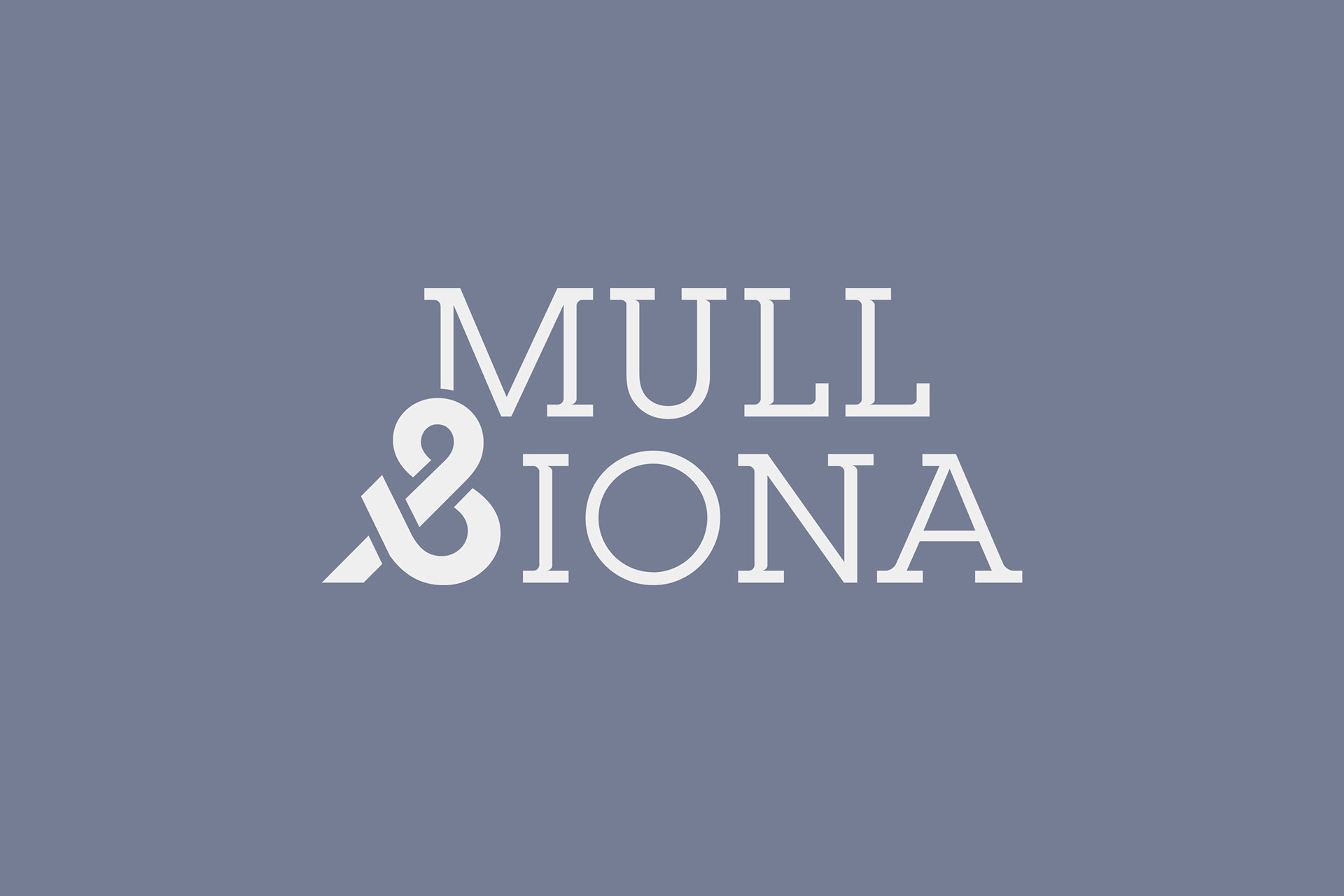
We created an elegant word mark to reflect the beauty of the islands. Crafting a unique ampersand to resemble the shape of the islands in the style of a Celtic knot. This demonstrates how perfectly balanced the islands are and how the people and land, play their part in making it unique. Resulting in a bold and long lasting icon that will stand for quality for decades to come.
A group was formed to showcase and promote their area for tourists and local residents. The islands have long been desirable destinations for homemakers and tourists alike. Mull and Iona wished to build on this and promote their area to increase visitor numbers and awareness, while showcasing the local luxuries to a bigger audience.
From a series of research workshops we defined and conceived the brand values, tagline, identity system, positioning and photography.
We created an elegant word mark to reflect the beauty of the islands. Crafting a unique ampersand to resemble the shape of the islands in the style of a Celtic knot. This demonstrates how perfectly balanced the islands are and how the people and land, play their part in making it unique. Resulting in a bold and long lasting icon that will stand for quality for decades to come.
Deliverables include: Research + brand identity and logo design
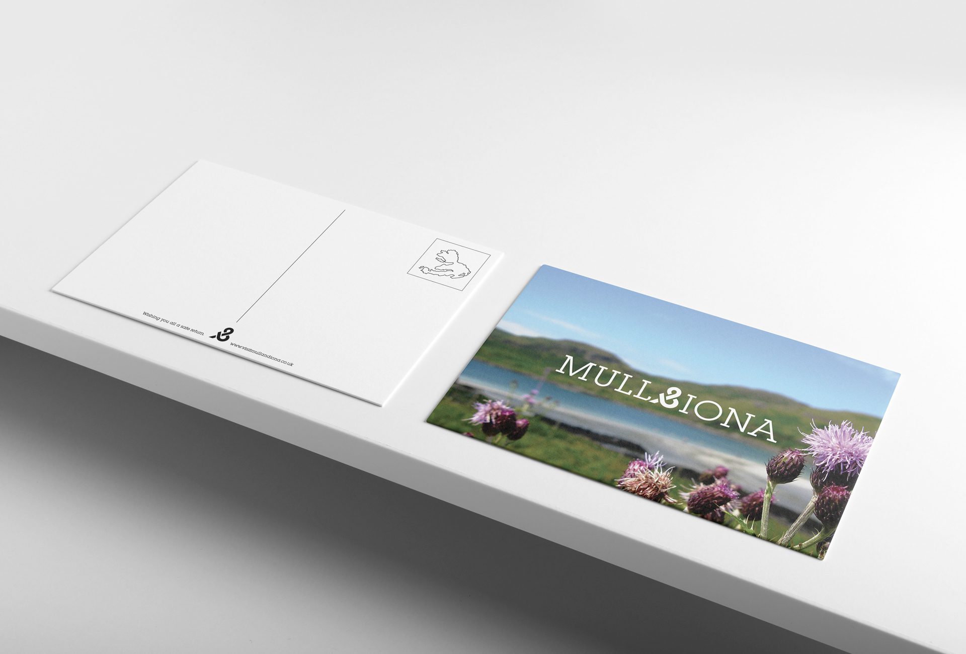
Visit: visitmullandiona.co.uk


-
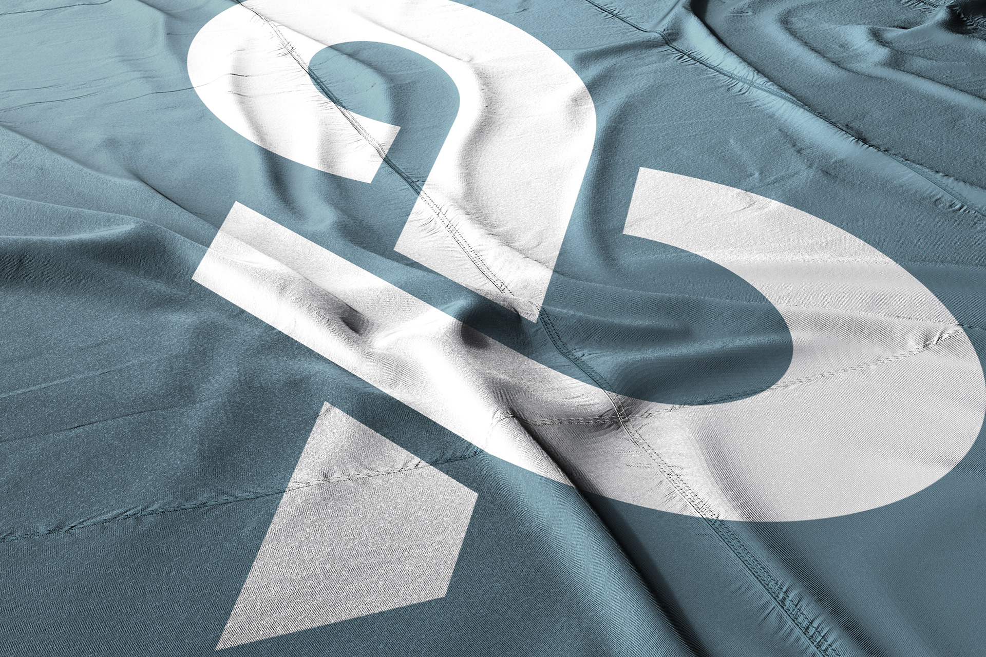
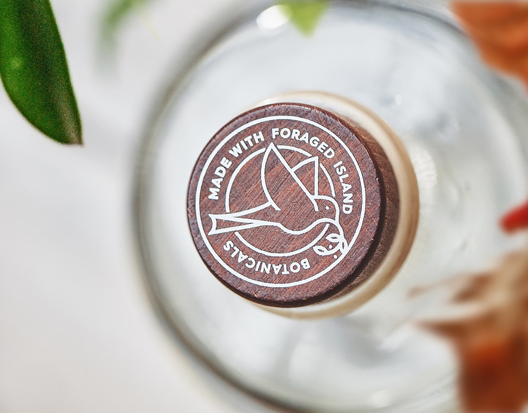
The icon
Reversed ampersand linking the shapes of both islands together in a Celtic knot.