A film by Monette
-
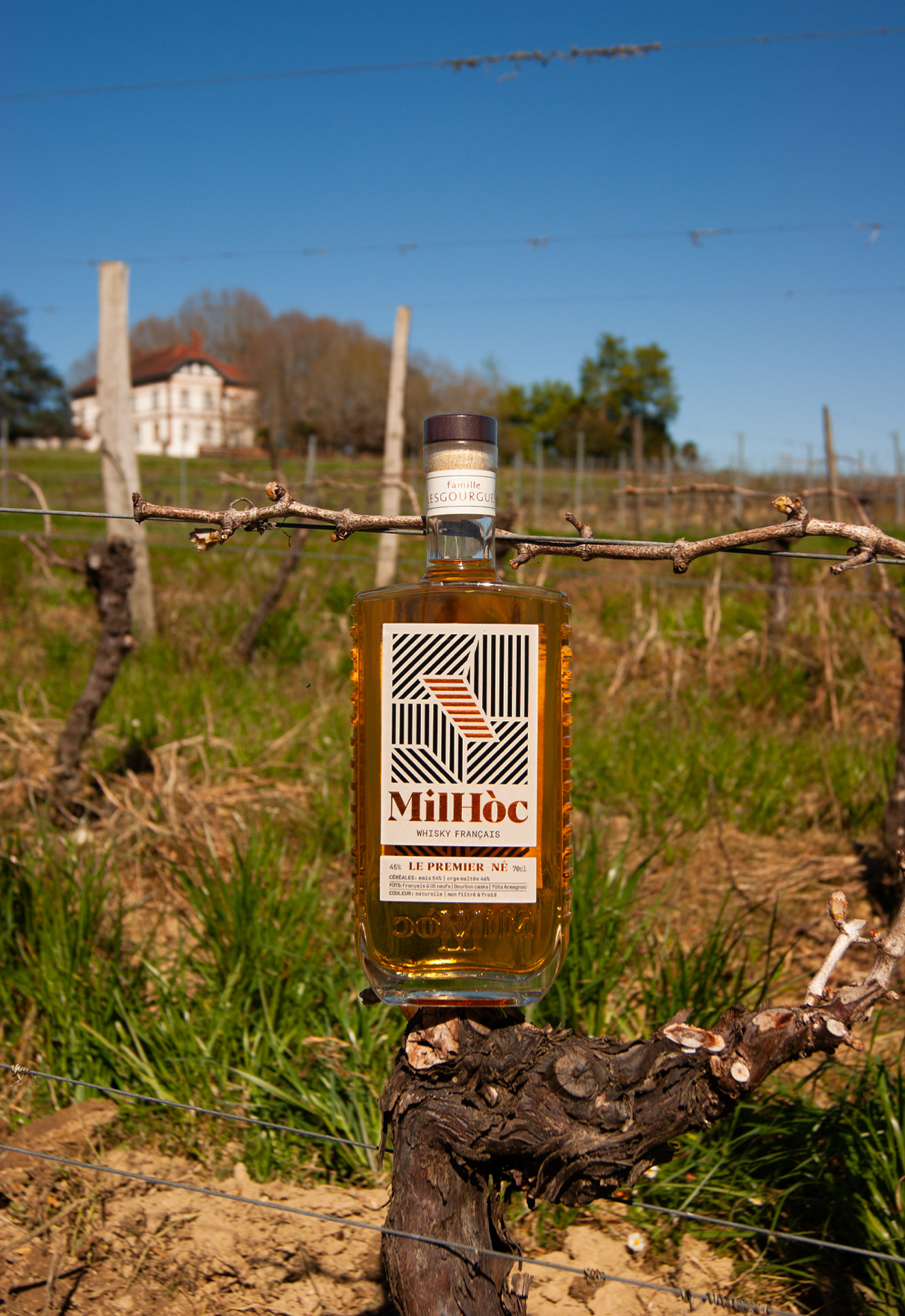
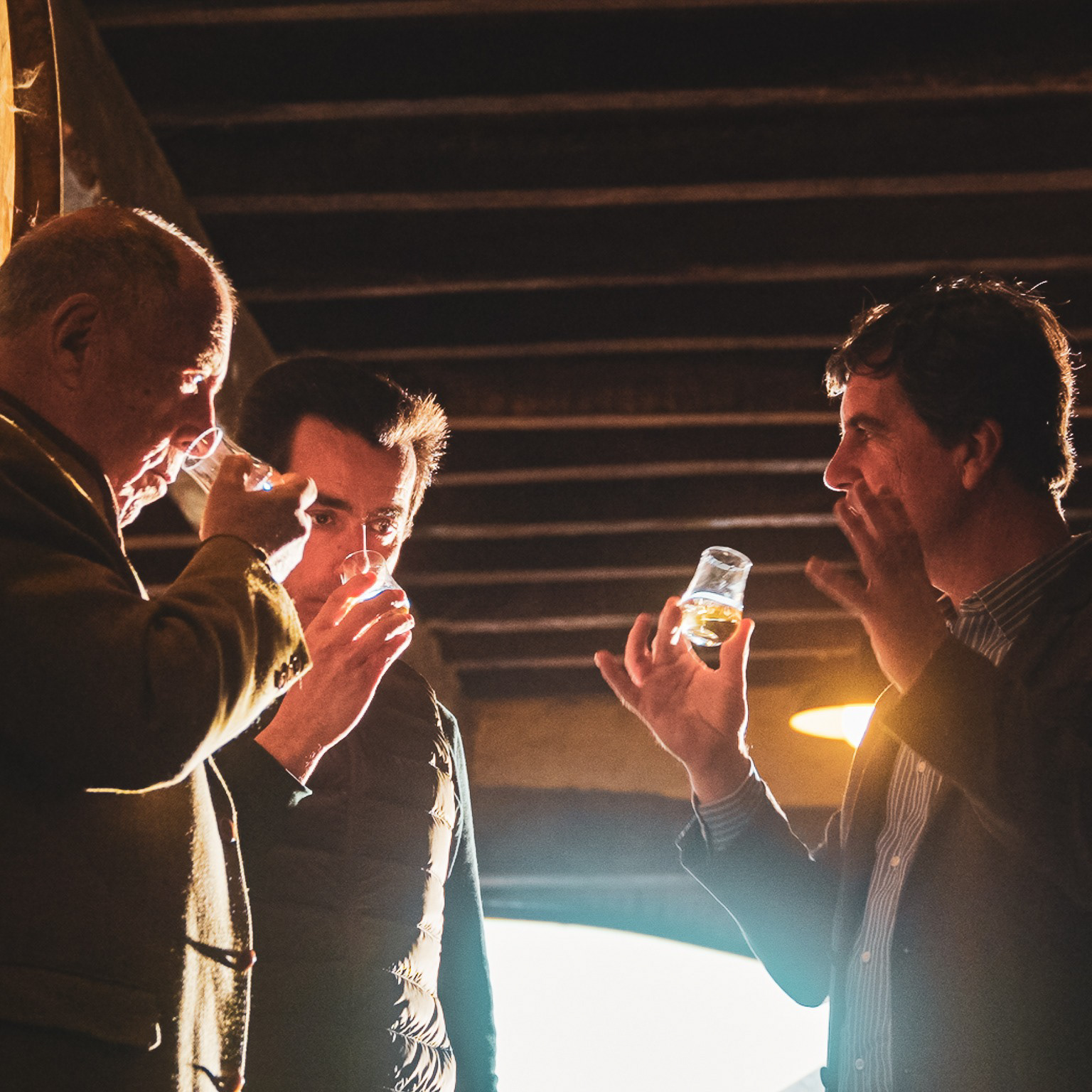
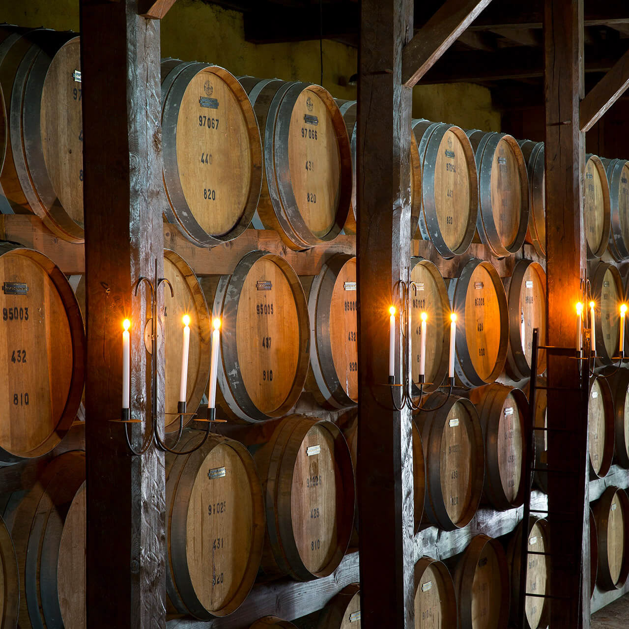
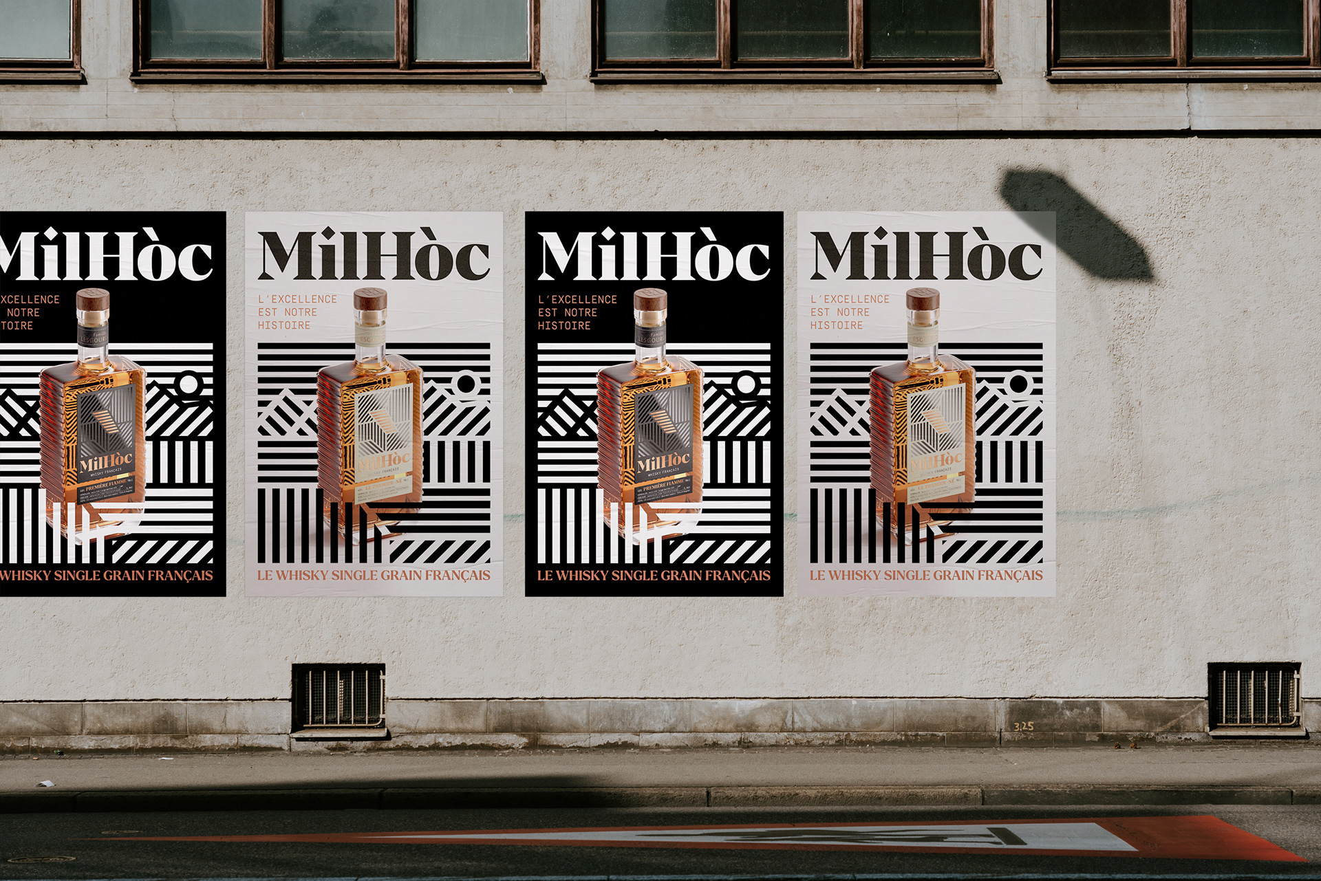
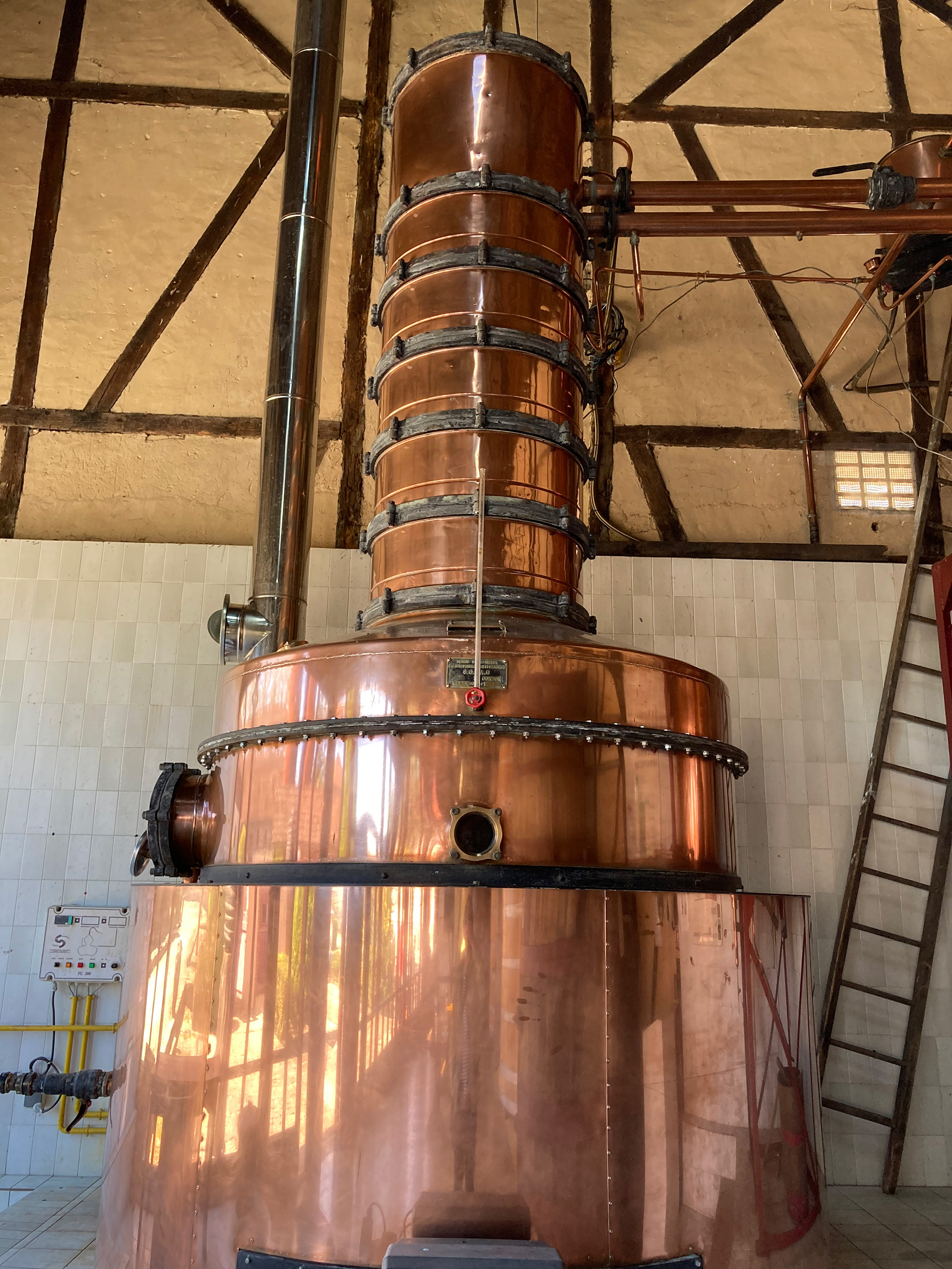
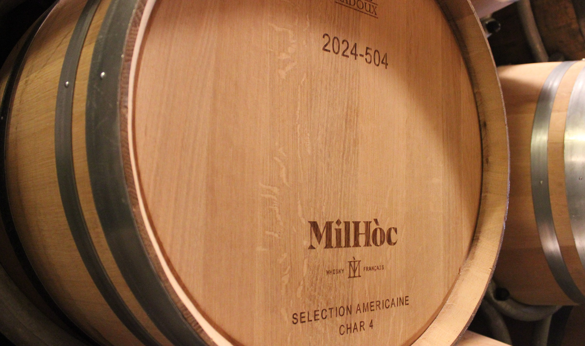
Milhóc Whisky, is located in the middle of France's famous Armagnac producing region! Their first-born single-grain whiskey, Le Premier-Né and a second limited edition bottle called Premier Flamme. Were created from their unique Bas terroir. With Estate-grown cereal grain mash fermented in traditional ridged Column Stills and Finished in Bourbon barrels. Armed with their deep knowledge of Armagnac traditions and processes, Milhóc took a step into the unknown! Blending their experience with the unexpected to create this first Innovation!
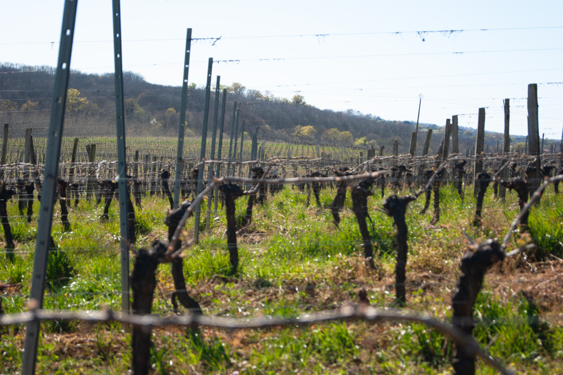
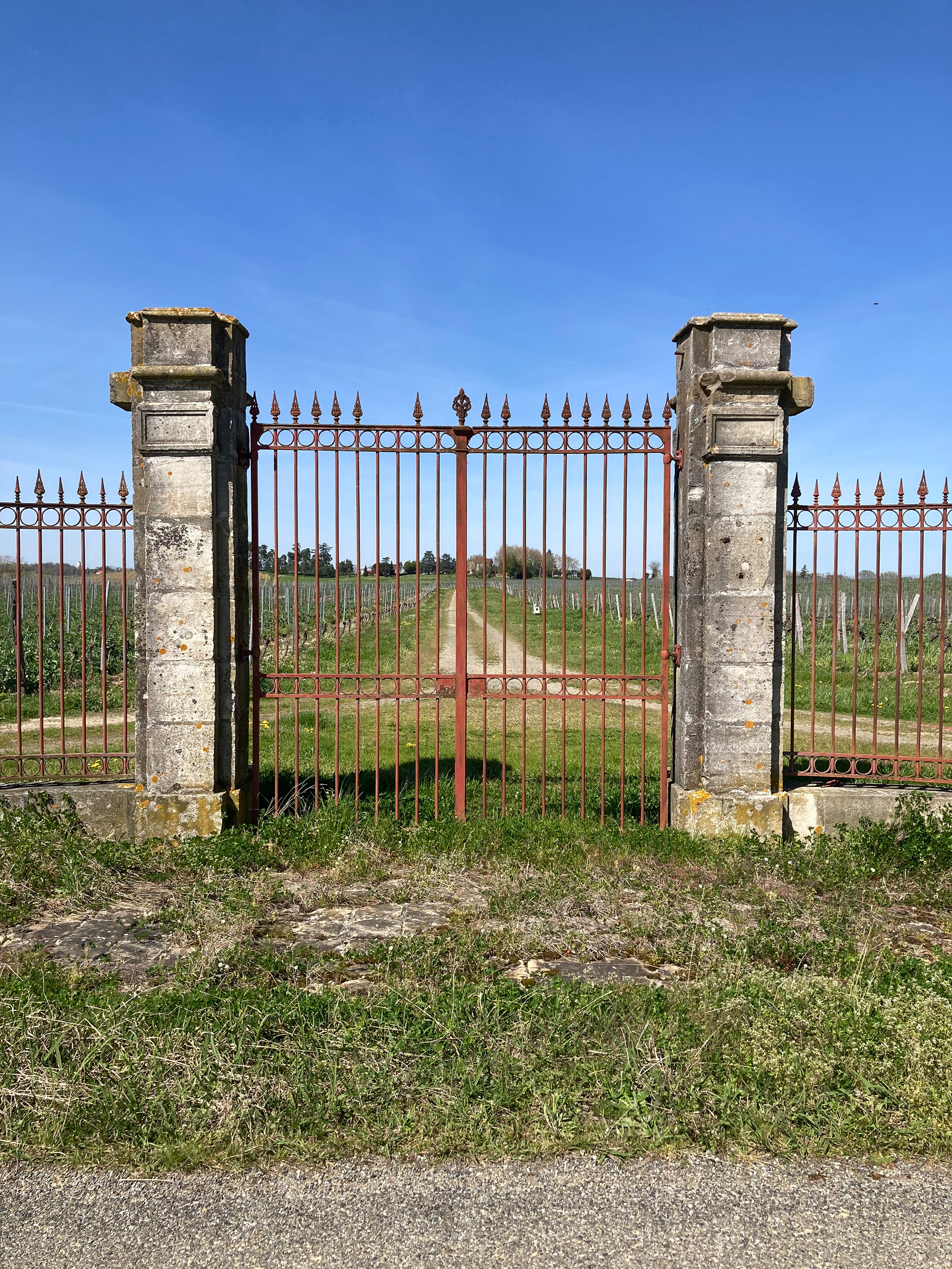
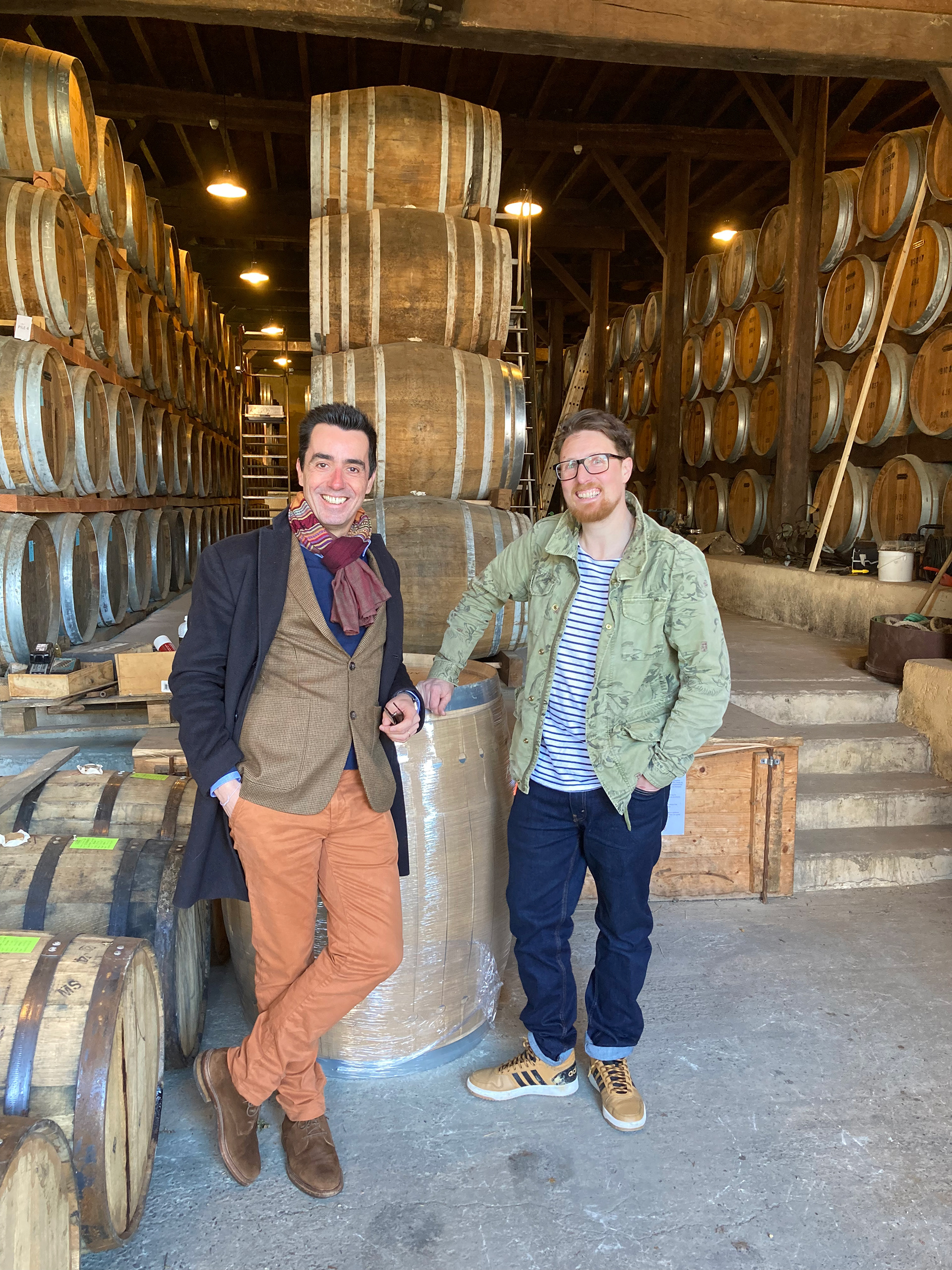
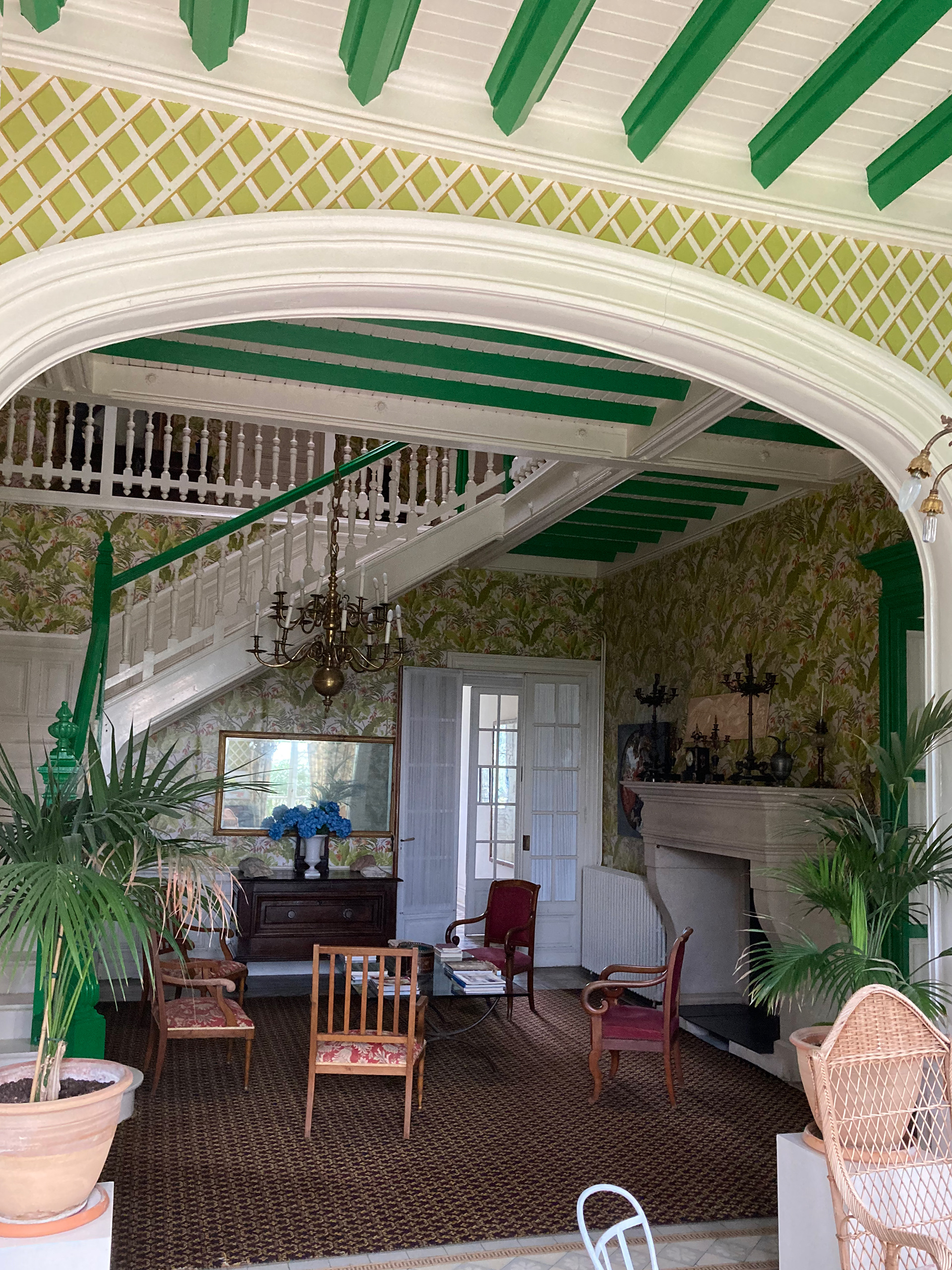
My Creative visited the region in South West France to collect and record inspiration to start the brand and packaging. The traditional processes and skills were plain to see amongst acer upon acer of graphically beautifully but strategically aligned vineyards. Chateau Laubade was already globally renowned for fantastic wine and brandy production, but not whisky. What stuck out was a few golden corn fields, later to be used to produce their spirit. In the middle of this cultivated landscape, patterned with Ridges and Furrows.
This became an important story to tell through the branding. Aligning Milhóc to be unique and different in the market and surrounding area. A sort of black sheep, Innovationing with its tradition.
Deliverables include: Research + brand identity, logo, brand elements, illustration system, packaging design, label design and D3 bottle molde.
-
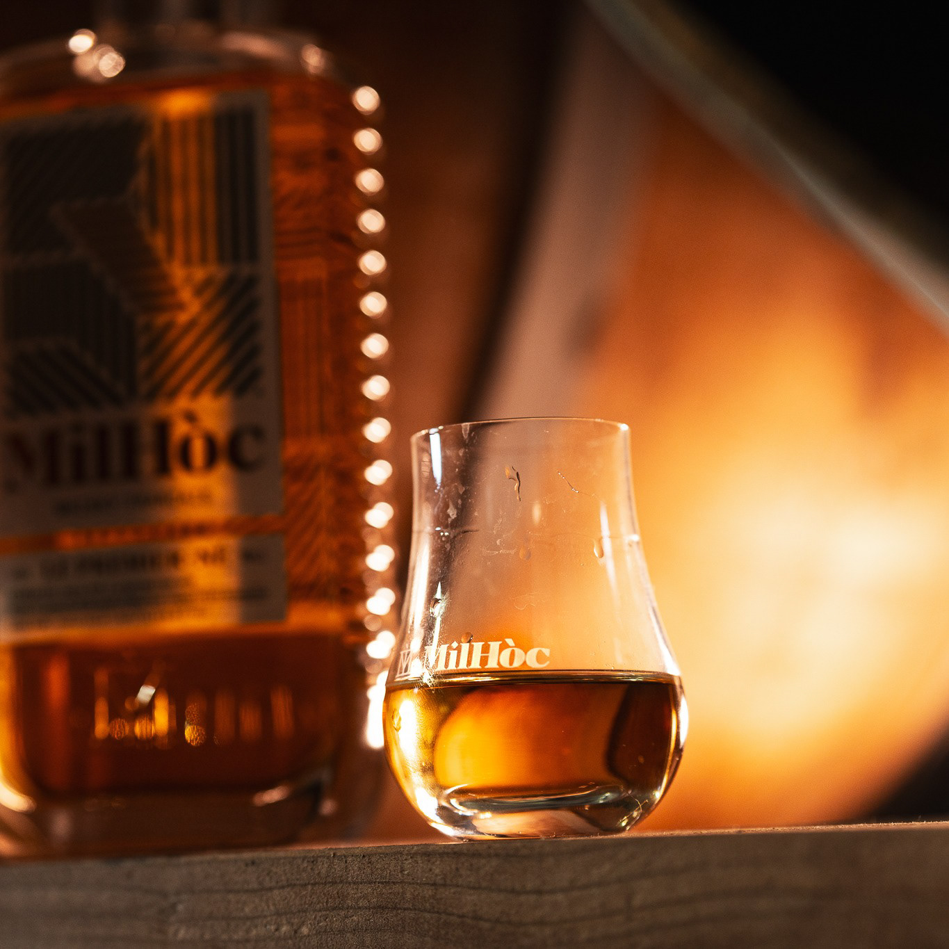
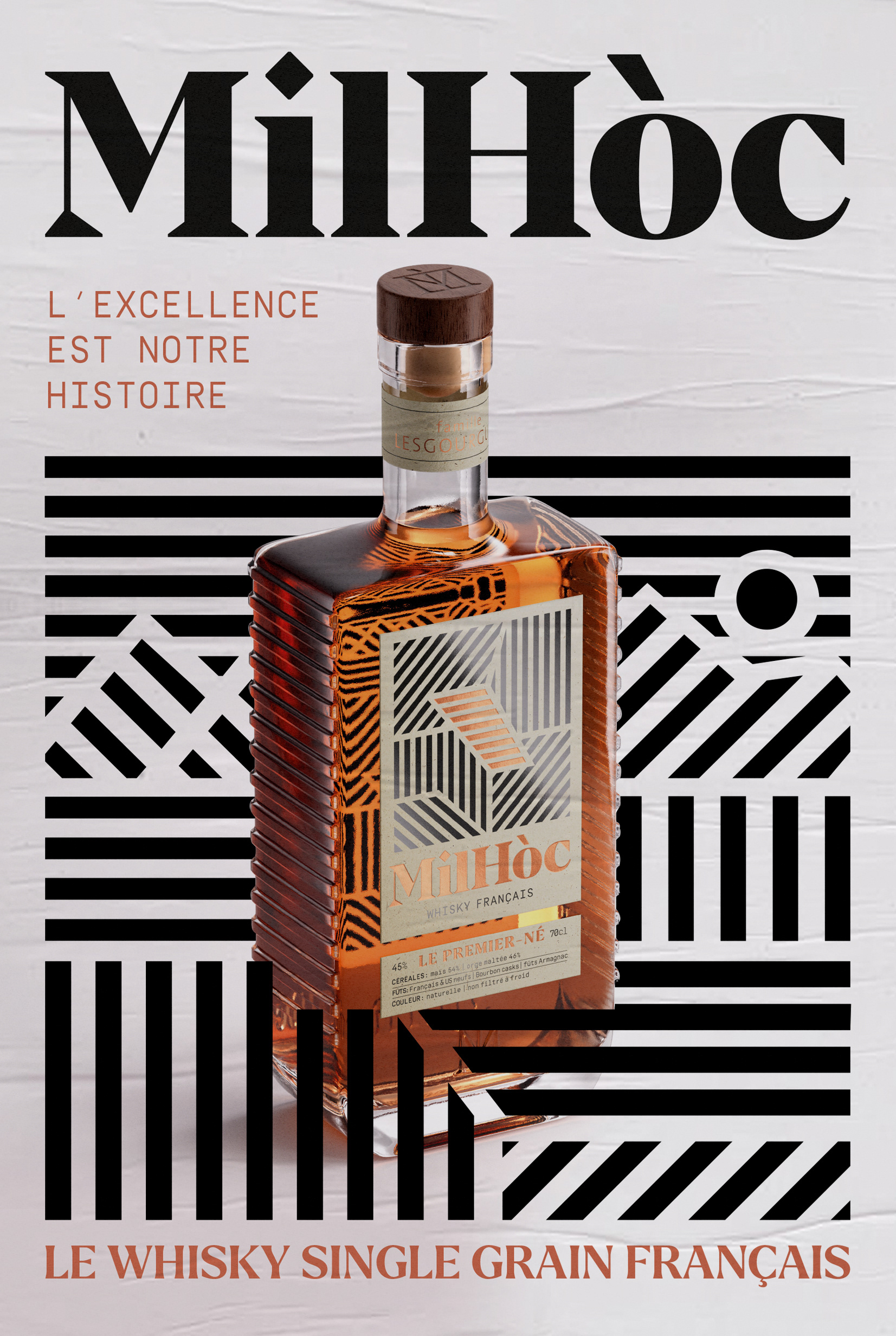
Milhóc Whisky Bottle: A bespoke mould modification with Wordmark and Monograph placement to the front and back faces. The iconic Ridge and Furrows run down both sides of the bottle to give a unique profile and nice grip when handling. But more importantly, when pouring! ;D This design is also represented in the Column Stills, linking up produce to production.
-
Print Specification: 2 foils have been letterpressed onto craft paper (Woodstock Betulla by Fedrigoni). In addition, a reveres print was applied to the back label to reflect the paper around the whisky bottle. Interacting with the Ridge and Furrows running down both sides
-
The Gift Box: 2 foils have been letterpressed onto thick craft paper (Woodstock Betulla by Fedrigoni). The pattern of the fields runs around the full box, lining up with the design on the bottle label.
-
Print Specification: 3 foils (black, white and copper) have been letterpressed onto craft paper (Woodstock Betulla by Fedrigoni).
-
The Gift Box: 3 foils (black, white and copper) have been letterpressed onto thick craft paper (Woodstock Betulla by Fedrigoni). The pattern of the fields runs around the full box, lining up with the design on the bottle label.
-
Shipping Box: We wanted this item to stand out as much as the bottle and work when stacked. Celebrating the bottle's profile and the ridges with a chevron design running along the lower two-thirds of the box.
-
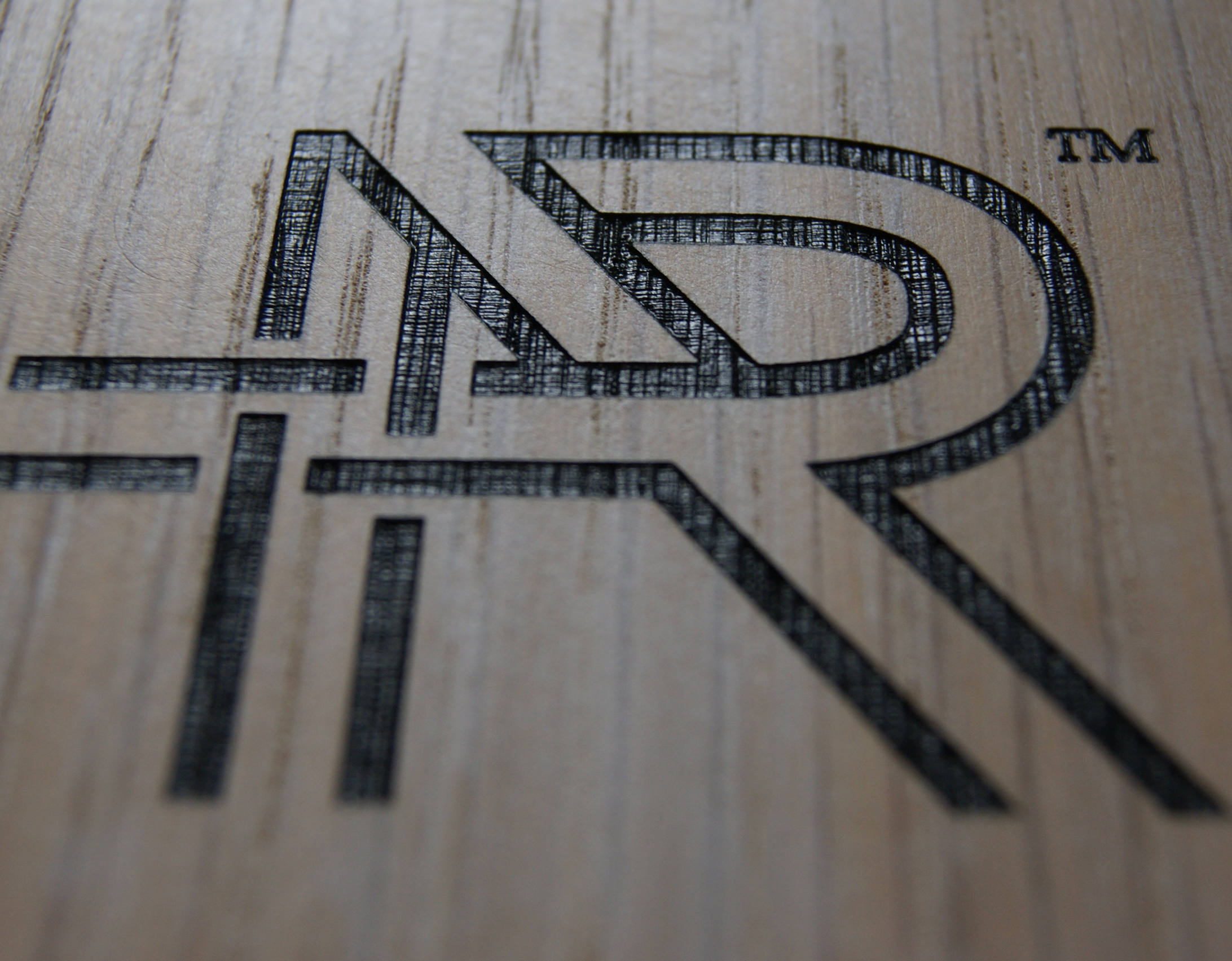
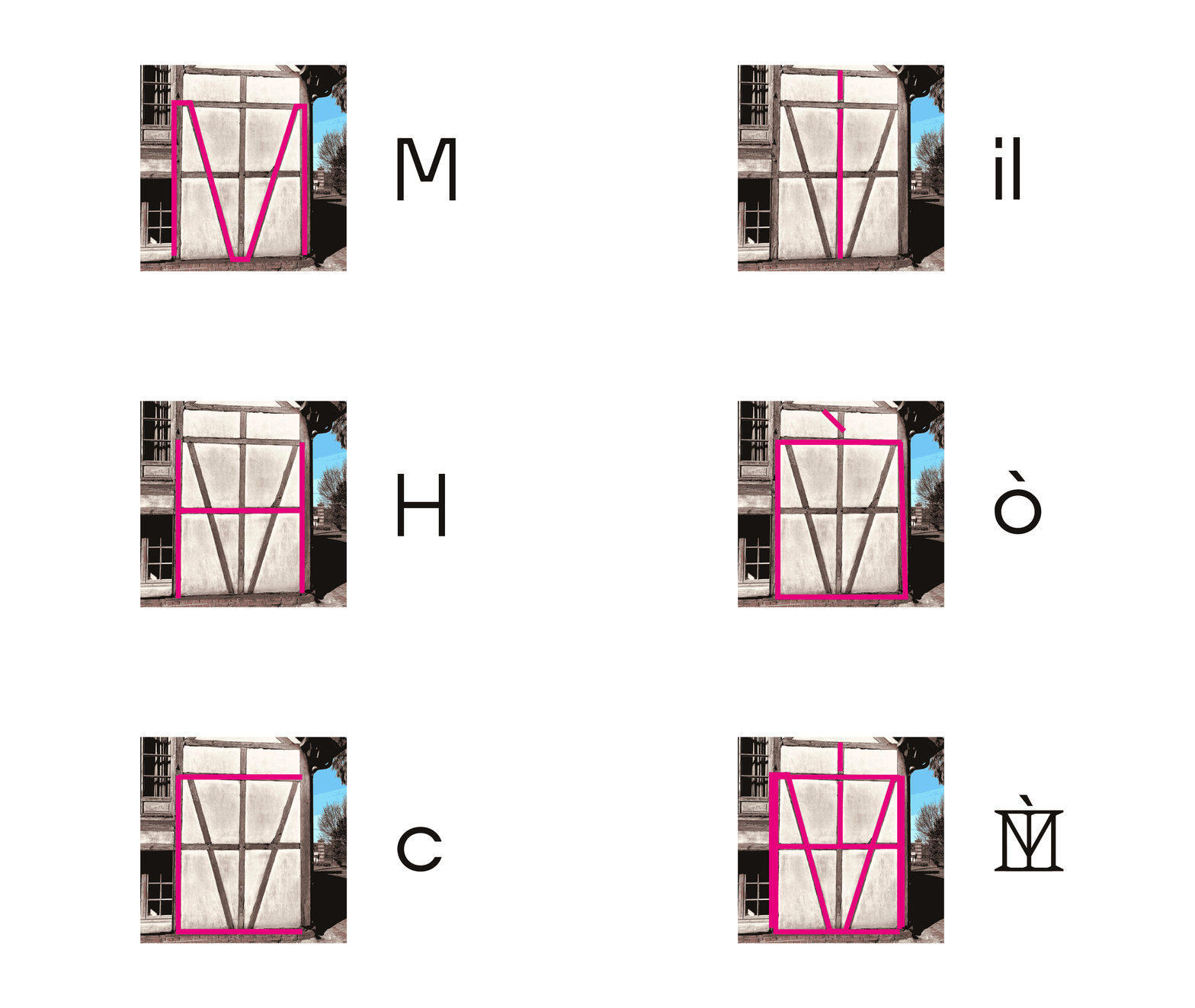
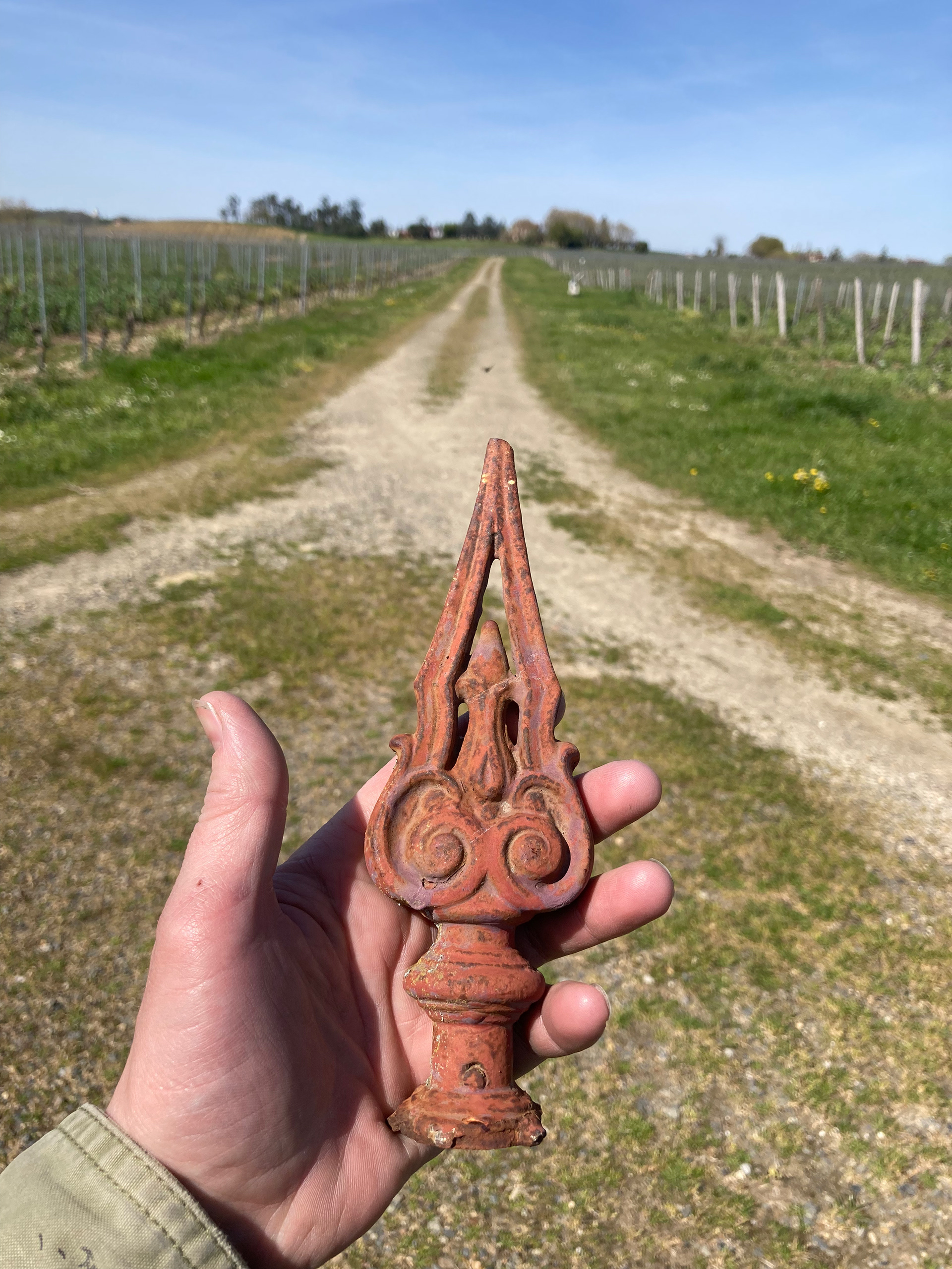
Monograph: When exploring the location in South West France. We recorded many unique details that inspired many elements of Milohoc Whisky. Nome more than the Monograph made up of the brand's letters in design layouts found in local stone masons and gable ends of traditional buildings.

Milhóc or Corn growing in the middle of the vineyard!
Whisky in Armagnac country!
Standing out! standing tall!


-
Available from: MilhocWhisky
-
Thank you.
If you would like to know more about My Creative or are interested in collaborating in a new venture, please visit us at Twitter / Instagram / Email or, our Contact Form


