-
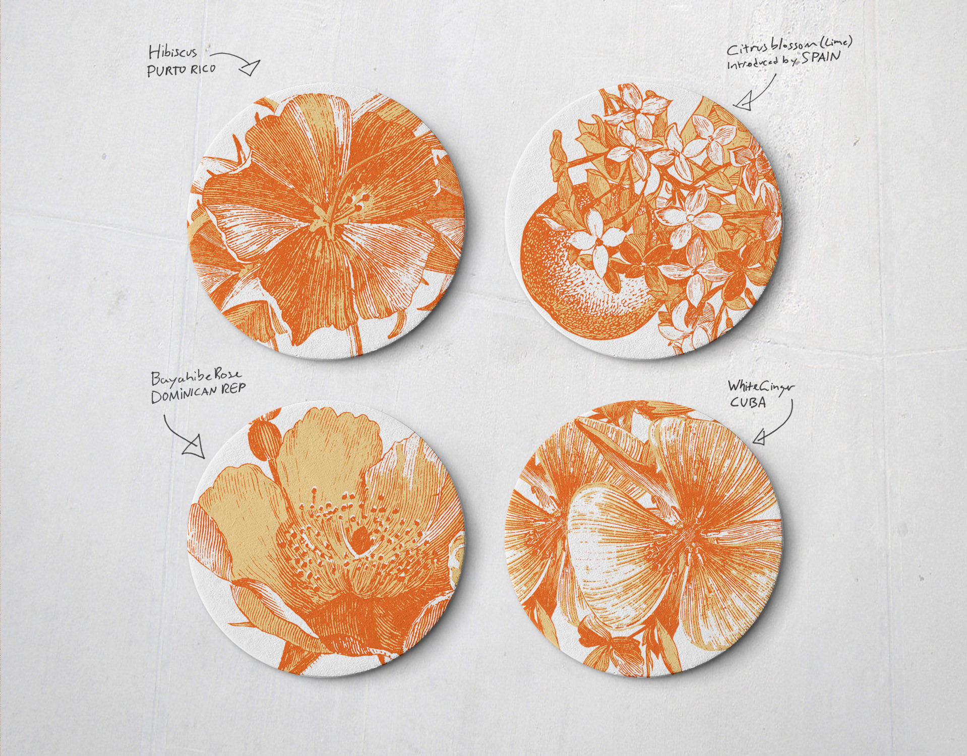
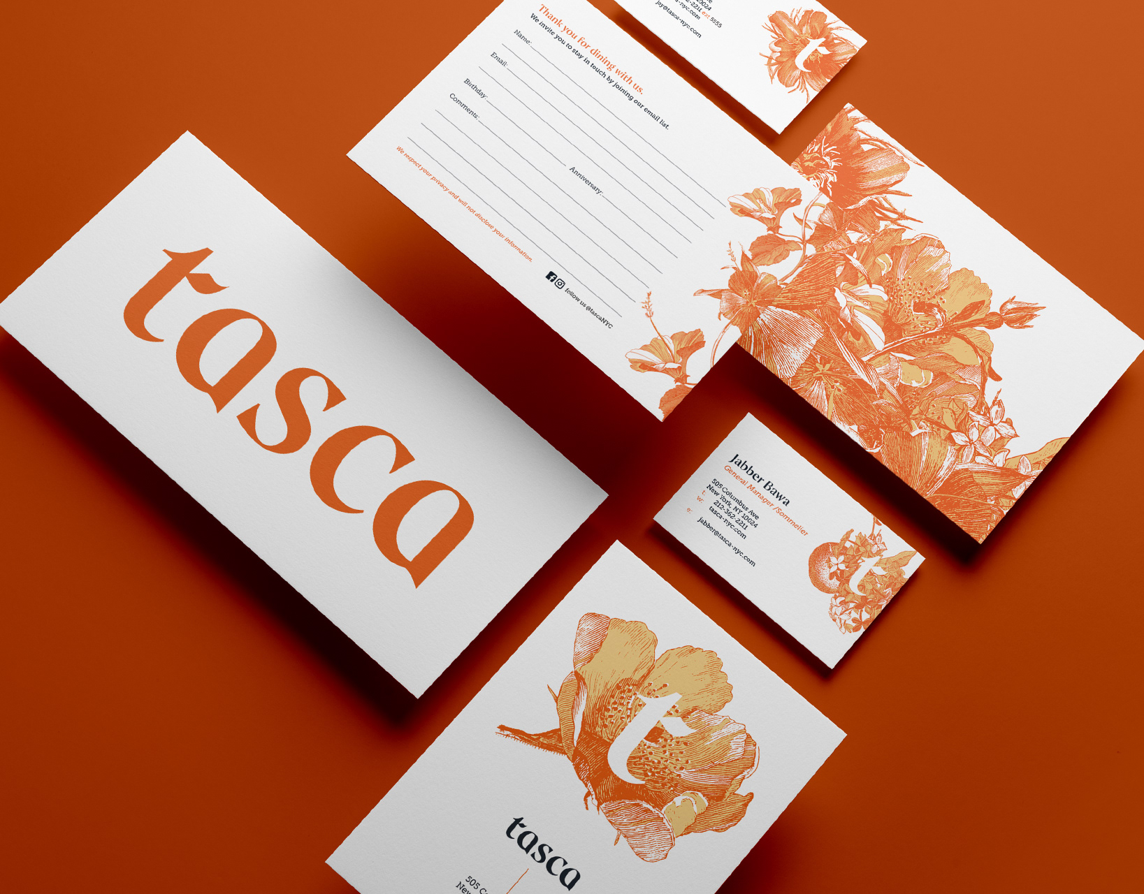
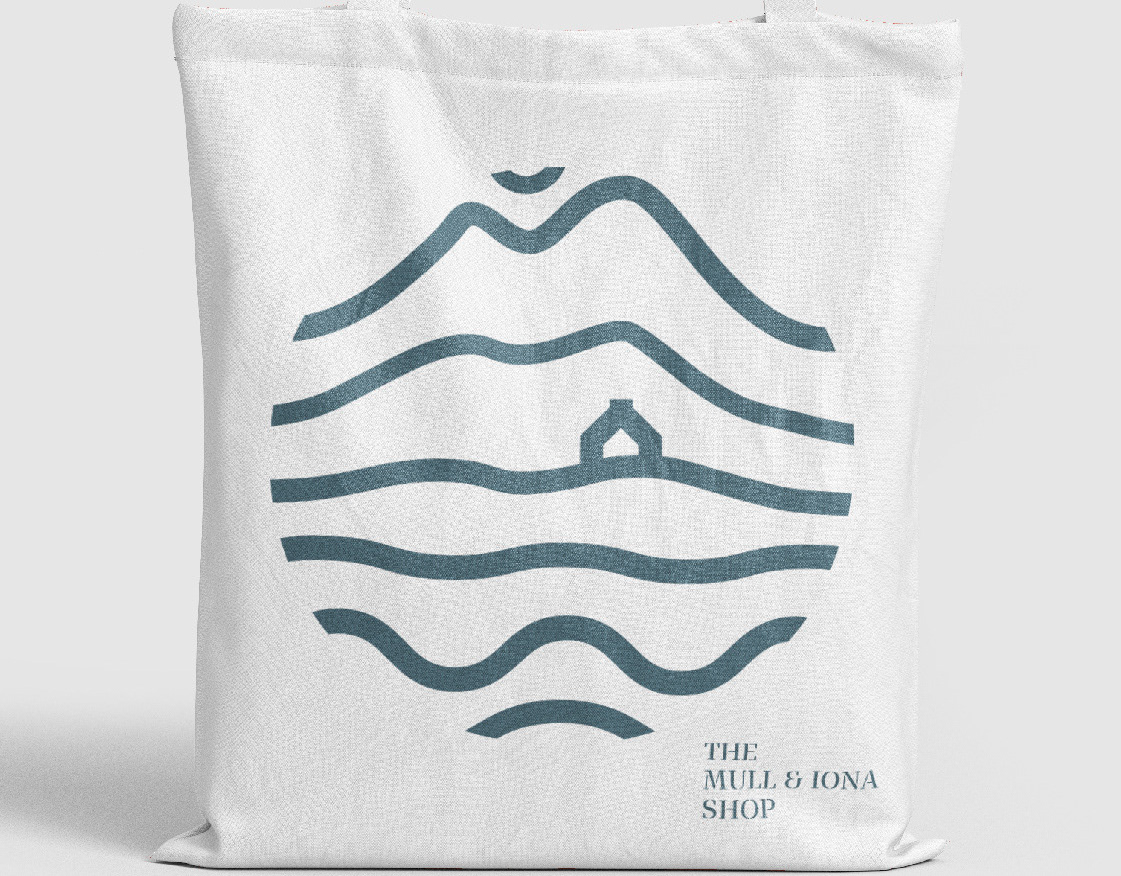
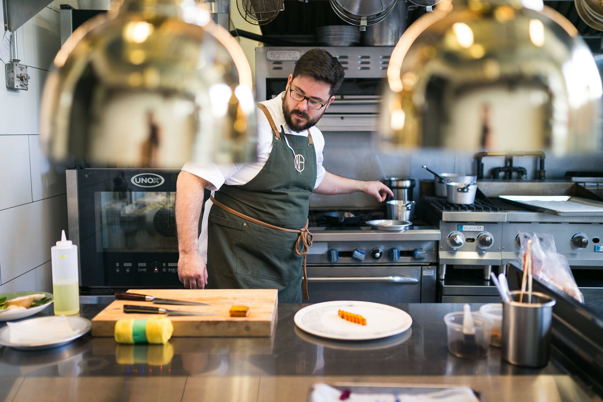
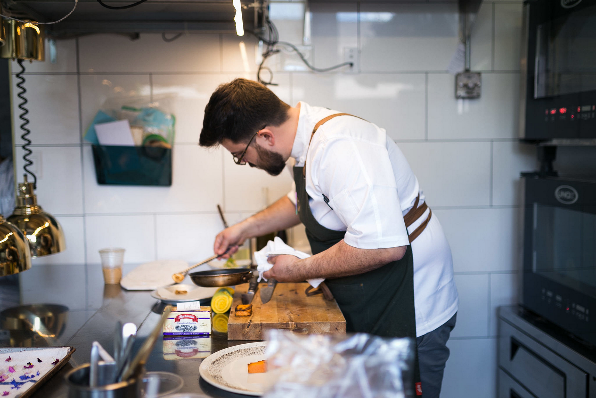
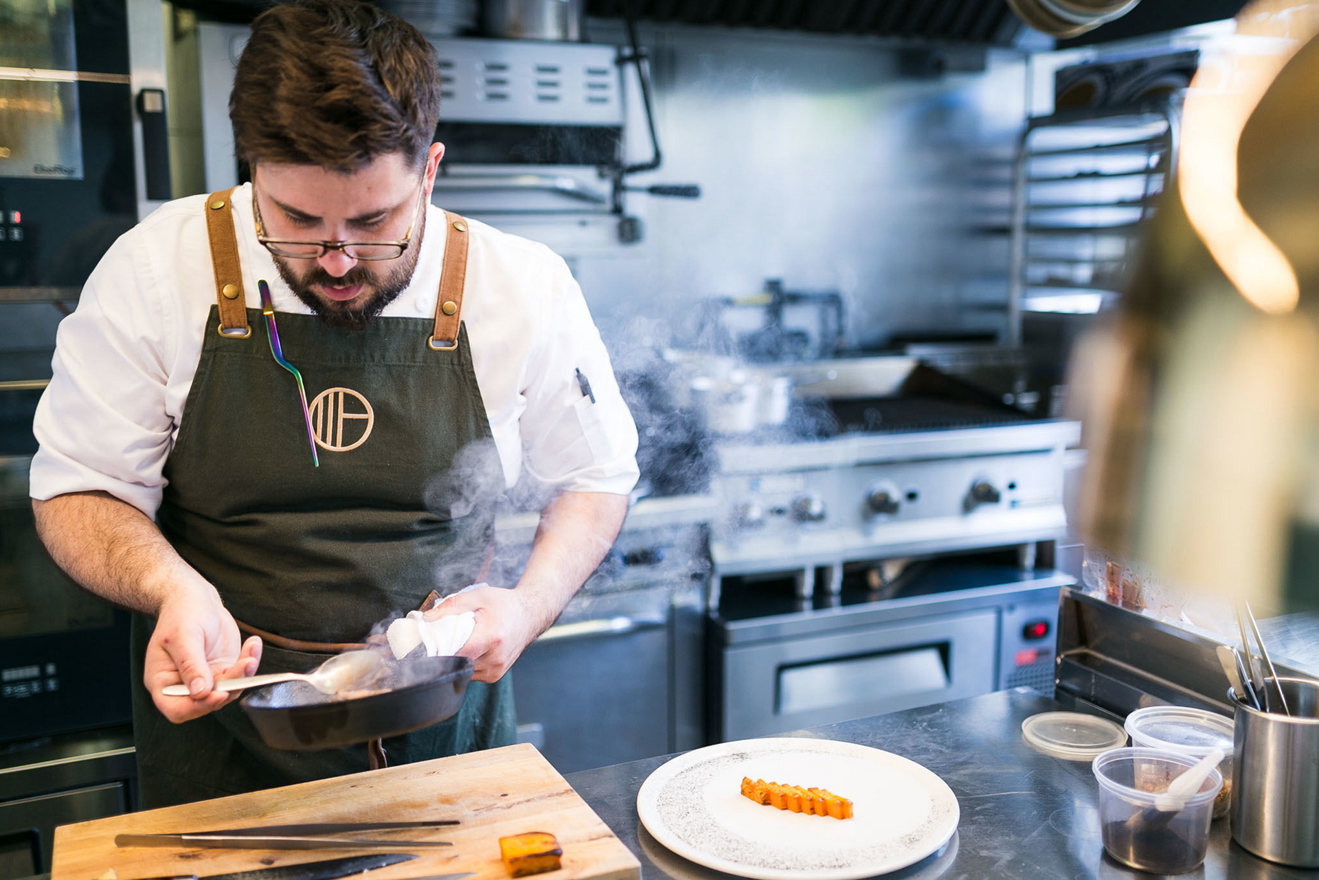
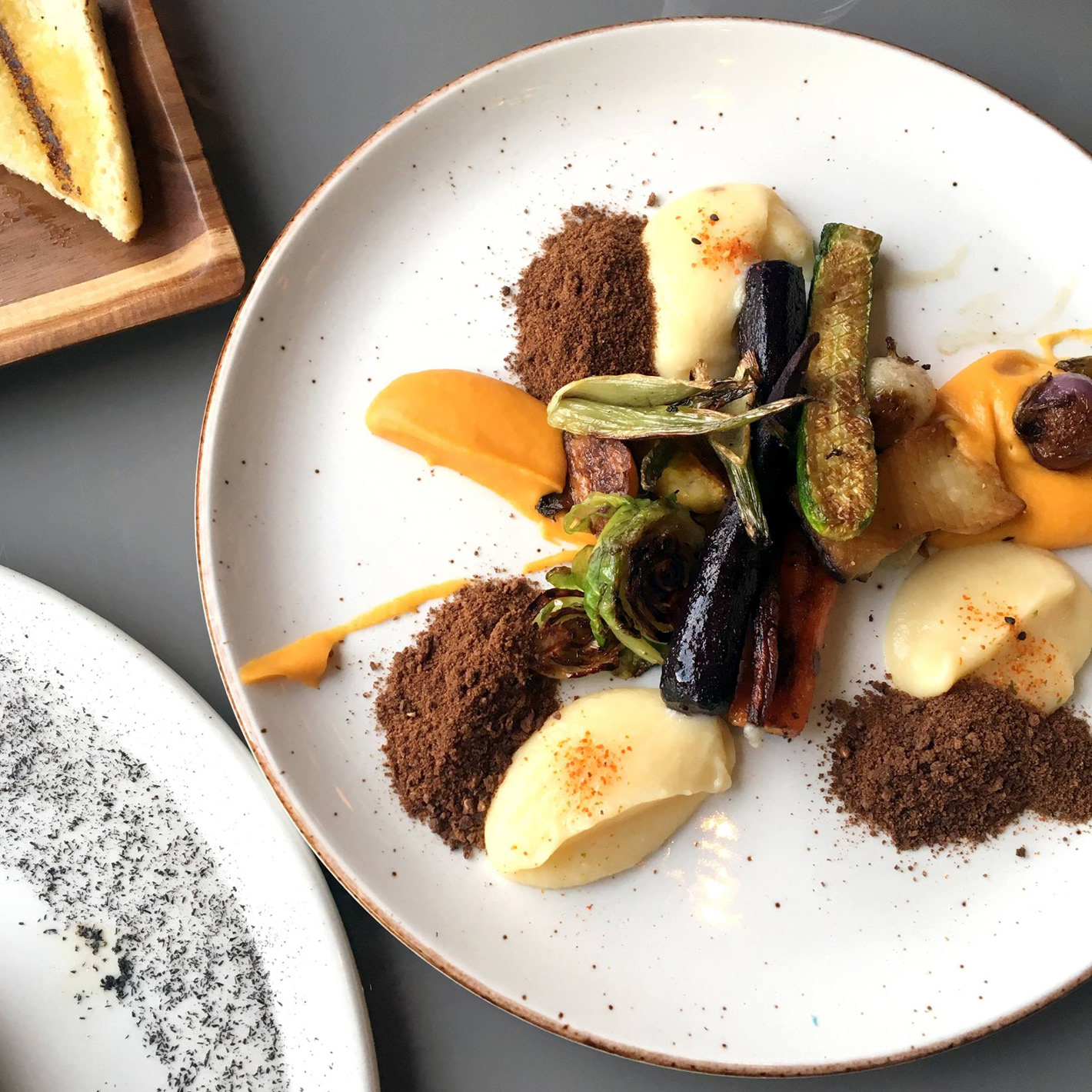
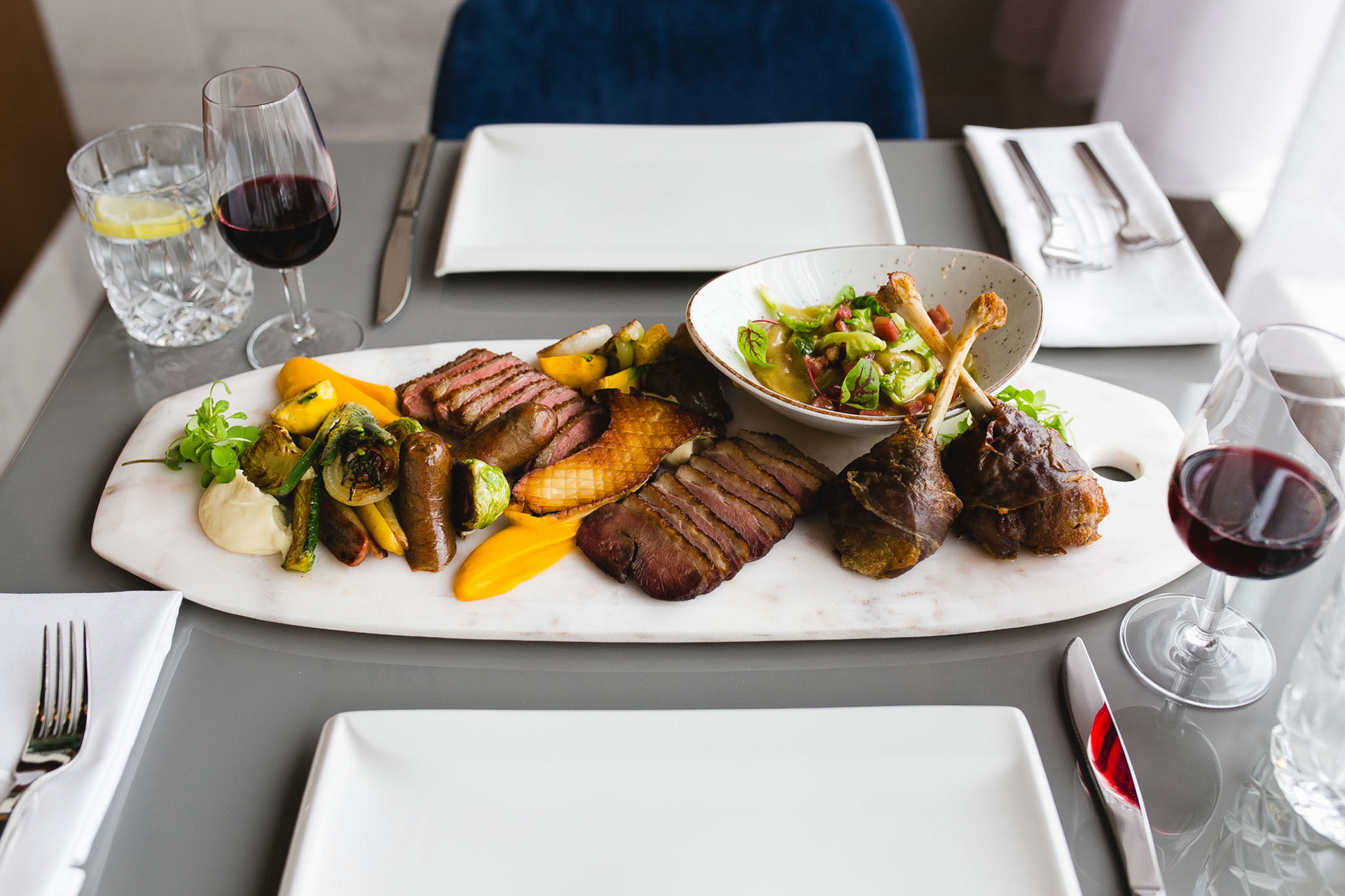
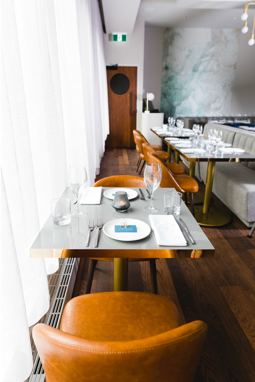
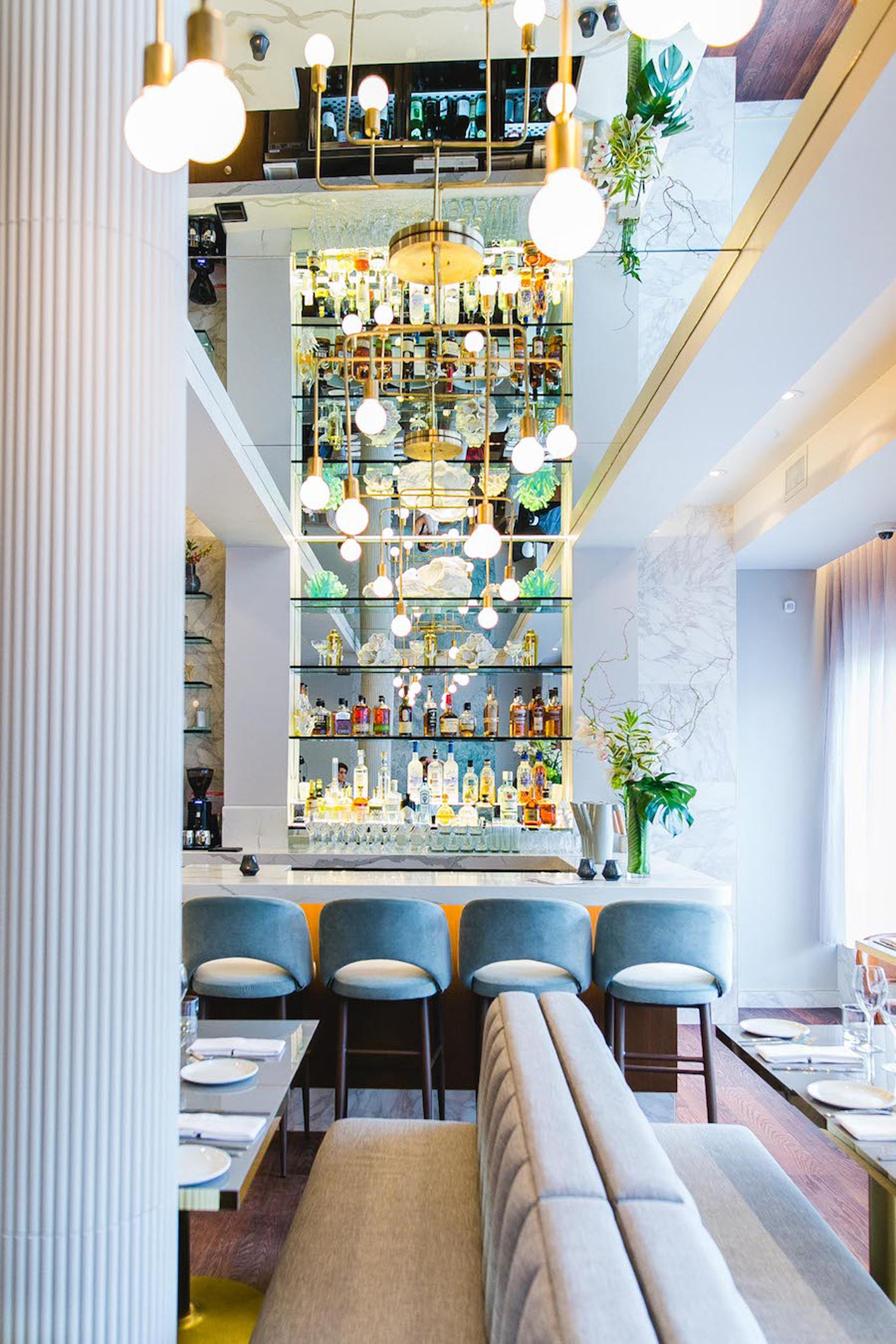
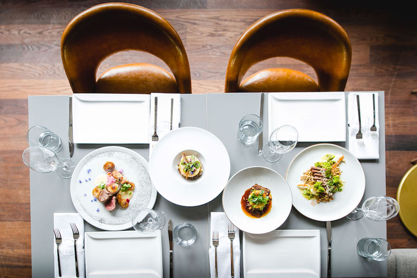
Hopkins a upscale restaurant in Montréal offers seasonal small palte sharing menus. Creating artistically plated food from a zen kitchen culture. These were the main brand influences for this project. We sought an aura that reflected not only their creativity and zen, but the sometimes chaotic and random forms found in nature.
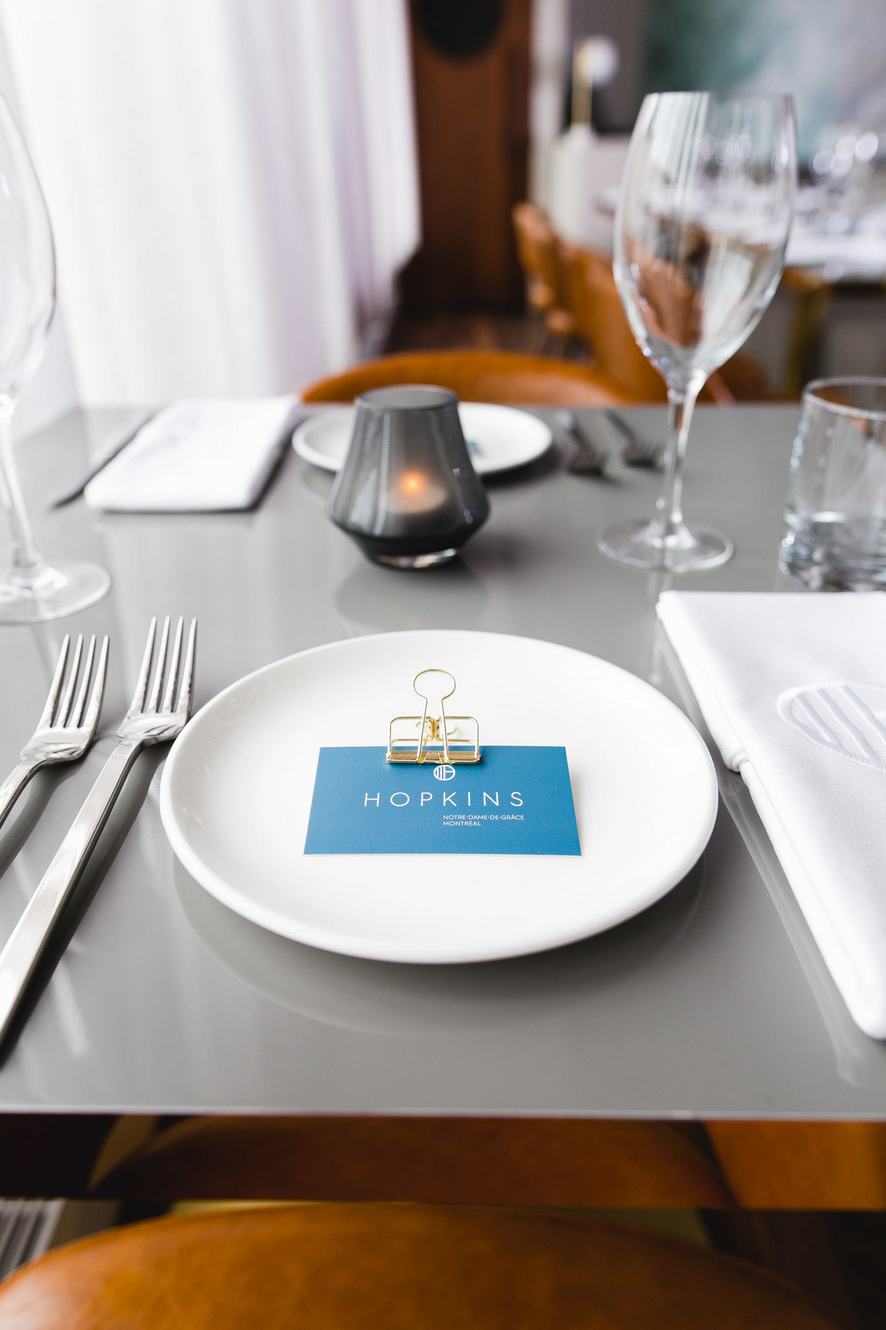
Rational: The clean and elegant typography and structure of the logo represents the clients attention to detail and precision. These man made elements paired with organic illustrations demonstrate how the chefs draw their own inspiration from the fresh seasonal ingredients they source from the land to place on your plate.


BENTO DESIGN AWARD 2019 — People’s Choice Award Winner
Kind words... “Hopkins' design is simple, yet layered with a real consistency of how it's applied throughout the various touch points with just the right amount of surprise. It sets a clear intention and I found it very evocative, extracting a real feeling from the viewer. A balancing act like that is more challenging to achieve than you think.”
- Camilla Marcus, Founder of west~bourne

-
Thank you. If you would like to know more about my:creative or are interested in collaborating in a new venture please visit us at Twitter / Instagram or Email
-
Credits.
Brand and design by My Creative: (UK)
Logo Design & Illustration by Ewan Leckie
Brand strategy with SaintUrban
Brand strategy with SaintUrban
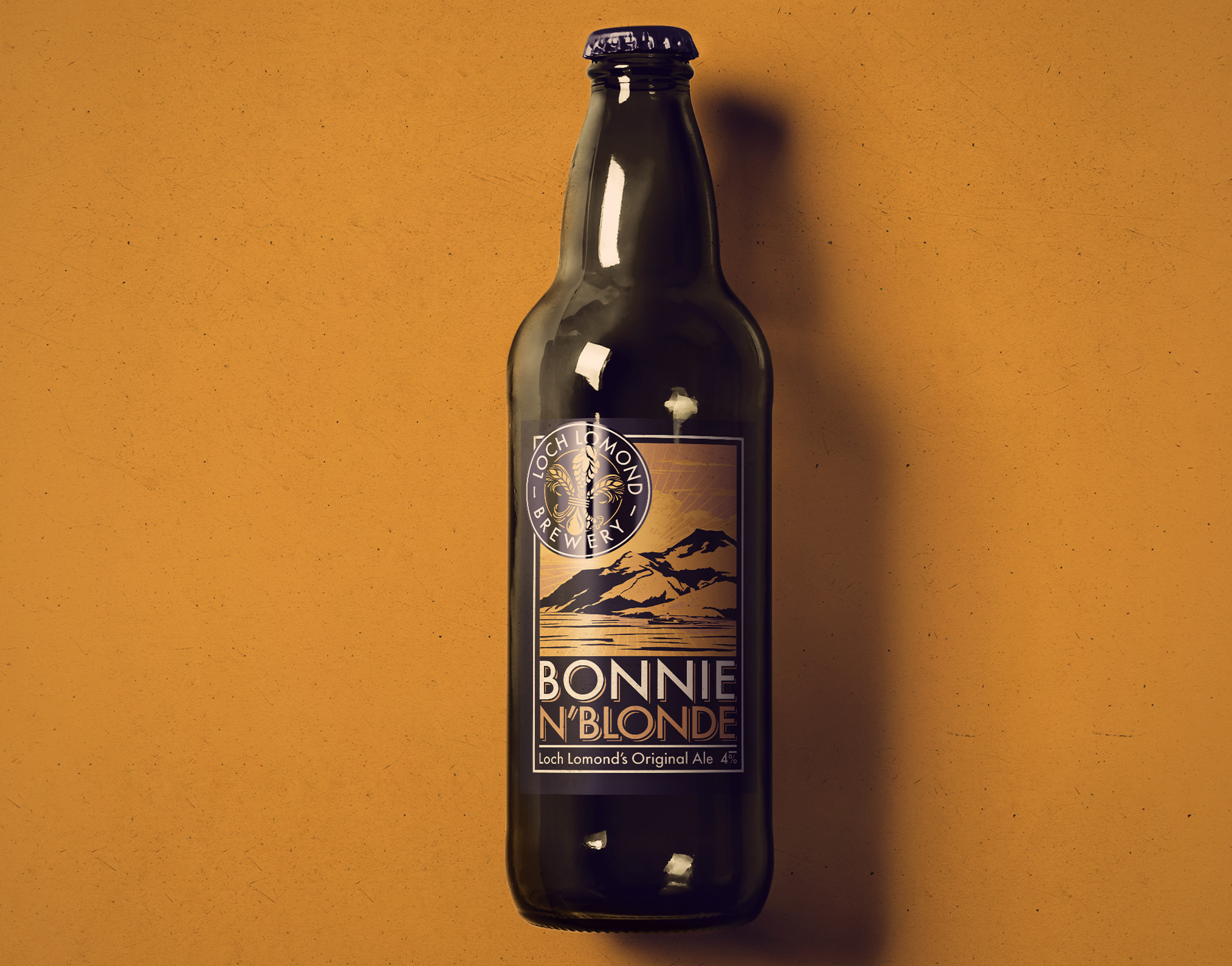
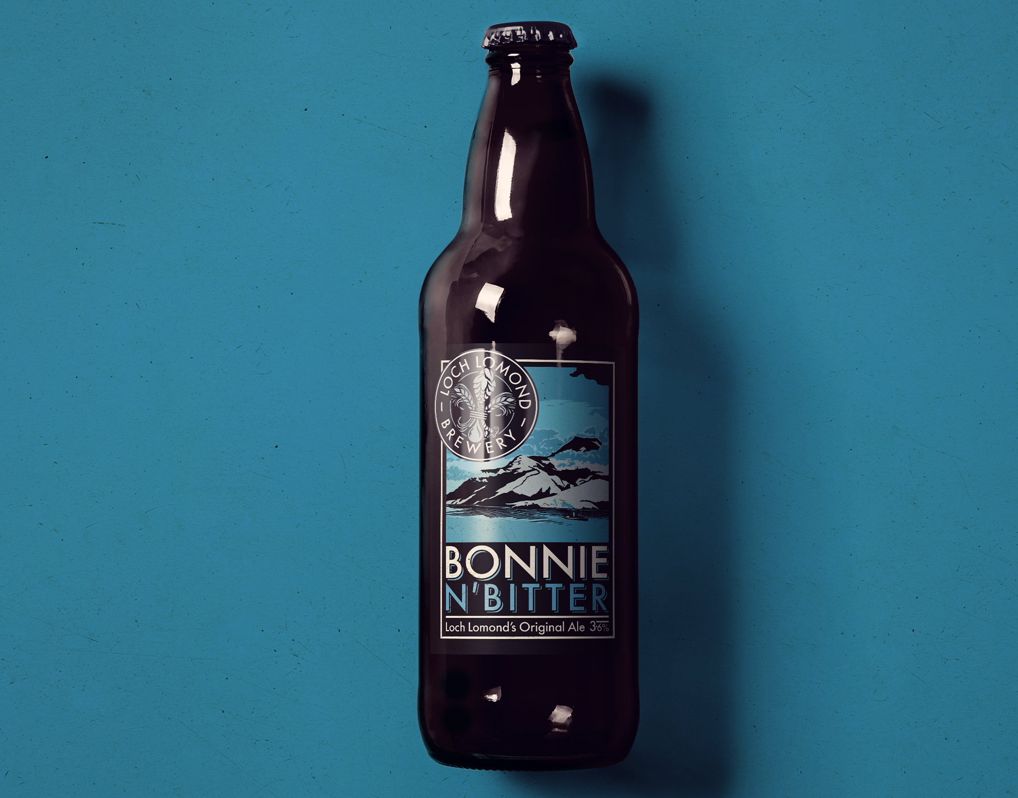
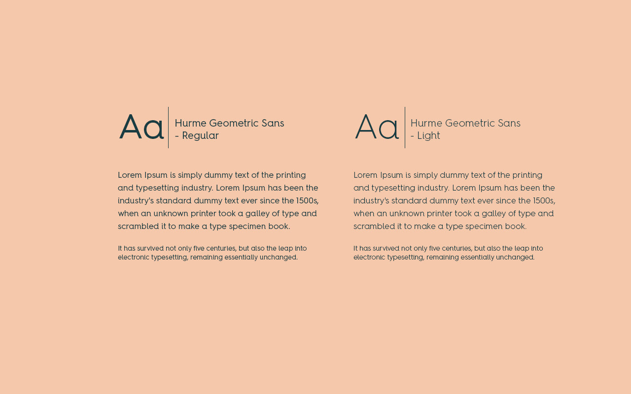
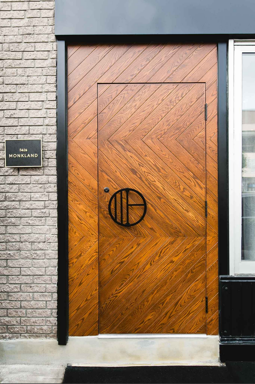
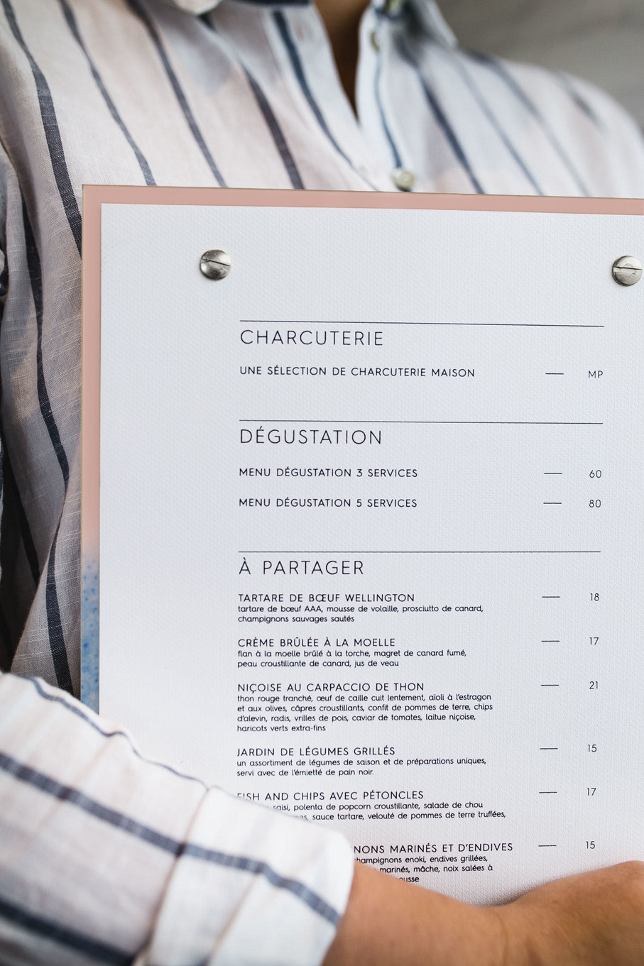
Deliverables include: Research + brand identity, sign design, shopfront elements, menu system, Logo design, wine labels, typography, uniform apparel and takeaway packaging.


