
-
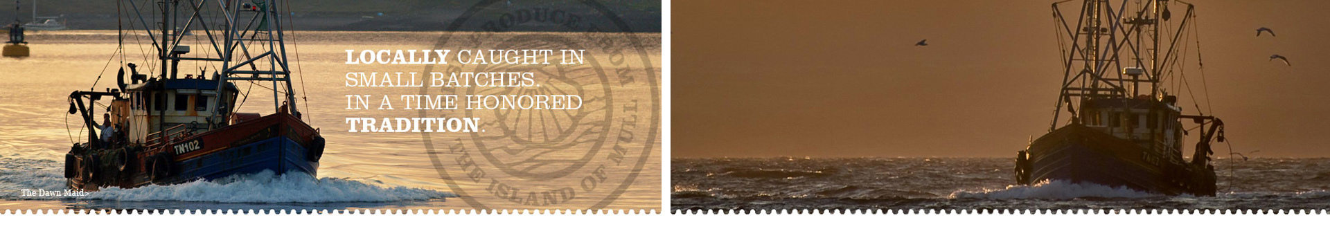
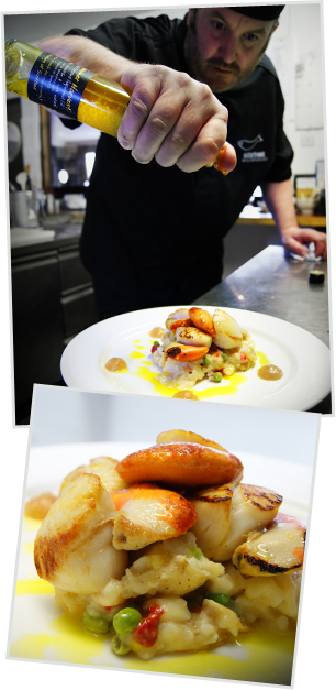
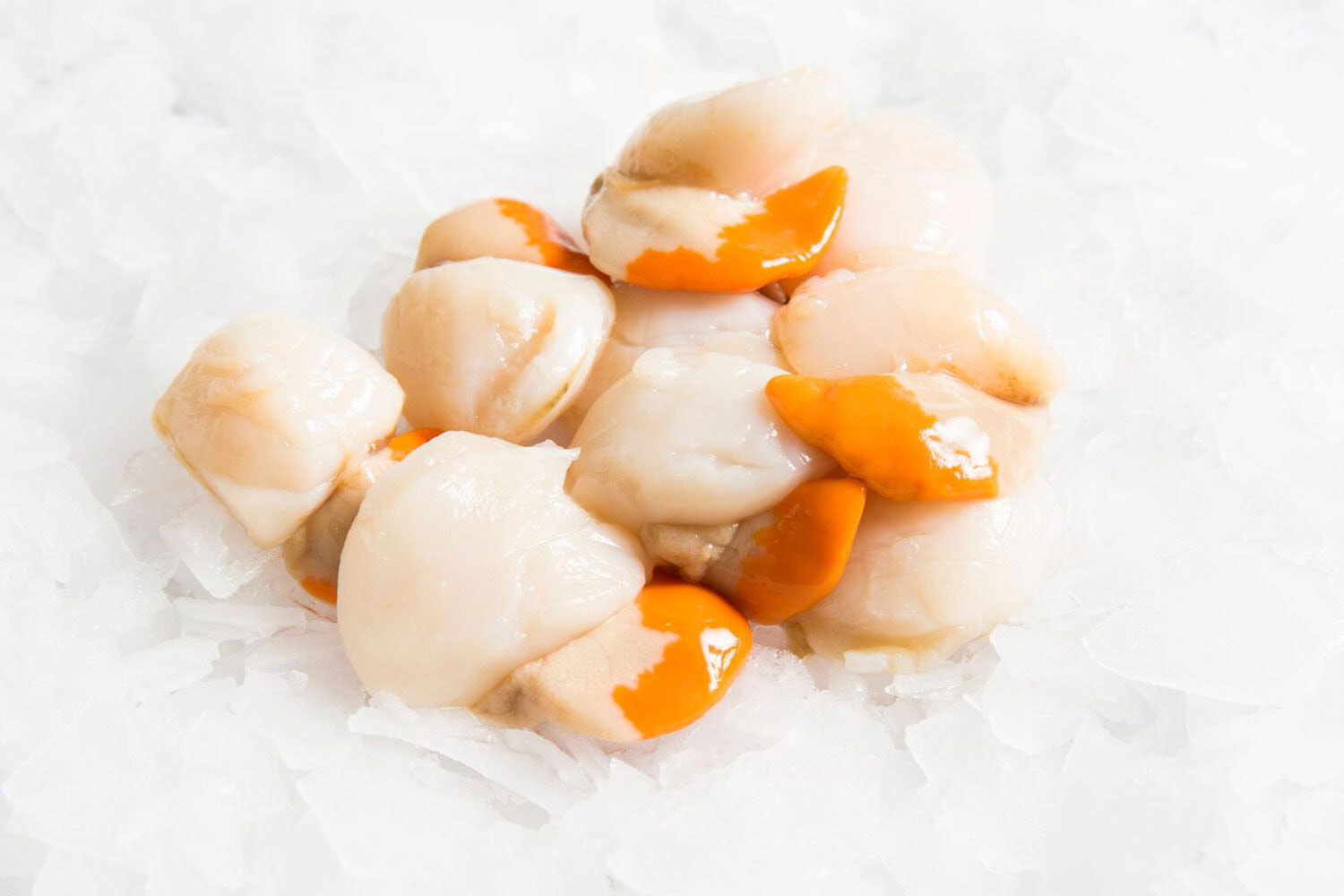
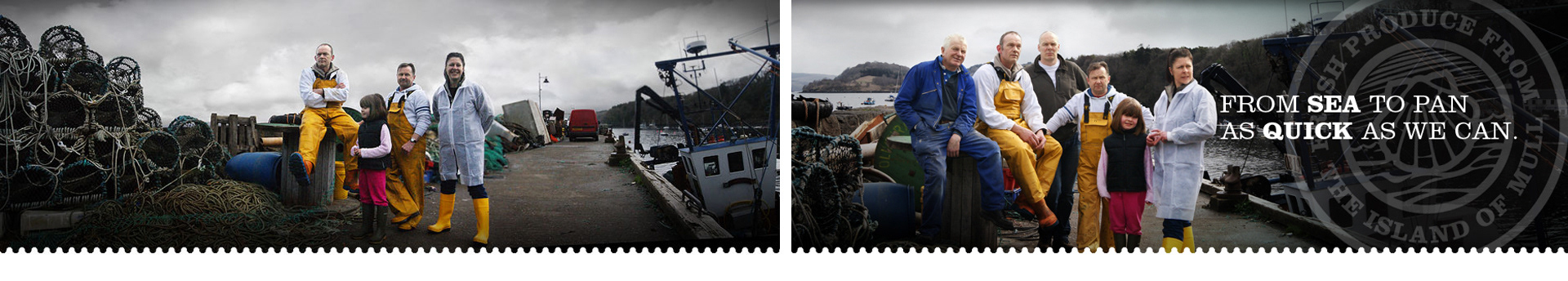
Back in 2010 Isle of Mull Scallops approached us to create a brand that would build on their reputation of quality seafood and visually speak to both public and suppliers. We delivered a new visual identity, labeling, packaging and a set of branding tools that fitted their brief: family focused, authentic, honest and of course a delicious Scottish delicacy.
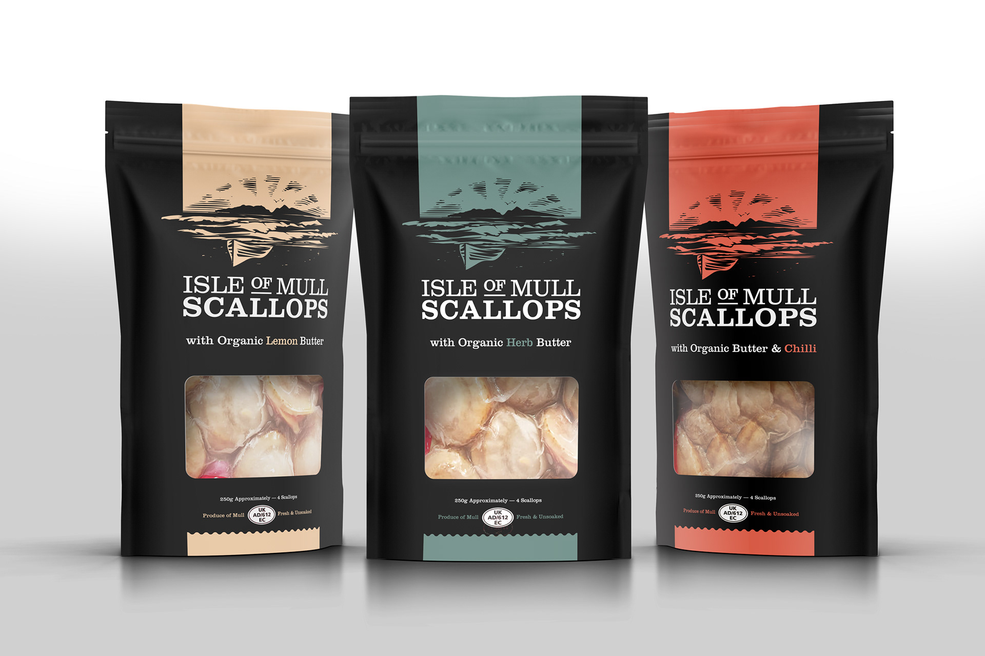
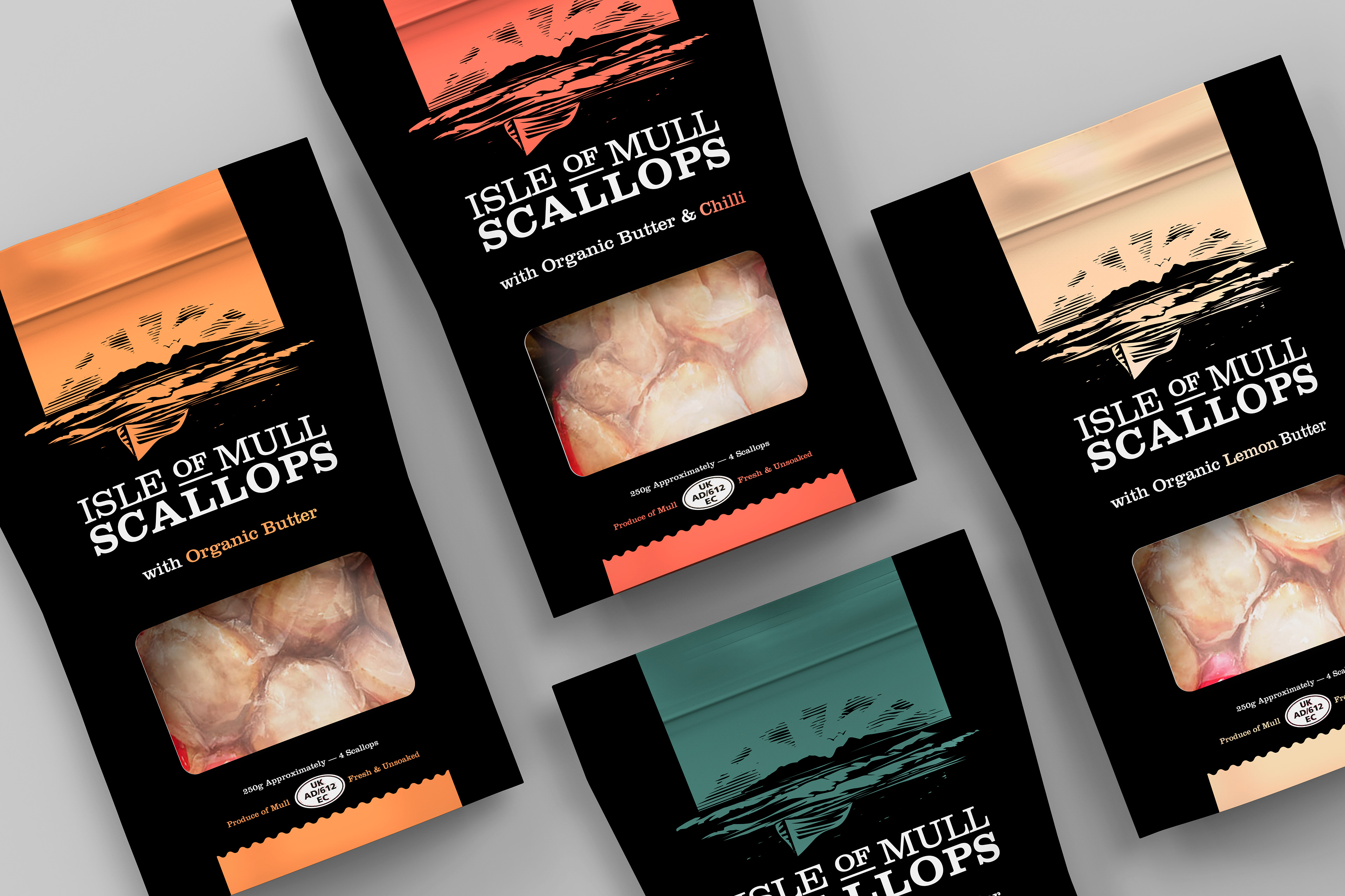
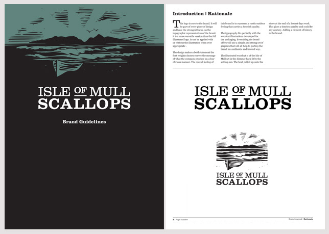
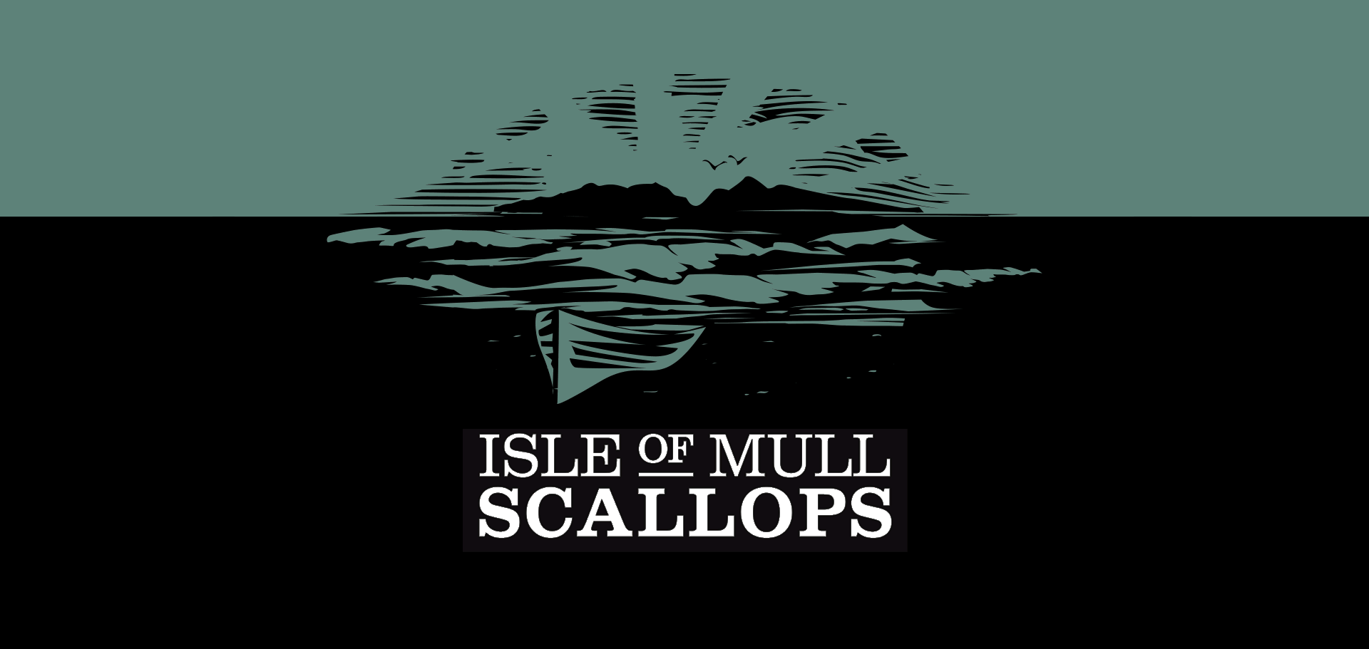
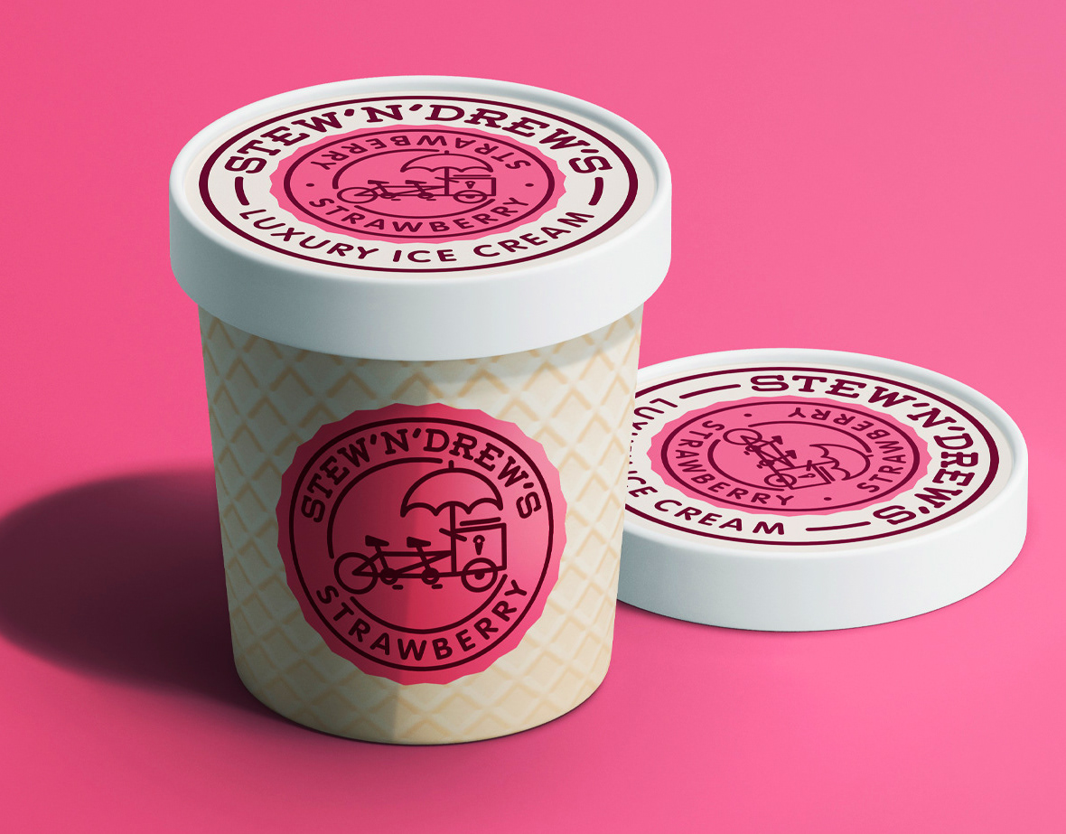
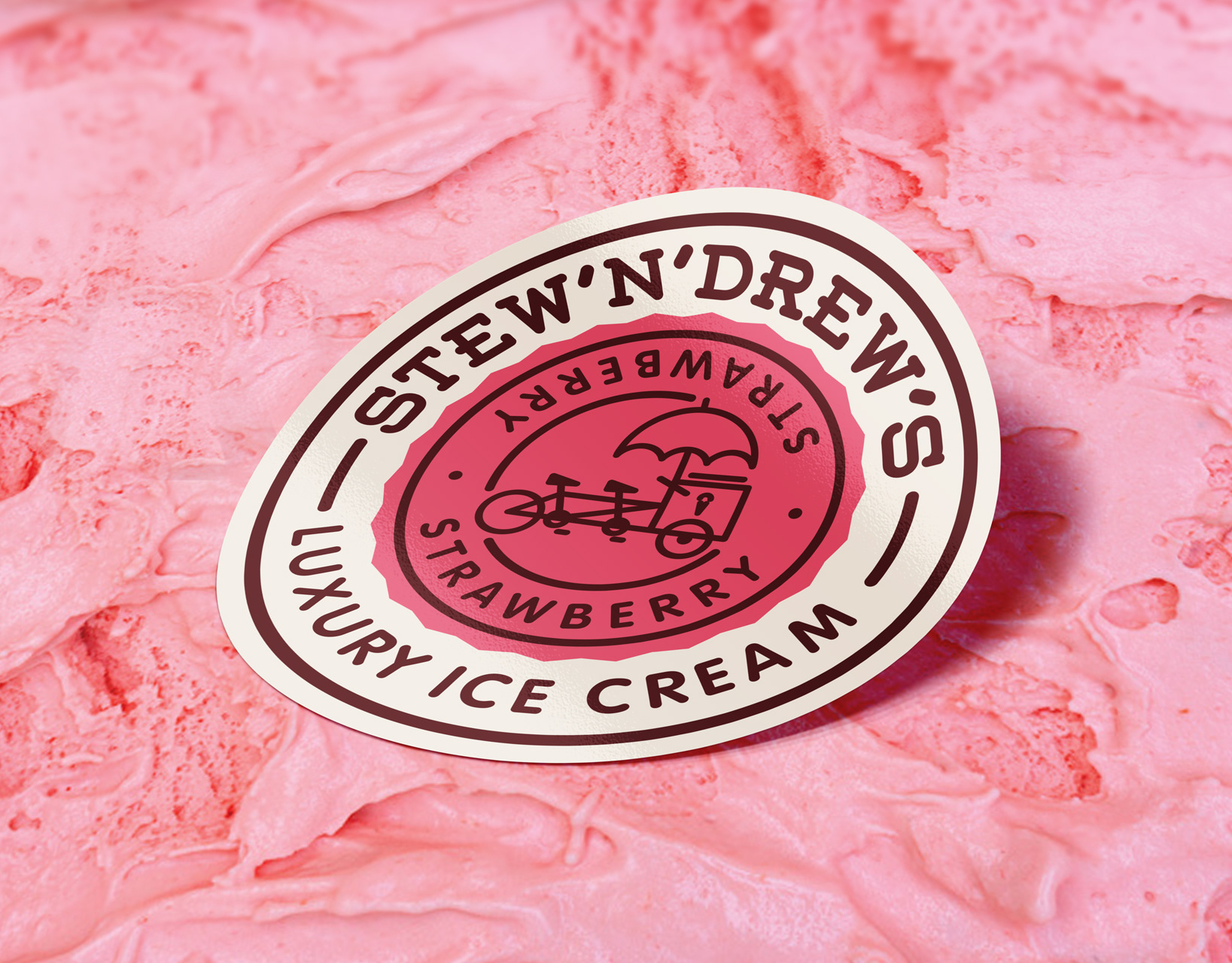
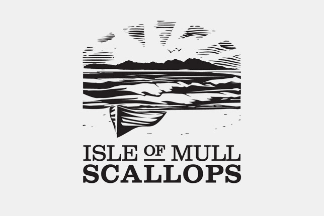
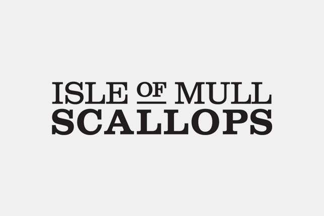
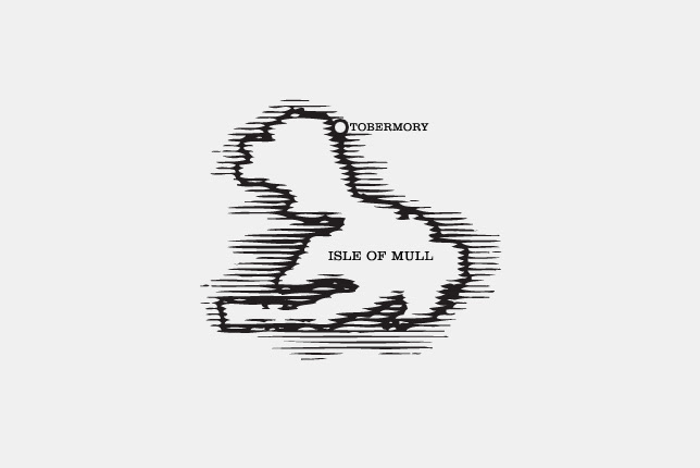
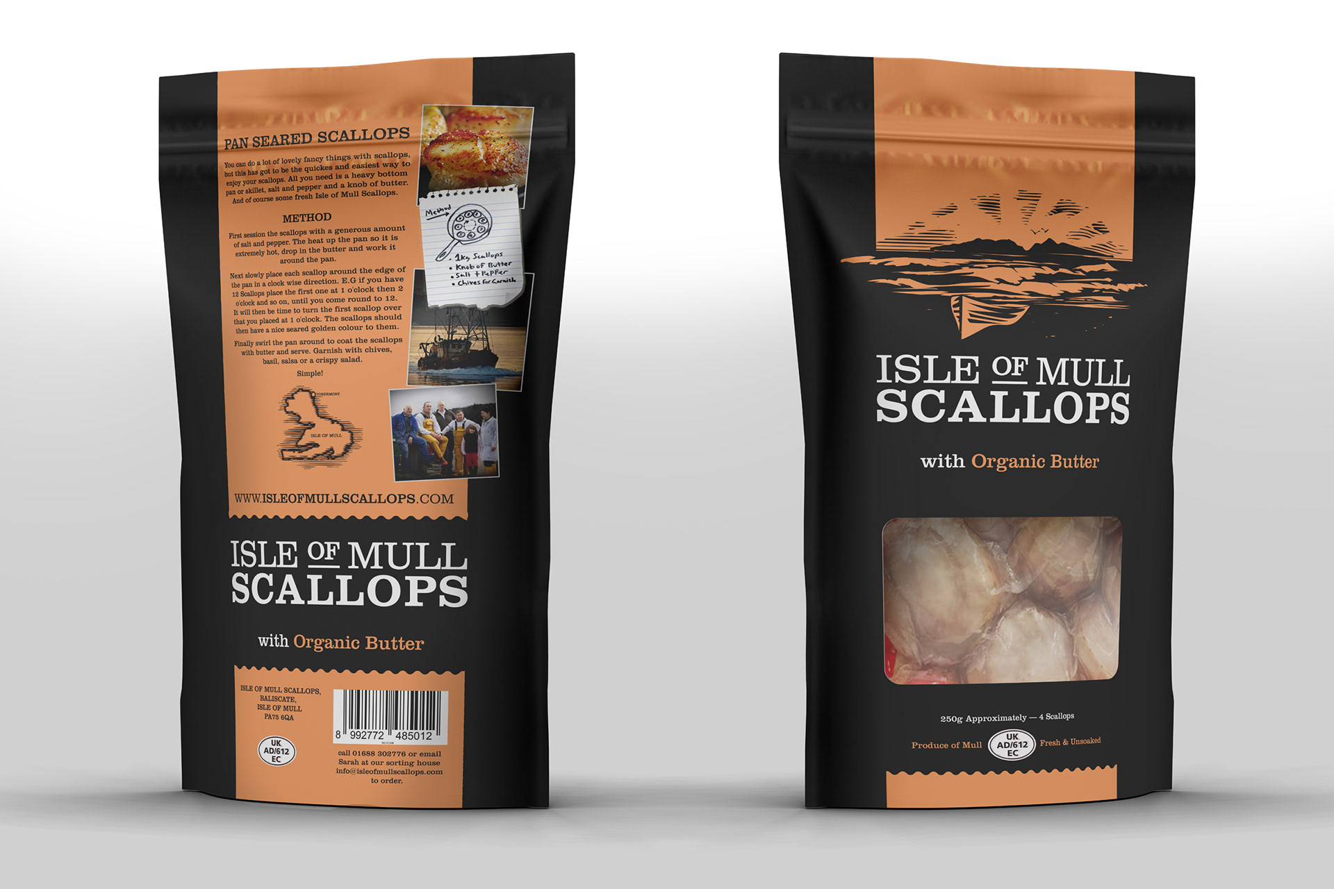
The logotype and woodcut illustration are designed to make a bold statement on the packaging and signage with the typography conveying a direct message of what the company produces in a contemporary way.
The logotype and woodcut illustration are designed to make a bold statement on the packaging and signage with the typography conveying a direct message of what the company produces in a contemporary way.
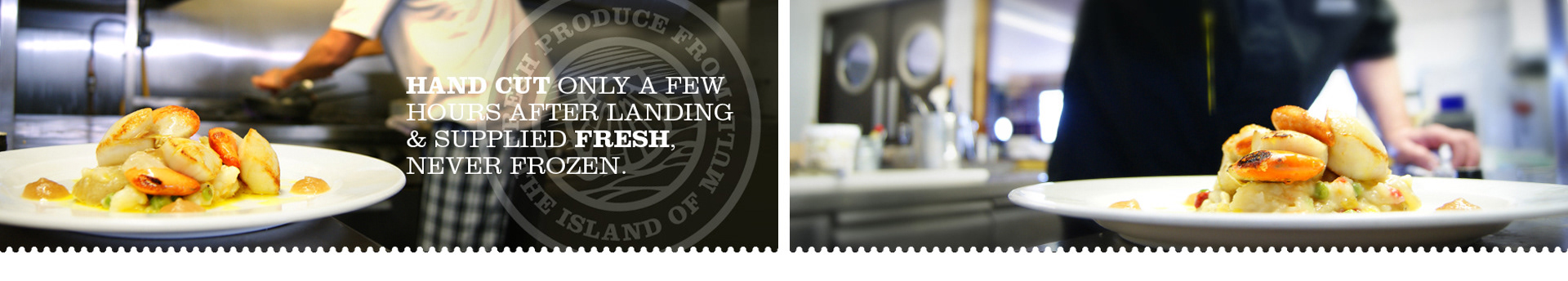
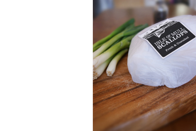
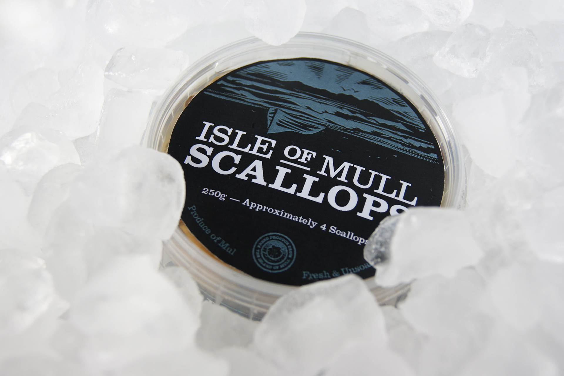
2019: We revisited this project by looking at ways to cut back on the plastic packaging previously used by 75%. With a new vacuum pack that can be sealed when purchased at the fishmongers or as soon as its landed to keep fresh for longer or frozen without damaging the meat.
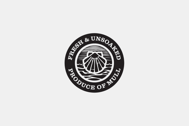
Deliverables include: Research + brand identity, copyrighting, signage, packaging, labeling system, stationary, logo & illustration, website and photography.

–
Packaging: Cutting back on the plastic used previously by 75%. With a new vacuum pack that can be sealed when purchased at the fishmongers or as soon as its landed to keep fresh for longer or frozen without freezer burn.
A set of complementary colours where selected for each additional product - Chili, Organic Butter, Lemon and Herb. The overall feeling of this brand was to represent a rustic outdoor vibe that carries a Scottish quality.